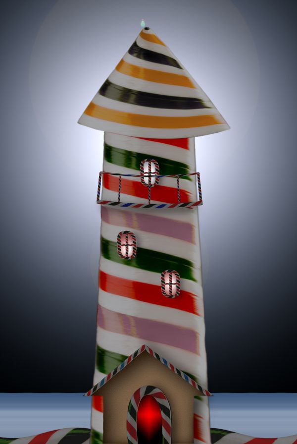
only source image used
(5 years and 3715 days ago)
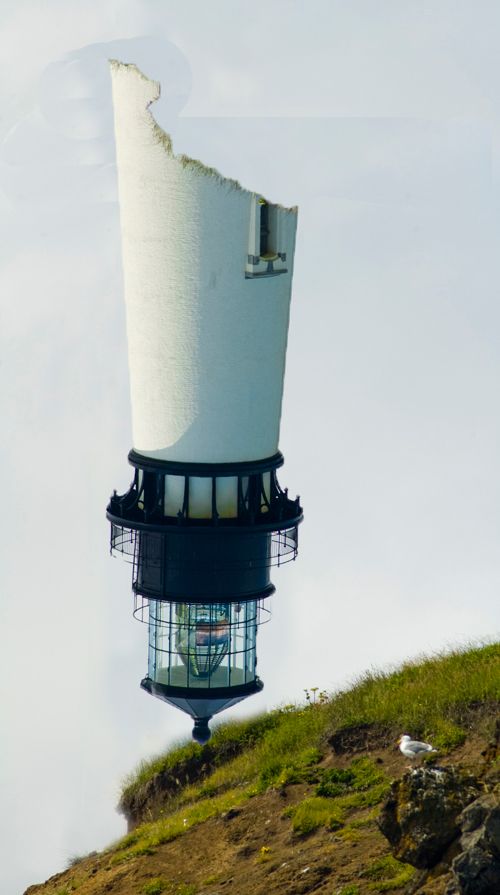
(5 years and 3719 days ago)
Clean up the top left edge and give the tower some dimension...
the lighthouse looks like its floating in air, can you see what it looks like if you move it down a tiny bit?
Or try making the hill wider, and put the point of the lighthouse on the hill, you will have to make the image higher though, so a high res will probably be needed.
eyesore
Now the top of the sky is a mess, and we don't see anything of the interior of the tower...you can fix this.
Howdie stranger!
If you want to rate this picture or participate in this contest, just:
LOGIN HERE or REGISTER FOR FREE
(5 years and 3768 days ago)
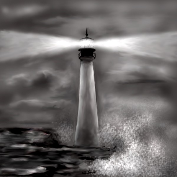
its almost like a charcole image, very nice author 
Great idea. Did you know you can get straight lines with any of these three tools using your shift key?
12th place congrats... wonderful image amongst wonderful entries.
Howdie stranger!
If you want to rate this picture or participate in this contest, just:
LOGIN HERE or REGISTER FOR FREE
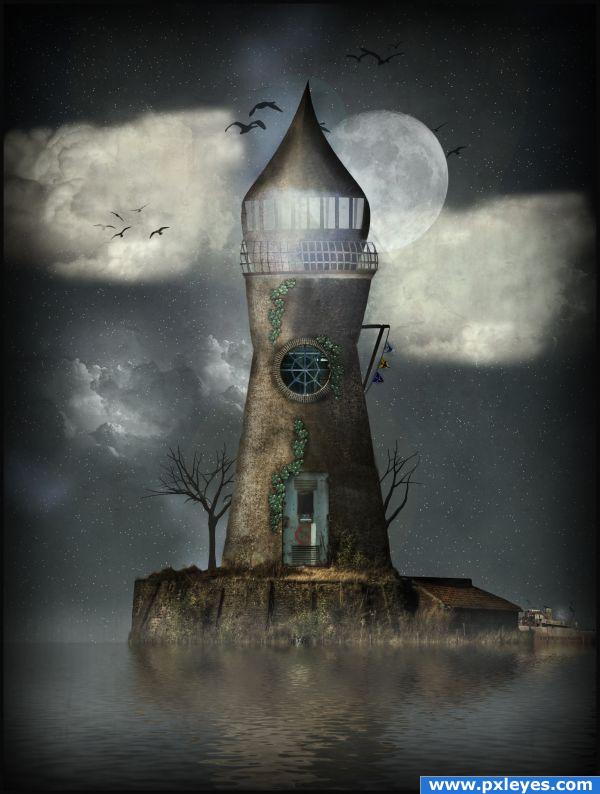
This is an old image i did from PST. therefore i had to do alot of research to find my old sources.
Thanks to Giulia for the ship source!
And a HUGE thank to CGtextures.com for all the other sources.
The clouds, birds and trees are just brushes which i did't found again from Deviantart.
Update: i fixed the ugly line in the middle and reshaped the "head" (5 years and 3820 days ago)
This looks great.
Very original, looks amazing.
beautiful mood! But you should work on the cloud's shape and light
Very pretty!!!
nice
nice to see it back again.
I remember that one!Nice to see it back!

Congrats for your second place, Lodd
congrats odd mod LOL (just saw ur avtar) 
congrat for your second place 
Congrats!!!! WONDERFUL!
Congrats
Howdie stranger!
If you want to rate this picture or participate in this contest, just:
LOGIN HERE or REGISTER FOR FREE
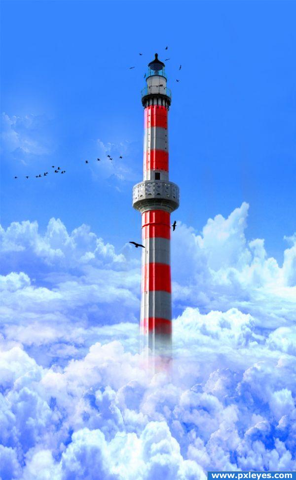
Random idea of having a lighthouse reaching up into the clouds.
(was going to put flying boats but changed my mind lol)
(5 years and 3845 days ago)
need to solidify the base if you want it to look real.. but it's a neat concept (the translucent base makes it look like it begins in the clouds.. but if that was your goal.. more power to ya
Put some more clouds at the base so the tower doesn't look like it's disappearing...
EDIT: Much better! 
Much better.. good luck!
It's fantastic! However, if it's a lighthouse you should probably put a light at the top. Also instead of making the tower become transparent you should make multiple cloud layers gaining opacity on top of it.
Pretty cool! It doesn't really look like a lighthouse, but it's still great! GL 
Great idea. I think that it would be more accurate if there weren't clouds at the top of the picture since the lighthouse is meant to be higher than clouds. Maybe you should also try to make the sky a little darker (with a gradient) at the top to show that it's really high.
Nice job, author! Rather captivating...
flying boats would have put this over the top for me. well done as it is
great pic.
the coloring is really good, only the bottom part of the tower looks a bit "unreal". love it otherwise
Howdie stranger!
If you want to rate this picture or participate in this contest, just:
LOGIN HERE or REGISTER FOR FREE
very nice.good luck
Very nice image, GL
nice done
Looks really delicious
very good the final result, i just would change the background...dont know, put a green field
Good work.
Thank you for the comments.The background is simple but it give depth and motive to the lighthouse.
Good job
Wonderful....
Howdie stranger!
If you want to rate this picture or participate in this contest, just:
LOGIN HERE or REGISTER FOR FREE