(5 years and 3793 days ago)
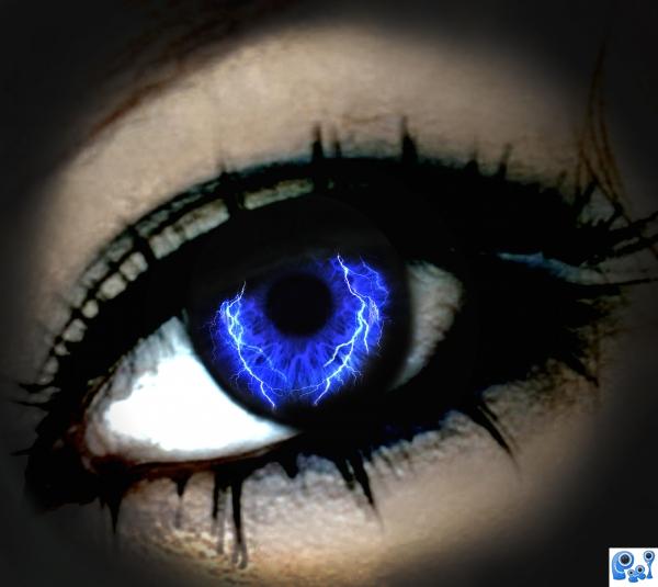
Thanks to lilfuzz6 for the gorgeous eye image.... (5 years and 3808 days ago)
Quite clever.......I think I know this person!!! LOL 
Nicely done, but in general I am getting bored of seeing eyes and globes.....every graphic artist uses them 
very nice 
Howdie stranger!
If you want to rate this picture or participate in this contest, just:
LOGIN HERE or REGISTER FOR FREE

:) Not much to say.. or Thanks to nosheep (www.sxc.hu) for hands :) (5 years and 3808 days ago)
Nice job with the glowing light between the fingers.
GL ..
There is some of the background image on the left side of the hand that doesn't look right.
Nice work...u have to add some shine to all fingers.Beside that image is very good....gl
@jawsh thanks! I didn't see that.. Ill edit it
and @erathion I tried to 'shine' up the fingers.. maybe you wont see the difference? I don't know. Thanks to all for comments. Just comment if it's something that can improve my pic ;D
Hands aren't from SXC...they're from Adobetutorialz.com
@CMYK Maybe both?
I was on abuzeedo, and saw the hands, and id really liked to use them.. and i did. So i checked where the tut found it... sxc.. and nosheep uploaded it. u can check yourself..
very nice 
Howdie stranger!
If you want to rate this picture or participate in this contest, just:
LOGIN HERE or REGISTER FOR FREE

An artistic manipulation of the source image.
Credits to:
PSDTuts my inspiration in making my artworks.
Piotr Bizior
for my superman image.
ponti55 and elficho for your reminders and advices.
Heheh! : D Enjoy! (5 years and 3813 days ago)
Interesting image, good luck!
Thanks ponti : D.... ^_^
looking different
creative use of source author.
very nice 
Howdie stranger!
If you want to rate this picture or participate in this contest, just:
LOGIN HERE or REGISTER FOR FREE
(5 years and 3842 days ago)
What's the blob in the middle?
Mother and child.
I think you should delete the mother and child--it would be a better looking picture without it.
Please provide source link for mother & child...
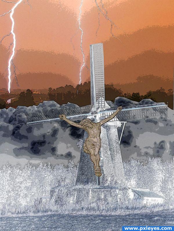
I changed this image. I took the picture of Christ at St. Ann's in Wadena, Minnesota.
Thanks for your feedback guys. It looks a lot better since I changed it. Thanks again!
What a sacrilege 
I'm a bit offended by the content but getting past that, the foreground reminds me of infrared techniques.
I guess you wanted to make a monumental scene with the lightning that illuminates the ground, and you inserted the Christ to underline the fatalism ( if i can say so) of the momment. Suggestions for the future: target your theme and exploit it at the max. In this case the lighning. You should place just a big powerfull one instead of many, and put it in contrast with the rest of the scene. Also , you should avoid using religious symbols in a way that might offend folks, cause you're entry can get removed, instead of getting appreciated.
Howdie stranger!
If you want to rate this picture or participate in this contest, just:
LOGIN HERE or REGISTER FOR FREE
Great expression onthe Drake's face.. really great job!
What a beauty! Looks like a piece of jewelry!
Amazing
SBS pls....very nice work...
if you made this from that source pic then you are an artistic genius..amazing
That's fantastic...
congrats
very artistic! congrats!
Congrats! for 3rd place
Great manipulation. Your work is the tops in my eyes. Period.
great output... congrats!!...
congrats
Congratulations on the top- three, Jaskier! Looking forward to seeing more of your Photoshop jewelries!

Congrats!!
Thanks for Your comments and votes.
looks ok
Howdie stranger!
If you want to rate this picture or participate in this contest, just:
LOGIN HERE or REGISTER FOR FREE