(5 years and 3119 days ago)
- 1: city
Check Step 7 for an animated gif of the steps in this piece.
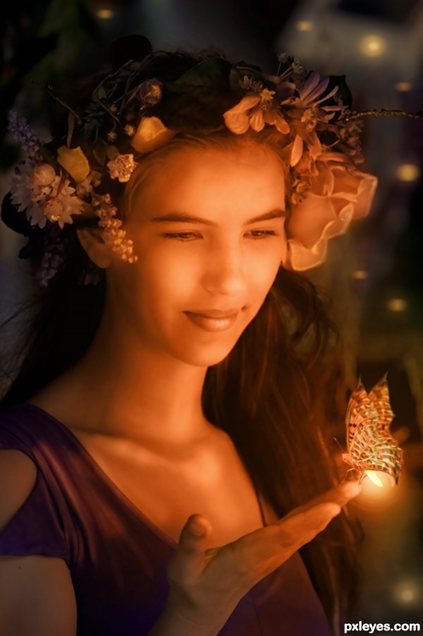
Sincere thanks to artistatplay (or atistatplay) for the inspiring base image, and to hirekatsu for the butterfly. (5 years and 3183 days ago)
FAB WORK!!!
Thank you! 
Nice, but 50% orange at best.
"In this contest, we're going to create such a fantasy scene with the color 'orange' as the main theme... anything fantasy related goes, as long as the dominant color of your subjects in your scenery is made out of orange tones."
Orange tones. Please check my SBS. Thanks for stopping by.
I like it, nice job on the blending/smoothening of lady..
like the in-between butterfly-firefly idea
easily could be an image in a fairytale book 
The highlights are orange and the highlights dominate the image, so it's orange enough for me. Reshaping the butterfly wings into something more dramatic was inspired. I'm not sure what happened in Step 4 of the SBS, but she started looking at her thumb instead of the butterfly which drastically minimizes the overall impact.
Dan, I think what happened was the added light to reflect the insect glow in her eyes? I toned it down. Thank you!
Interesting composition, GL!
elegant and sweet (fantastic source find) GOOD LUCK!!!
Lovely image and beautifully done ... your "over-painting" really finishes the piece nicely. Great SBS ... you get extra points from me for that!!!
Very nice Author and I agree with Arca  good luck
Beautiful fairy tail girl 

Wow.. such painstaking work, beautiful result! 
Howdie stranger!
If you want to rate this picture or participate in this contest, just:
LOGIN HERE or REGISTER FOR FREE
(5 years and 3270 days ago)
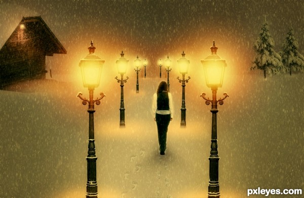
Very cool work author...IMHO she is a bit big compared with the rest of the image...also perspective of the laps is for few degrees wrong...try to fix that and this will be great...by the way great touch with adding foot steps in the snow...best of luck
She's way too big, and the perspective on the tops of the lamps is wrong. Good idea & mood, though.
Also, symmetry doesn't help this image, two identical buildings is a bit weird. Find one or some tries for one of the sides.
edit: I made changes. Thanks erathion, CMYK46 and greymnal for your useful suggestions. But I don't understand how can I make my lamps perspective better...tell me
well done!
From the angle at which the lamps are shot, I don't see what you can do about the perspective issue.
You could transform the lamps just a bit , so that those in the foreground appear bigger, but Make Sure you Don't split the image with them. Splitting image = failed composition.
Also make the far distance foggy, so that you can't perceive horizon, but just image it. Check works of ponti & arca if you don't understand what i mean. I usually do it with some scatter common brush on a layer which I gaussian blur. But internet has many tutorials, try them.
Last tip: since all your elements are vertical, image might be plain - try to tilt the snowfall, a few degrees.
You're doing good, and you're also the only guy with warm mood!
Howdie stranger!
If you want to rate this picture or participate in this contest, just:
LOGIN HERE or REGISTER FOR FREE
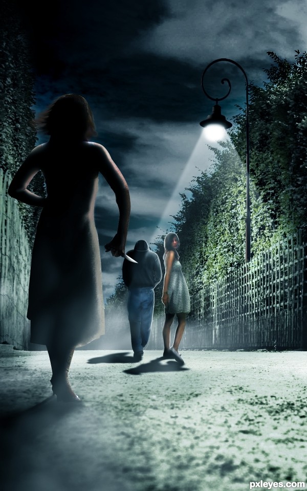
i frnds i used ps cs5 hope ya all like mah creation :)
special credits
1.WolfcatStock
2.Seraerith-stock
3.wookiestock
4.lumuria (5 years and 3282 days ago)
the blending is not good! people are blurred! but i like shadows and the light! good luck!
anyways thanx 
The light should not be shining behind the man since he is casting a shadow...especially since it is NOT shining behind the woman next to him.
thanx mossy for your suggestion
i hv changed that pic bcoz the author of that sources was not givin me the permission to use them .
The light from the streetlight would still not continue behind the figure. That part would be in shadow.
The far woman is this side of the streetlight (as evidenced by the direction of her [oddly distended relative to that of the {even if unusally short} guy behind her] shadow), so she should be largely a silhouette like all the figures in this scene.
i know there are lots of mistake but i still tried to improve it.
Howdie stranger!
If you want to rate this picture or participate in this contest, just:
LOGIN HERE or REGISTER FOR FREE
(5 years and 3286 days ago)
Howdie stranger!
If you want to rate this picture or participate in this contest, just:
LOGIN HERE or REGISTER FOR FREE
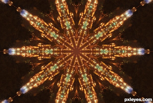
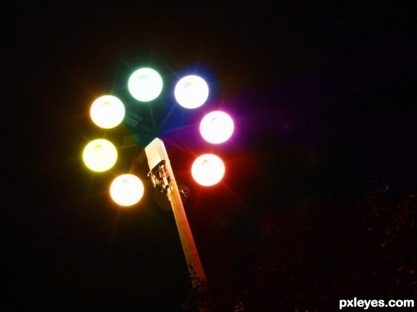
really cool.. this reminds me of the movie 'Independence Day' space ship scene, just before they start the 'checkmate process' or explosion scene of different cities..
SBS is not mandatory if your photo source link is present...
Reminds me the bottom of a space ship, very well done, good luck!
Beautiful futuristic star
Howdie stranger!
If you want to rate this picture or participate in this contest, just:
LOGIN HERE or REGISTER FOR FREE