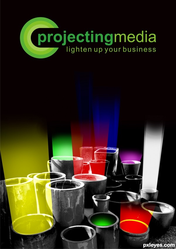
it's a simulation of a flyer (5 years and 3612 days ago)
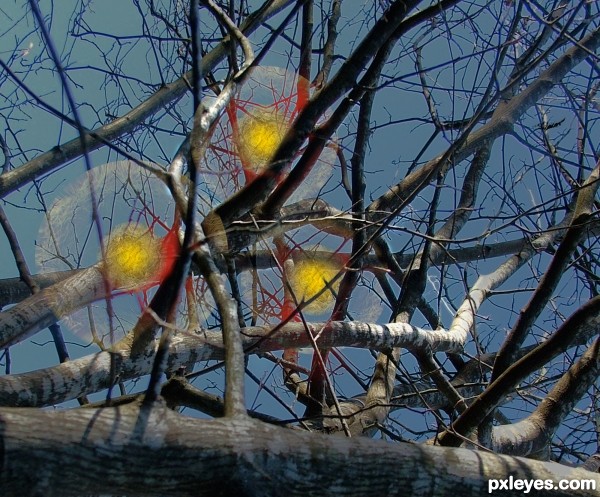
Three strange lights in a tree with no means of support. Just hanging in the air. (5 years and 3623 days ago)
Do you feel you are being watched ?
nice
Interesting idea! 
Different! 
GL
nice entry... gl
Good .
.
Howdie stranger!
If you want to rate this picture or participate in this contest, just:
LOGIN HERE or REGISTER FOR FREE
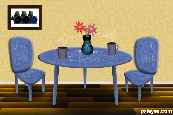
after a grueling 4 hours of selecting, transforming, blending...you get the idea. :)
morning coffee with table chairs and flowers all from the original orange light on the traffic light. (5 years and 3627 days ago)
Pretty good! 
Nice effort! How did you do the smoke coming from the coffee?
erikuri: its in my SBS under step 4
hehe nice 
yes come on over, coffee company is welcome! 
GL
great job, author,.. gl
good luck
good luck
nice job
Howdie stranger!
If you want to rate this picture or participate in this contest, just:
LOGIN HERE or REGISTER FOR FREE
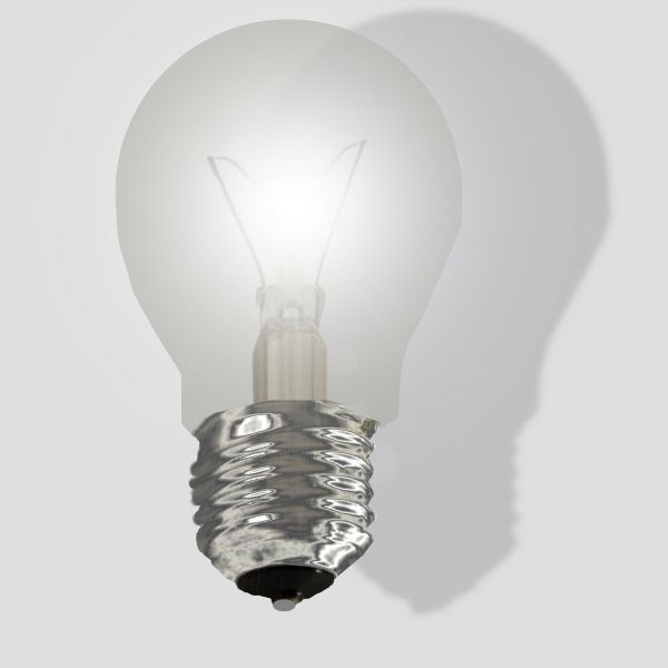
no extra sources used (5 years and 3687 days ago)
Shadow is a little bit sharp. Just a little bit of blur... 
Hey Thanks erikuri. I somehow forgot to add blur Hows this any better?
Howdie stranger!
If you want to rate this picture or participate in this contest, just:
LOGIN HERE or REGISTER FOR FREE
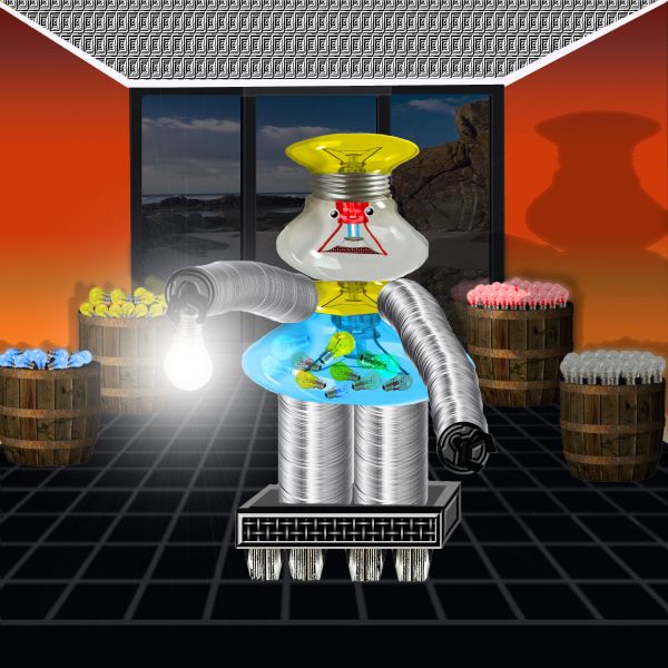
A Spec Thanks to mqtrf a member of pxleyes for use of his picture Valcobo Beach
There are no other sources used everything done or made by me. (5 years and 3691 days ago)
nice , i like the way you made the barrel and i think it will look better if you changed the wall color
Thanks sophia I changed the wall color this after noon.I think this may be better.What do you think?
yup its looking better now .. gl author
Thanks Nator How's that?
great work...good luck author
Good one after all the changes.....
Thanks to all for help
Howdie stranger!
If you want to rate this picture or participate in this contest, just:
LOGIN HERE or REGISTER FOR FREE
You're showing you're really good in design!
Creative. I personally feel all the black space in the middle is excessive and starts to work against the "lighten up your business" slogan. I find it curious that the green glow in the front is the only light without rays going towards the sky. The yellow and red foreground lights need their bottom edges cut back so that it doesn't look like the front rims of their pots are emitting light (all the light should be coming from inside the pots). On the other hand, the right edges of the yellow and purple lights need to be a bit wider so they come right up to the edge of the pot rim.
i edited it after ur suggestions, dan. Thanks alot, you help always ... and the green that doesn't have rays... well that's the cookie :P
some of the light over laps the edge of the pots. just thought I'd let you know. otherwise a great idea and an an equally great job of turning it into an image.
nice idea
gud work....... a different thought ........ GL ...............
very cool design - compared to your other colours, the white light looks a bit strong to me - I would have made it a tad more transparent. But hey, thats just my opinion
Nice idea for this unusual source image. GL
Howdie stranger!
If you want to rate this picture or participate in this contest, just:
LOGIN HERE or REGISTER FOR FREE