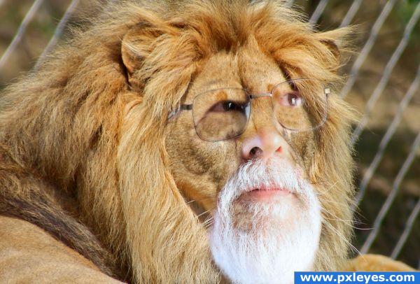
I used one external source of Lion
thanks to http://www.sxc.hu/photo/1141264
Author: GermanGirl
- Cloning, masking (5 years and 3819 days ago)
- 1: Lion

Only source (5 years and 3867 days ago)
Nicely put together. g/l
very cool job
this is great! Very nice step by...
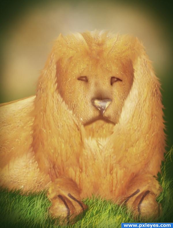
Good idea, but i think you need to add some depth here, before seeing your step by step guide i thought it was a cat's face on a rock. Good luck 
kinda weird 
Howdie stranger!
If you want to rate this picture or participate in this contest, just:
LOGIN HERE or REGISTER FOR FREE

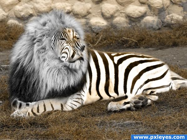
Made from a lion and a zebra.
Added some extra colors as well.
Edit: Impoved a bit (5 years and 3880 days ago)
Would he be tempted to eat himself? Haha! I like it. Your stripes are well placed, too. Please upload a high res (just click edit entry and check high resolution box) so I can judge it better.
Yes.. HIGH RES please.. he's so FLUFFY!!!
Done
Very nice but the hairs look a bit fake, maybe you can make it more real 
There's a halo around him....fix that too. good ideea.
o.o your zebon is giving light o.o;
Mane is too desaturated...
Great work! I love the stripes.  Suggestion: It looks like you used a brush for the mane coloring. As others stated, this makes it look desaturated. Also, it makes you lose color on the right side of the Zebon's face and cause loss of color due to the fuzzy edges around the mane.
So, as far as the loss of color, try using a layer mask with a combination of the smudge tool to make the edges of the mane less fuzzy and more confined to the hair. Then, to deal with the saturation issue, create a copy of the original mane, desaturate it, then put it on top of the brush layer, setting it to overlay or soft light. This will bring out the shadowing of the hair and give it more depth without losing the new, light color you have given it.
Good work and good luck, author!
Not bad. Musicj19 gives a good tip about the manes. I'd also remove the glow around the body with a mask and you may want to look again at the lion's nose. Good luck!
LOL, very funny!!!  ) It reminds me of that saying : "you are what you eat" LOL
great job but you should have kept the mane the same color.
Howdie stranger!
If you want to rate this picture or participate in this contest, just:
LOGIN HERE or REGISTER FOR FREE

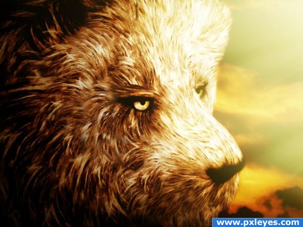
As the source image is not very clear, I focused on one portion of the chicken that looked bit better to me and selected it.
From that selection only I have created different shapes for my lion's hair. I used a lot of warping, resizing, flipping, rotating, masking in order to create diversity and blend them as good as possible.
I added sky backround, light beams, flattened image and added a lot of adjustment layers: gradients, brightness/contrast and two types of filters that I have never used before but which proved themselves to be very efficient for the overall effect I was looking for: under Artistic/ Sponge and Watercolor.
Hope you like it!
SBS on the way for more details! (5 years and 3925 days ago)
awesome image  looks a bit like a bear because lions have much shorter hair on their faces but that doesnt make a difference. i love the mood. very high marks good luck
great job!!
Wowee!! The mood on this is excellent, and the detail in the fur.. WOW! High res is a MUST SEE! Great work, super high marks from me!
some light on nose and eyes may work great
just WONDERFULLY done.. he is more bear then Lion. just because of the tones and the fluffy fluffiness. hehehe.. Even though it has heavy brown tones and is very dense.. because of the light work.. you could poke him with a pin and he'd blow up like a balloon. JUST AMAZING!!!
perfect
nice work
Looks more like a bear/dog than a lion, and the light side is a bit too dodged...
You just put together a new type of wild animal... Wonderful work... I agree with CMYK though that it's a bit to light on that one side... good luck.
Very clever use of the source & very nicely executed....but would have to agree the lighting could do with being toned down a bit
good work
good work
awesome 
Excellent idea.. nice work author ! good luck!!
growing up, yeah?  cooool!
nicely done..... good luck author
congrats!! 
Congrats! Well done!
Congratulations for 2nd
Congrats Nellista!
Congratulations!!!! 
Congraaaats 

Thank you very much guys....! I'm soooooooo thrilled!
congrats
Howdie stranger!
If you want to rate this picture or participate in this contest, just:
LOGIN HERE or REGISTER FOR FREE
Good blend, but you need to remove the part of his neck at lower right...
This made me laugh. I hope that was your intent.
WOW this is wondeerful
lol...now thats different
rofl gl
Thanks for your valuable comments. I will change the part of neck.
Perspective not quite right! Good luck
Howdie stranger!
If you want to rate this picture or participate in this contest, just:
LOGIN HERE or REGISTER FOR FREE