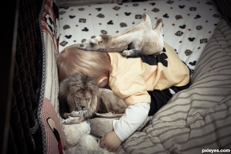
Add a description... (5 years and 2520 days ago)
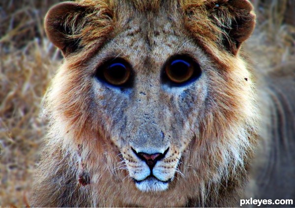
(5 years and 2757 days ago)
Howdie stranger!
If you want to rate this picture or participate in this contest, just:
LOGIN HERE or REGISTER FOR FREE
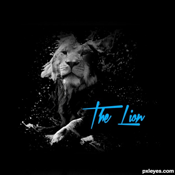
Lion Splash (5 years and 2839 days ago)
No high-res?
Howdie stranger!
If you want to rate this picture or participate in this contest, just:
LOGIN HERE or REGISTER FOR FREE
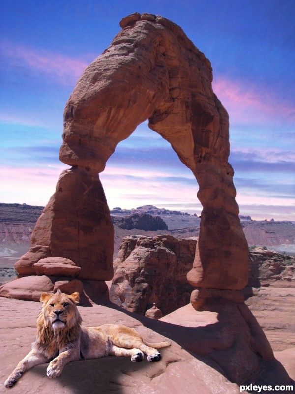
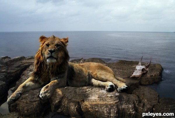
King of Arches. I took both the sunset picture and the arches picture then merged them with the lion! (5 years and 2842 days ago)
Now it's better. Note that because of the light font there shouldn't be light between the animal's front legs, and the shadow can also be darker, take for example the shadow on the background. Just my opinions. GL author
Howdie stranger!
If you want to rate this picture or participate in this contest, just:
LOGIN HERE or REGISTER FOR FREE
(5 years and 2843 days ago)
Howdie stranger!
If you want to rate this picture or participate in this contest, just:
LOGIN HERE or REGISTER FOR FREE
You might want to soften the edges of the camel to match the sharpness of the surrounding image.
 send me a PM so I can illustrate.
Also when adding shadows make the 'connection' of the two surfaces similar in darkness. i.e. the camel looks a bit like it's floating because the darkness of the shadow you made doesn't match the parts of the camel that are meant to be in contact.
The shadows are about right in strength, you just need to add that much darkness to the camel as well, or lighten it up where it's darker. If you don't understand what I mean (which wouldn't surprise me because sometimes I don't express myself very well
PS: Just want to help!
Hee-hee! Sweet!
Thanks!
Howdie stranger!
If you want to rate this picture or participate in this contest, just:
LOGIN HERE or REGISTER FOR FREE