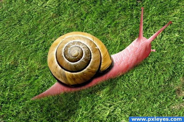
It's just some transforms :D (5 years and 3805 days ago)
- 1: Grass
- 2: Snail shell
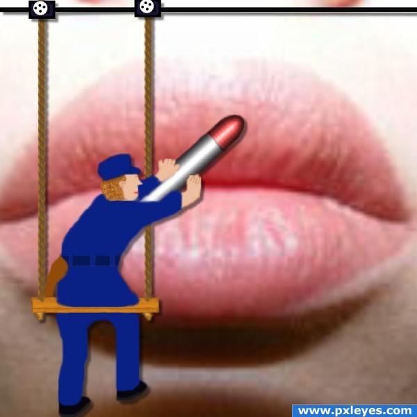
replace original (5 years and 3805 days ago)
Clever!
Howdie stranger!
If you want to rate this picture or participate in this contest, just:
LOGIN HERE or REGISTER FOR FREE
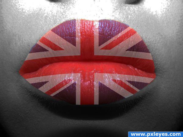
(5 years and 3809 days ago)
you have the same cut lines as the image above  I would try a few more modes on your flag layer and apply the same advice as I gave to the other image, too harsh of lines, and though the flag idea is cool, it looks too much of cut and paste w/ just lowered opacity to be visually appealing.
you could also try redefining your edge it would make it look smoother
this is a lot nicer now
God save the queen,nice idea...
Clever!
very patriotic
Howdie stranger!
If you want to rate this picture or participate in this contest, just:
LOGIN HERE or REGISTER FOR FREE
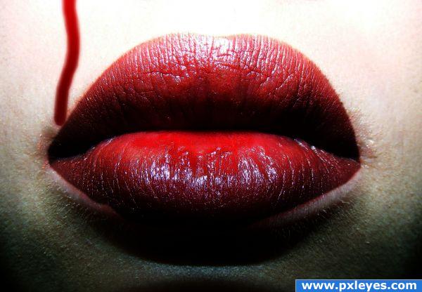
My first entry on here.
please take a look when the picture's shown as small.
I think it has a special touch then. (5 years and 3809 days ago)
Looks a bit simple to me, and the lower part is too dark, but i like what you did with the lips themselves, the look evry luscious. Good luck!
Updated my picture now. Thank you very much for those tips.
It's a better treatment than some, but in high res you can see the filter effects. The blood drip doesn't match visually here because of it.
Nicely Done!
Howdie stranger!
If you want to rate this picture or participate in this contest, just:
LOGIN HERE or REGISTER FOR FREE
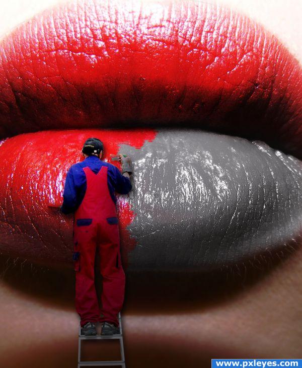
(5 years and 3810 days ago)
very clever! I love the look of this, good luck!
Good idea...try to fix white edges on painter...
EDIT: Looks great now, good luck! 

oh i like this, its like billboard one 
sharpen him a bit 
nicce job
Nice idea and result 
i like it 
good idea author, so far it is definately standing out in the group 
This is awesome! Very creative!
Very creative idea!Well done!
Excellent idea...it would be even better if you could somehow make the unpainted areas...not shiny or less so. 
Thank you very much to everyone for your very encouraging comments. Pixelkid, thank you for the suggestion, i tried decreasing the contrast of the unpainted side of the lips and i also used the burn tool on some of the highlights. I also tried using the Channel mixer to try and achieve the effect that i thought you were looking for, but in the end it really didn't look great. One area was just too washed out and didn't fit at all with the contrast of the rest of the image. Either way, thank you very much for the comment 
very good idea and good work.gl
Funny concept nicely done.
Absolutely Extraordinary!
SIMPLE YET VERY EFECTIVE, 
Really nice work, well executed. Good Luck!
Great idea...but with the ladder resting against the chin, the painter would be bending backwards to paint the lips. If the ladder was resting on the lips with a shad from the ladder that defined depth, it would be perfect. I like the high gloss lips that aren't yet painted. You've established a great neutral look in that area. Good Luck!
COOL BANANAS
Once again thank you all for your comments. Stowsk, i understand what you mean, but the reason that i didn't worry too much about that is because from the source, if you look at the shadow on the chin it becomes clear that the chin is protruding quite a bit, and seeing as how the chin can't be seen in the source, i thought that it could be the way it is.
Congrats 
Howdie stranger!
If you want to rate this picture or participate in this contest, just:
LOGIN HERE or REGISTER FOR FREE
Nice work . I think it would look better if you apply some blur to the snail edges (eeeeeeeeeeca!)...
nice
it looks like the snail lil bit "flying" author.... btw, good chop
great chop. love the use of souce
good idea
Howdie stranger!
If you want to rate this picture or participate in this contest, just:
LOGIN HERE or REGISTER FOR FREE