(5 years and 3616 days ago)
- 1: source1

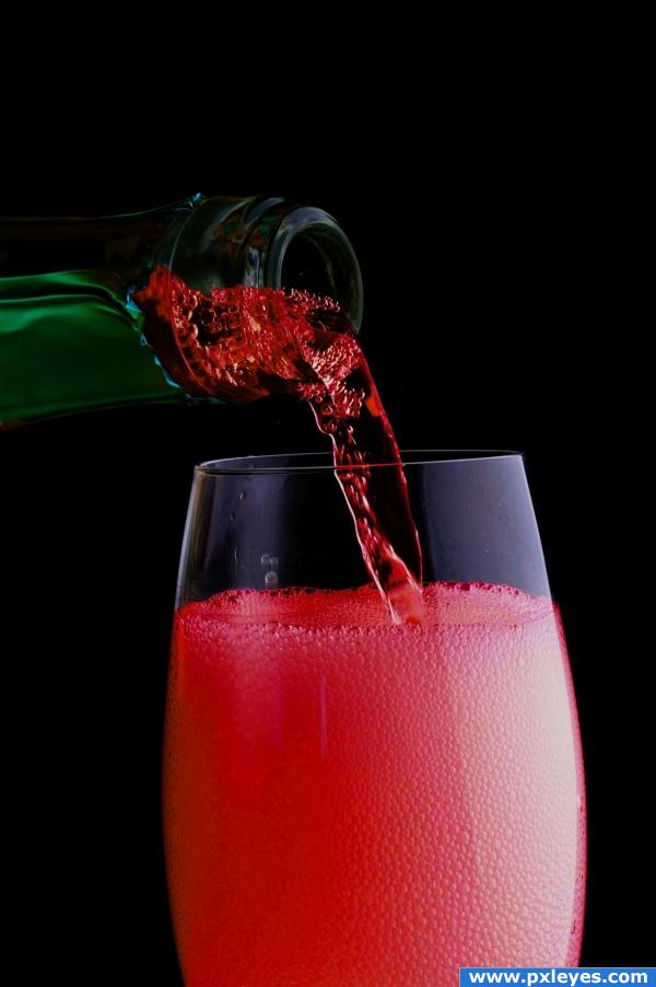
Used only the image provided. Did most of the color changes by useing different blending modes on different layers. (5 years and 3893 days ago)
pretty
cool image!
nice coloring
Could have been better...the upper part of the glass, the empty one, I like better. The transformation is relevant on that side of the pic.
Howdie stranger!
If you want to rate this picture or participate in this contest, just:
LOGIN HERE or REGISTER FOR FREE

See the step-by-step! :) (5 years and 3924 days ago)
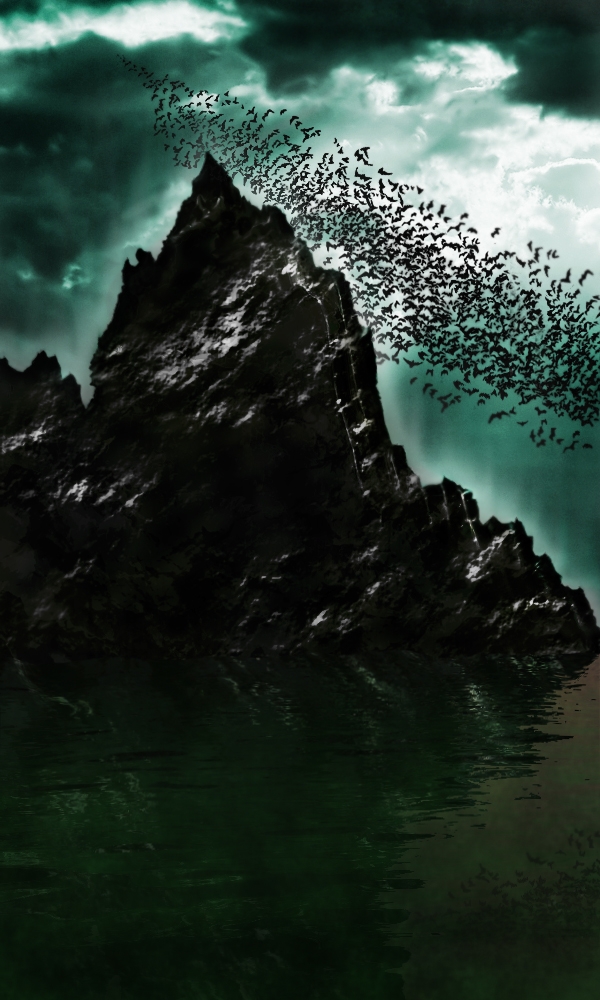
Very batty  ...nicely done indeed...good luck.
whoah cool
Great atmosphere nice work!
Thanks a lot CMYK46, Tuckinator & Warlock! 
very nice feel
gud work + imagination.......bt mountain's top area luks bit flat.....
cool
reminds me of the bats movie lol great mood
Thank you. How should i make the mountain look more realistic? (not flat) =)
really nice idea & job author ... GL
hey nice work
cool
Thanks to all of you! 
very nice balance of shape and form author.. the two merging triangles are a risk as they could easily throw you up and out of the picture but the complex base really retrieves you back into the focus of the whole composition.. quite nice.. even though it is very dark.. but that's just me and my eyes  (I'm a tad bit addicted to color
  IMHO
IMHO
take off, or reduce the outer glow on the mountain.. will make it look more realistic, and if your going to put a blur on any of the bats, put it on all of them. it actually doesnt look bad with a minor blur. maybe make a copy of a flattened layer (select the top layer and press command+option+shit+E, this will duplicate all your layers and flatten them into one) after that, do a bit of a diffuse glow (if that helps with the brightness) or add a medium gaussian blur, and set the blending mode to overlay, and bring down the opacity to around 20. this'll help give it a smooth, yet sharp effect.
great feeling! 
Excellent idea.. nice work author ! good luck!!
So unique and creative, realyl nice work!
WoW Thanks everybody. Thanks for all your fantastic comments! ^^
Congratulations for 1st
Congrats! Well done!
Omg.. I won? :O Thanks for everything guys  !
!
Congrats 
Congrats, well done 
Congrats...good job! 
Congrats!
Congrats for 1st 
Congratulations!!!!
Congratulations!!!! 
yesss, you deserve this first, very well work, congrats.
Thanks to all of you!!! 
Howdie stranger!
If you want to rate this picture or participate in this contest, just:
LOGIN HERE or REGISTER FOR FREE

(5 years and 3955 days ago)
what ever Missy said... she knows She Knows SHE KNOWS... it's almost like a divine right... (Golem Skeeeeedaddles before he gets throttled)
i dontk know if you should use the opacity on the part where the statue is melting on the stone..nice work anyway i like it
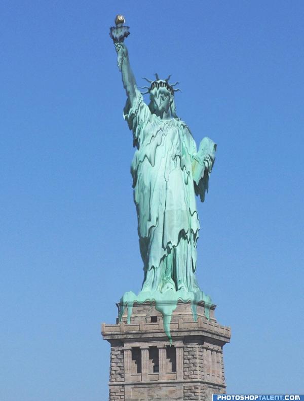
good idea, but her face loks too blurred as opposed to melted 
Good Luck 
Why do I feel this perfectly depicts what's happening in our country right now? OK - end of political commentary. : ) Author this is nicely done. I especially like the drips over the edge. Consider keeping the ledge edge straight, with melting over the edge. It seems you want the statue to melt but the base to remain solid. If that's true, then the very top of base should be straight, not melting. Good luck!
Pixel, you mean transparency...
freedom is anyway illusion... 
I do the same with OliviasArts:her face loks too blurred!
good work
Nice one! GL!
Pretty ok! I agree with OliviasArts about the head., In fact I wouldnt expect such heavy dripping there since there's less that can be dripping in the first place. Pixel also has a point. The transparrence can work, but what if some parts around the edge has more dripping so it would cover the base more so there would be less/none transparency? Maybe an idea. Good luck!
very nice melt!
Howdie stranger!
If you want to rate this picture or participate in this contest, just:
LOGIN HERE or REGISTER FOR FREE
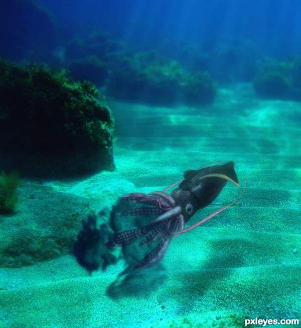
Great job author...Looks so realistic...good luck
Very neat work! It's incredible to imagine that your squid was born from a tree!...
That's pretty clever, author, nice work.
thanks...
I just tried everything I could
very good construction i thought it is real, before i see the sbs.... good luck to you...
awesome work ........... gud luck to u author ..........
awesome, different work ! Well done
Howdie stranger!
If you want to rate this picture or participate in this contest, just:
LOGIN HERE or REGISTER FOR FREE