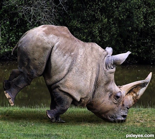
This is the problem with evolution sometimes. The big head can cause a terrible imbalance.
All done with just the source image. See SBS for details.
High Res uploaded to your convenience. (5 years and 3560 days ago)
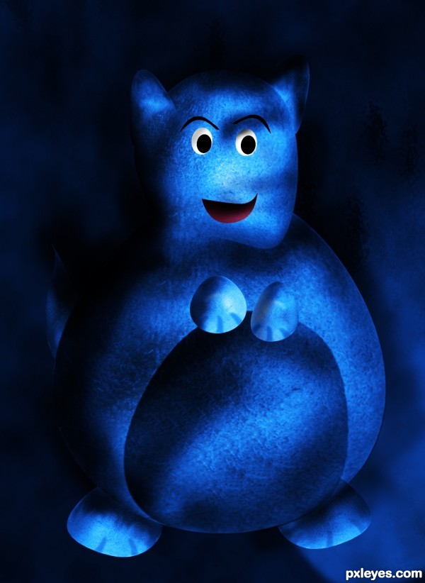
(5 years and 3566 days ago)
heheh
cute guy....
Howdie stranger!
If you want to rate this picture or participate in this contest, just:
LOGIN HERE or REGISTER FOR FREE
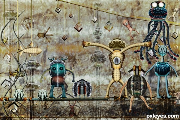
Used two images for this entry- the source and Meter Guard picture by Jawshoewhah. (5 years and 3570 days ago)
 your style is distinguishable. and so wonderful! i love the whimsy to this one!
hehehe.. like a tight rope on the jetsons!!! 
Awesome usage of the source, great entry and wonderfully imaginative!! GL
I like the steampunk mood of this work! 
Awesome and fabulous as always 
Lots of work here. Great 

Gnarly!! 

Thanks to all for the nice comments and support! 
congrats!
another congrats
And also congrats for your third place!
Yes! Congrats again! 
and congrats again! 
Howdie stranger!
If you want to rate this picture or participate in this contest, just:
LOGIN HERE or REGISTER FOR FREE
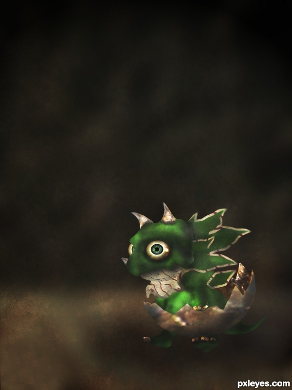
Got inspired by a creature i saw in a card game :) (5 years and 3579 days ago)
Uber Cute!
he's so widdle and KAYOOOOOT!!!
i would soften the edges around him just a little. But yes, definitely CUUUUUTE!
nice entry ........... 

Hey, I'd like it for pet... does it grow up too much? 
Cute little guy and good job of drawing. Egg shell could use some dimension on those cracked edges. GL to you - I'm seeing great progress in what you are doing!!!
Cool looking baby dragon
Good job!!
congratulations
Howdie stranger!
If you want to rate this picture or participate in this contest, just:
LOGIN HERE or REGISTER FOR FREE
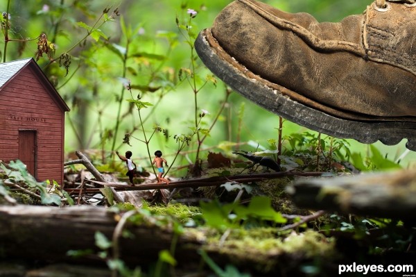
Basicly it was simple to make but the cutting out took a while..
All I did is every source in there has been cut out and blended in, I also added some levels to some of the images and some curves.
Thanks to lyom for source 5 - The Barn. Thanks to fazong for source 4 - the Boot. Thanks to shipaviu for source 2 - Boy2.
I hope that you like it! (5 years and 3583 days ago)
nice work -- only one small thing the leg of the diaper boy could use a touch up
Good thinking, and great masking. Be careful with lighting and light sources, try matching them all to the lighting of the barn.
Thanks for the feedback 
My comment would be the same as above, double check the original light source, soft and diffused. Thats how all the other components need to be lit, soft shadows and soft highlights.
Thanks for the advice.. I made the barn lighter
Nice work all around. I see some leftover debris from a mask in the middle of the safe house. Other than that good job. Good luck!
Gulliver? 
very nice i like the idea
clever idea and a nice entry .............. all the best .......... 
funny and good... 
Howdie stranger!
If you want to rate this picture or participate in this contest, just:
LOGIN HERE or REGISTER FOR FREE
to get rid of those extra sources author.. just go to my stuff and just reupload.. that will get rid of the extra sources..

GREAT JOB (reminds me of the that bird that falls over on it's prey because it's heads so big
Thanks DL.
Great work! Really nice idea.. very clever thinking, author! I feel like the shadow should be a bit longer and a maybe blurred a little more, but this looks great as it is.
Excellent! Thanks for the grins!
Poor guy... I hope its intelligence is as big as its head!...

Very funny and creative idea!
First class image....great work author!
Looks good to me, I wonder if it would look better with his back legs pointing straight down - but that is only a minor thing.
ya it's good to see
Made an adjustment to the shadow as per Ponti's suggestion.
Perfect. Well done author
nice thinking! good luck!
Congrats Rob!
Congrats Rob!!!!
Congratulations!
Congratulations for 2nd
Congrats for 2nd
congrats
great entry, congrats
Howdie stranger!
If you want to rate this picture or participate in this contest, just:
LOGIN HERE or REGISTER FOR FREE