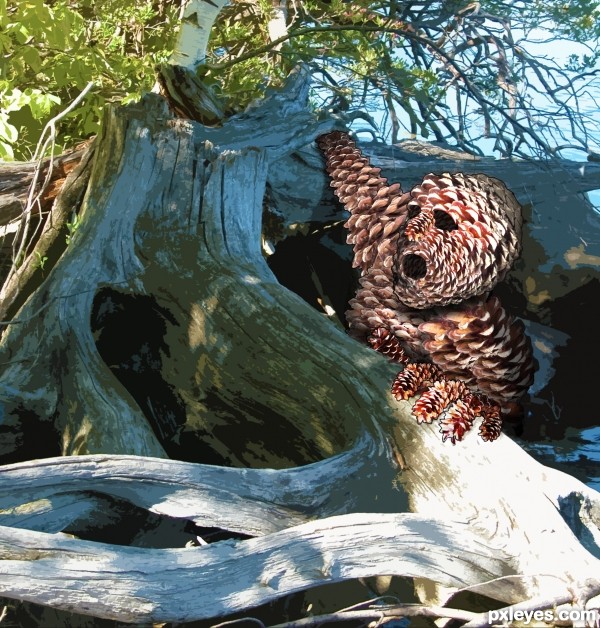
took apart each pine cone and built a scary dude out of the pieces. the background is an old vacation photo I had. (5 years and 3609 days ago)

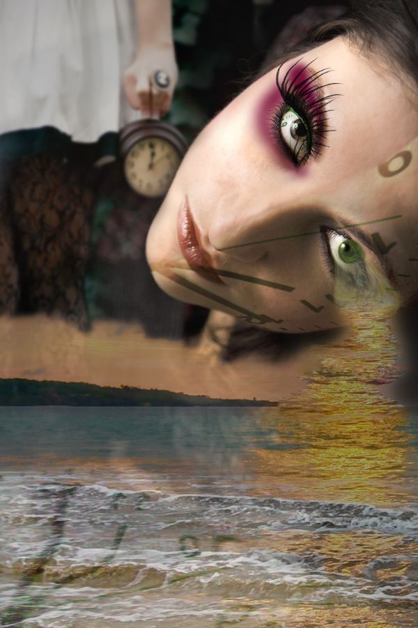
This image represents the different times in our lives - somtimes happy, sometimes dark, and like the ocean, it ebbs and flows... (5 years and 3696 days ago)
Nice take on the theme. GL!
great work...good luck author
this gives meaning to the song 'cry me a river' 
thanks for the comments, thought I'd try something different - for me. suggestions welcome, too. 
NOW THIS ...... I LIKE !! fab well done
Beautiful!
Nice composition......Beautiful work.....Best of luck to you!!
Congrats!! 
beautiful eye!
Howdie stranger!
If you want to rate this picture or participate in this contest, just:
LOGIN HERE or REGISTER FOR FREE

Noob at work. (very first entry)
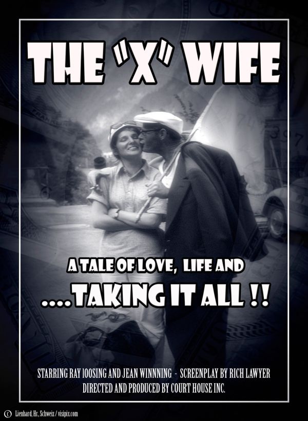
I started with colour images, desaturated, layered, blended, used black and white filter and hit undo so often I am not sure what i did in the end.
Had trouble interpreting the required concept so came up with my own. (5 years and 3701 days ago)
very nice...i like cast crew so much...lol...good luck author
Funny stuff! Now I'm watching a soap opera (here in Brazil) where he is Winning and she is Losing... For a while! 
Good job 
Howdie stranger!
If you want to rate this picture or participate in this contest, just:
LOGIN HERE or REGISTER FOR FREE

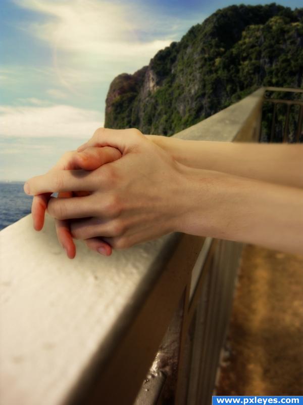
I didn;t upload a step by step guide because i think it was a pretty simple manipulation, really just pen tool and paste :)
The author of the hands will be notified, i'll upload a screenshot of the deviant art note as soon as possible. (5 years and 3913 days ago)
nice image!
Great! maybe a bit of burning/ shadow under the hands?
Edit: looks good now! 

Oh dear, thanks, there is a shadow under there but i just softened it a bit too much, thanks!
very nice visual.. good luck
The black stroke around the grades at the right part doesn't look good, maybe try to use a gray color to match more the metal.
The hand's shadows on the metal are not looking good, try to make it more realistic. Great idea overall, love it 
Thank you! I think you're right actually, i just imagined thet since the light was coming in from the left there would be a certain amount of shading, thanks!!
It's a good idea, but the extension of the arms doesn't work. The edges go abruptly from sharp to blurry, and there's no hair on the extended parts.
great
good idea! i liked
Thanks!
shadows need work, the arms are way too blurry, where the railing falls into the background is too dark
I added a soft glow effect when the image was done by taking a version of the image and blurring it by about 7 pixels, then changing the belnd mode to soft light, if you're referring to the blur of the arm itself, i was trying to show where the camera was focussing when the picture of the actual source was taken. Thanks for the comment.
very nice!!
Thanks 
realistic!!!
wonderful idea, I love it. The arm part is a bit blury on the edges, other than that wonderful creation good luck to you.
it looks great.
this image has an interesting feel about it. love the fact you have taken on board the feed back to improve your entry. WELL DONE authorl.
hope he or she doesn't jump
Thank you to everyone 
I like this one... but the shadowing just aint doing it for me though... but good work 
Howdie stranger!
If you want to rate this picture or participate in this contest, just:
LOGIN HERE or REGISTER FOR FREE
You need to show your "old vacation photograph" in your Step By Step
woo hoo... me likey!!!
Oh my GOD!!!! GL... and be careful...
uploaded some steps... cheers!
hhhhmmm.. Interesting GL
GL
I really like how you did the inside of the eyes and mouth, but I'm not sure about the stroke around the outside. Good luck!
Fantastic job author...maybe would be a bit scary if u used night scene...good luck
cool
Congrats for your third place, Krystian!
Congratulations for 3rd
Congrats!
Congrats!!!!
congrats on third place...
Howdie stranger!
If you want to rate this picture or participate in this contest, just:
LOGIN HERE or REGISTER FOR FREE