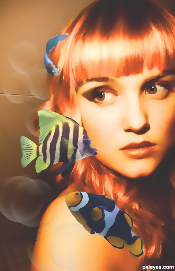
thanks to tigeress66-stock,thadz (5 years and 2890 days ago)
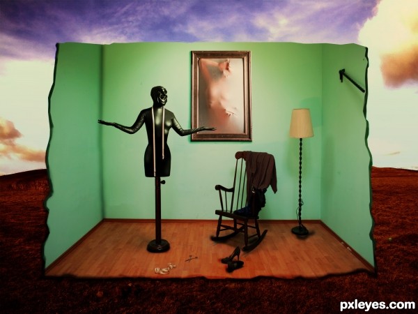
(5 years and 2928 days ago)
Striking and perhaps a bit disturbing, so it's certainly surrealistic to me. The intense
yellow lamp light on the wall seems jarringly fake, however
You are right . Thanks for comment.
Pretty magritte-esque, very surreal. Maybe a bit too much contrast for my taste, but that's personal. If you'd put the mannequin (or what is it?) a bit more to the left, there mgight be even more balance in the whole image. Good luck!
Yes its a mannequin a living one lol, i gonna try to improve it but that creppy room is too small . thanks for the coment
Howdie stranger!
If you want to rate this picture or participate in this contest, just:
LOGIN HERE or REGISTER FOR FREE
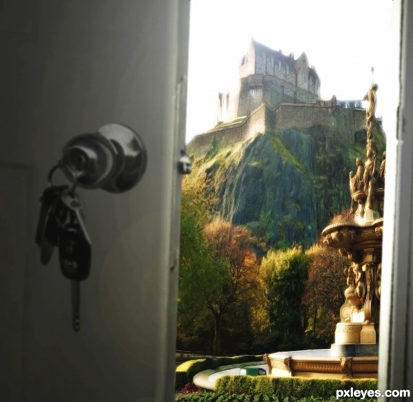
Although the decor is an improvement. (5 years and 2992 days ago)
Great thinking and good use of the source. 
Edit: Reminds me of the great Talking Heads song, Once in a lifetime:
"And you may tell yourself, "This is not my beautiful house"
And you may tell yourself, "This is not my beautiful wife"
Letting the days go by, let the water hold me down
Letting the days go by, water flowing underground
Into the blue again, after the money's gone
Once in a lifetime, water flowing underground
Same as it ever was, same as it ever was, same as it ever was
Same as it ever was, same as it ever was, same as it ever was
Same as it ever was, same as it ever was."
Oh you devil, you've gotten that song stuck in my head now! 
Howdie stranger!
If you want to rate this picture or participate in this contest, just:
LOGIN HERE or REGISTER FOR FREE
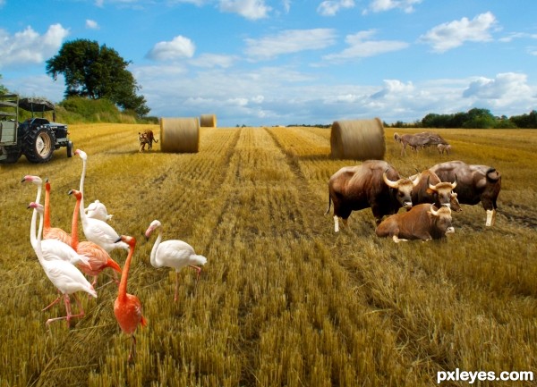
(5 years and 3094 days ago)
oh nice the field really came alive with all those animals, I think the bisons or whatever they aretoo small compared with the animals behind it and the birds in front. try add the shadows maybe a litle darker below the bisons as well  . good luck author
Sorry, flamingos don't graze in hay fields.
flamingos just runaway from hay.......
too crowded
@ Author, flamingo seem to be running indeed  good blending and good luck
An active field.luv it. 
Howdie stranger!
If you want to rate this picture or participate in this contest, just:
LOGIN HERE or REGISTER FOR FREE
only source image is used
see sbs for detail (5 years and 3125 days ago)
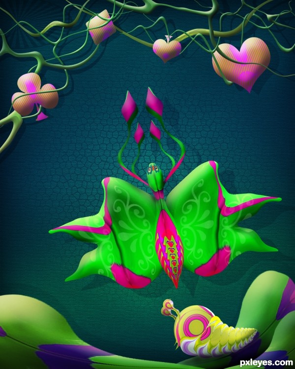
very surreal and love the bright colors.. GOOD LUCK!!!
thanks drivenslush...
Love the choice of colors...Cool!
great sbs nice work...
beautiful author
Great colors!!!!! GL.
beautiful work..
thanks Bernie, Passionboy, Mehul, George and Neo.....
Very nice design, good execution!
thanks Carol...
Nice Congrats
Congrats! 
Howdie stranger!
If you want to rate this picture or participate in this contest, just:
LOGIN HERE or REGISTER FOR FREE
The fish are not very noticable on the grey hair. Im also not sure if the grey hair is meant to be a sharp cut or if all hair was meant to be grey?
i thought it looked nice when i stumbled on it no i wanted highlights but i am new at this and didnt know how
That is 100% better author, as for email, we are all here to learn but at same time this is a contest site goodluck with your works
like the idea.
Masking of the fish needs some work as there are bit and pieces of the background showing (I assume you are not using the eraser to to cut out the fish) And the makeup around the eyes look a bit stuck on. Try a different blending mode for the layer with the makeup and maybe a bit more work could go into drawing the layer a well as they do not really match
nice job on the improvements -- looks very nice --good luck
if you take your smudge tool, drop the strength to 30 and have a soft edge brush...it would blend the blue makeup nicely. I like the cahanges you have made, much softer.
Every time I come back she gets better and better
Very intriguing in its flatness and its juxtaposition of the terrestrial with the aquatic, but I don't think this meets the theme requirement that fish be the focal point. Moving the middle fish to the right over her face more and amping up the saturation of all three fish might shift her to the background (which shift could be accentuated by blurring her some). A young woman looking into her aquarium would seem to fit your title.
I like it very much!! there is a nice contrast between the model (with orange tones) and the fish (with cold tones), nice artwork!
It would be cool to put your changes you have made since submitting in your sbs so we can see your wonderful progress.
liked it more when the hairs were blue. But still beautyfull
Howdie stranger!
If you want to rate this picture or participate in this contest, just:
LOGIN HERE or REGISTER FOR FREE