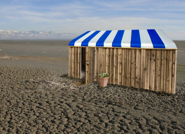
A nice house in the middle of nowhere. (5 years and 3673 days ago)
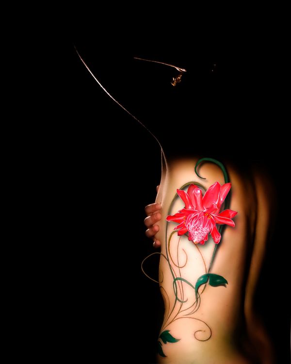
Thankx to Cmd-p.com & Sailormary for the very nice stock :-) (5 years and 3706 days ago)
I think it is simply beautiful 
Thx loopyluv 
nice...so sexy there.. 
Very elegant and sensual, lovely.
Beautiful.......Lovely....
Howdie stranger!
If you want to rate this picture or participate in this contest, just:
LOGIN HERE or REGISTER FOR FREE
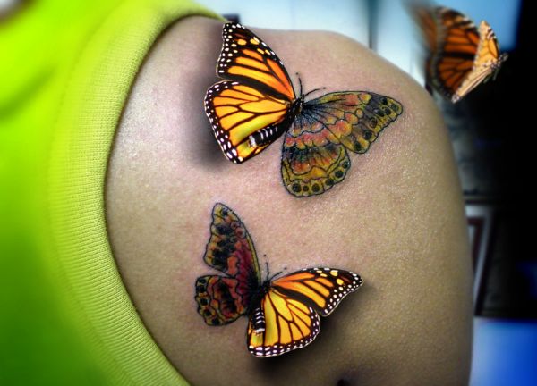
(5 years and 3710 days ago)
Good work 
very realistic! 
The wing shadows are a bit too dark, also you could check out the vanishing point for the shadows with your light source. A bit too much blur with the flying one, maybe?
Very nice work 
Good idea and work both....
would have been even better if the butterflies actually matched the tattoo... but a good effort none the less!
Re-think the upper shadow...it's opposite the one at bottom...otherwise nice work.
Howdie stranger!
If you want to rate this picture or participate in this contest, just:
LOGIN HERE or REGISTER FOR FREE
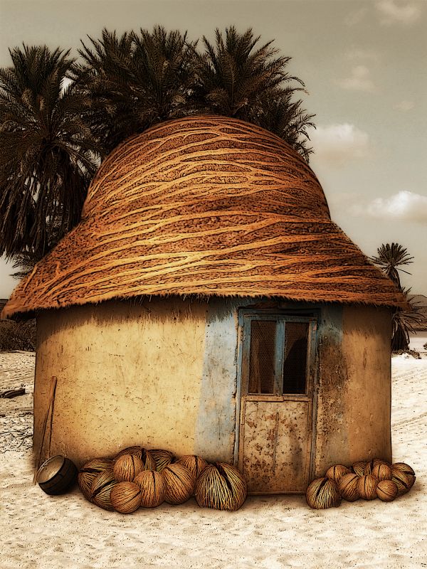
Credit hut picture: Eva Heinsbroek http://www.sxc.hu/profile/e-Eva-a (5 years and 3725 days ago)
Super! 
Very nice entry, however the shadows under the coconuts seem way too dark..the roof is amazing though! Good luck 
Thank you ponti! Fixed I... I think 
verry nice
now those are some big coconuts!
nice blend.
Thanks for your comments people! 
Great job and idea! I really like the new shape of the hut. Looks almost like a hat/helmet. And the coconuts in front of the hut are a very nice addition too. And I even like the filter, even though I'm normally not a huge fan of filters, but it just fits very good. Good luck!
Thank you Lelaina! I don't fall back on filtres much too, and I think they should be used with care. Here I could stop in step 11, but after having tried the two filtres at the top I liked the look of an old painted drawing 
I like this, its the nut hut!
That image looks nice...good imagination and, good use of source. Good luck author.
Good job 
Fantastic work....roof is great,coconuts near doors too...good luck author
Sweet little house 
good thought
gimme get a house like this haha. definitely good stuff.
Thank you people! Joqertrumbsall, I'm not sure whether you would want a house like that if you took a look at the original source and its surroundings  Thank you!
Great! GL
Howdie stranger!
If you want to rate this picture or participate in this contest, just:
LOGIN HERE or REGISTER FOR FREE
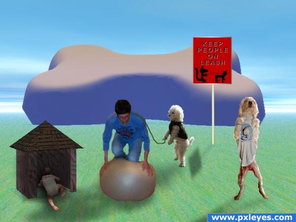
The contest says "Pick an animal type and show how a city or village of these animals living together would look like based on the habits and techniques we humans have." I have put dogs living together and they are using the habits and techniques we humans have.
This is not good, even though it took me a long time for some reason, but I had to get my idea out there ;) (5 years and 3868 days ago)
hehehehehe.. I've had those days.. Now put the meds in the cabinet and back away from the screen.. this has a wonderfully screwed up un matching feel that just doesn't let your eyes go... good luck.. it's just lovely goofiness.. and sometimes in life that is just necessary
GolemAura has a way with words, doesn't he? Good luck. I see you did your best. Glad you got it out there.
lol that's okay downoffthedragon, I would probably say the same thing to myself. lol I have no idea how this disaster happened!
maybe an existing streetscene could have improved your work and get the message better out there o.o; i dunno love the idea tho 
Eladine, I don't think anything could help this mess. lol 
Howdie stranger!
If you want to rate this picture or participate in this contest, just:
LOGIN HERE or REGISTER FOR FREE
very nice use of source.. good luck author
For desert, it's very cosy! Nice... I'd like to have one like this - but in another place, like a wonderful beach, for example...
nicely done
The blending looks wrong. Or, It's not absolutely perfect.. work with that.. and eventually make the texture a bit distorted to make a desert feeling.. :> GL!
If you take the desaturation tool and touch up a bit of the blue I think it would sit back more into the background. This was integrated well though!
More like storage in the dessert. Why no windows????
Howdie stranger!
If you want to rate this picture or participate in this contest, just:
LOGIN HERE or REGISTER FOR FREE