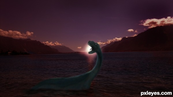
Inspired by the Loch Ness' very own Nessi. (5 years and 3165 days ago)
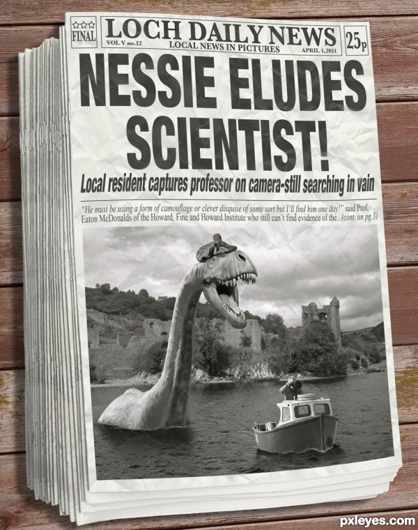
A little fun with a well known legend. Although I created the "photo" in color I went with a B&W newspaper in the end. (5 years and 3391 days ago)
This is funny and very well done. I like the newspaper approach.
so clever.. lol .. best wishes.. 
Love it...the hat is a great touch! 
Fantastic image author...perfect humor and great hit in contest target...all elements are handled very well...as Bob sad hat is perfect touch....also work with the newspapers is top notch...well done and fav from me
excellent work and so funny, love the hat 
Ouch; ya hit me funny bone 
Well done, GL author!
Great job... wonderful.,
lots of fun 
Super work.
excellent job
Great job, really funny, especially the fine print = )
Love the reference to camo, nicely done, author. 
Congrts, well earned!
Congrats Space  this really is brilliant
Way to Go! Spaceranger!! Well done!
congrats space buddy! 
Thanks to all for the kind comments and congrats! Always greatly appreciated!
Congrats Spaceranger. You did a good job....as usual.
Howdie stranger!
If you want to rate this picture or participate in this contest, just:
LOGIN HERE or REGISTER FOR FREE
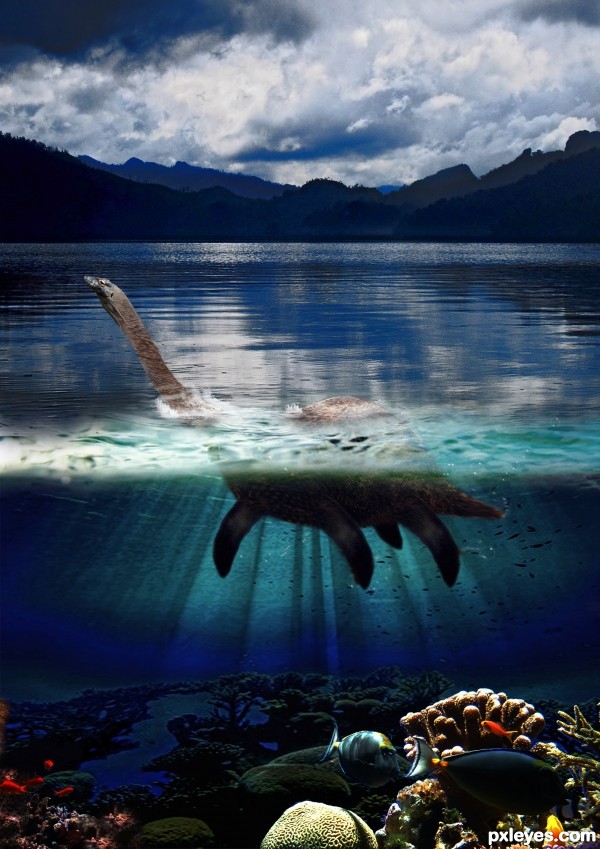
i have make this entry for water creatures contest but my pc crash so im late
sourse for pinguin http://www.flickr.com/photos/joachim_s_mueller/420862080/ (5 years and 3518 days ago)
The transition is well made, and your underwater area looks good, but at the moment the loch ness monster looks more like a cow's udders.
I suggest studying the fins of different animals and trying to replicate them a little more realistically with shading and depth.
I'd also remove the bubble overlay on the underwater part, the water would look better without it. Good luck.
Neck is flat. Add highlights & shading.
A longer tail would reduce the udder feel -- and substantially longer would be Nessier IMO (but maybe I'm just thinking brontosaurus).
Love the look of this! I agree that the tail should be longer, but since it is too late to fix anything, I'll just focus on the final image, and I like it 
very cool work author...gl
Howdie stranger!
If you want to rate this picture or participate in this contest, just:
LOGIN HERE or REGISTER FOR FREE
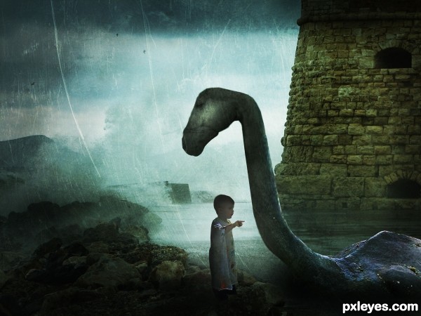
Credits to ~ttwm-stock , valpictures , Jaimie Duplass , Archin Camille and =night-fate-stock.
Im not very satisfied with it, so suggestions are welcomed.
Updated. Thanks everyone. (5 years and 3523 days ago)
It's too dark. Mood lighting is one thing, but when it's like a bad case of glaucoma, you need to lighten the image. It's almost impossible to see your figures, they basically look like shadows.
EDIT: Much better. Your focal point is easier to appreciate now. Good work.
I brightened the image. Thank you.
Very nice mood author, and great imagination...good luck
I would suggest working a little more on the detail around the head, at the moment it looks very two dimensional, and it doesn't fit with the rest of the image. I also notice (even in low-res) that there is a section of very overstretched pixels around the neck, try to avoid that by duplication and cloning.
Good luck.
nice mood,but Its not new.stick with your own style.That's your real talent
textures are always fun! and i like your overlaying texture here (familiar, i think i've used that quite a few times!  )...one thing, i might suggest using a soft edge eraser set at a 15 or 25 % opacity and erase a little more around your main focus of your piece...so that the texture doesn't detract from the focus. also, might make the boy a bit more visable, right now he's getting lost in the business.
i agree with ponti on the pixels on the neck...and on the bit of the head looking "flat" ... could us a bit of work.
 all in all, i say good luck to you!
Wonderful!! Love the mystical style!
Thanks a lot for all your suggestions. I'll work on that 
Nice job overall, some very good points made above. The only thing that concerns me about the composition is that the little child is right under the monsters head, yet seems to be looking off into the distance rather than up at its face.
Work Updated. Thanks everyone 
Did you try to place the kid a bit to the left and rotate his head so that he looks at the monster's head and not like ignoring him? I know it's not easy but it would have a great effect.
Lol I`m partial to a loch ness image myself  .... Great image author & very best of luck!
Nice.
cute idea.... colors work well here.... little dark...but nice....gl author
I really llike that you did something different. That's the only way to grow. I agree about having the child looking up, but congrats on a good entry! GL
Howdie stranger!
If you want to rate this picture or participate in this contest, just:
LOGIN HERE or REGISTER FOR FREE
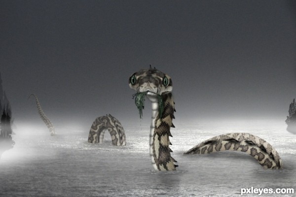
Thanks to bunlee at SXC.hu for the background. Everything else is the source and PS. Thanks for looking. (5 years and 3646 days ago)
very cool work author...best of luck
fantastic work...
i loved the eyes....
this is awesome.
It looks cute and nice... Very neat entry, author, GL! 
Great expression! Maybe you could add a nice dark sky for the overall image.
Have to admit.. the face is extremely sweet
Superb idea and some very nice work!
I like it, shame the head skin couldn`t have been a little sharper, but the slight blur does make the excellent eyes stand out, well done
Very nice work. Great face expression 

fantastic idea for this, and tho snakes usually creep me out, this one does have a sweet expression! I like the prominent green in the eyes and seaweed that you left. nice work, author.

nice 
Congrats great image!
Congrats for 1st
Congrats for the 1st
Awesome work, congrats 
Congratulations! Great entry!
Congrats for the 1st. place! It's shining in my favs gallery!
Congrats! for your winning
Howdie stranger!
If you want to rate this picture or participate in this contest, just:
LOGIN HERE or REGISTER FOR FREE
need to fix the masking problem at the base of the neck.. wonderful colors and lots of fun.. good luck
WHOOP.. I think you caught it yourself.. MUCH BETTER
You've got the sun rising in front of the mountains...
@Drivenslush: Already did that. I realized someone would've realized so already did that. You have one heck of a sharp eye mate. Thanks.

LOL CMYK46! How did I miss that. Gotta see to it ASAP. Thanks.
EDIT: Did that ASAP
I wish the source had been a little bit more recognisable.. your work is nice tho
@Eladine, Thank you. Actually that Curly S only gave me this idea.
Yes, it was a hard source to use.
Howdie stranger!
If you want to rate this picture or participate in this contest, just:
LOGIN HERE or REGISTER FOR FREE