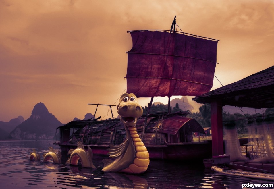
Lock Ness monster found in China. (5 years and 2431 days ago)

(5 years and 2758 days ago)
This is very well done - the blurs, the shadows. Good luck!
Howdie stranger!
If you want to rate this picture or participate in this contest, just:
LOGIN HERE or REGISTER FOR FREE

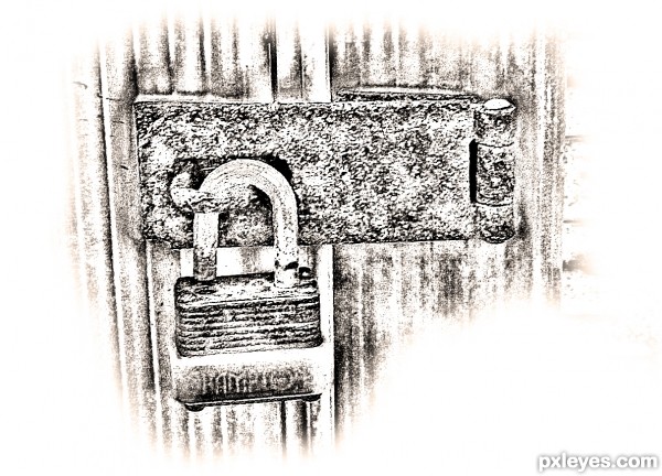
black and white
contrast
desaturate
more contrast
out erase (5 years and 3156 days ago)
looks like a sketch .
Love that you focused on the lock and gave the rest a soft edge. 
Howdie stranger!
If you want to rate this picture or participate in this contest, just:
LOGIN HERE or REGISTER FOR FREE

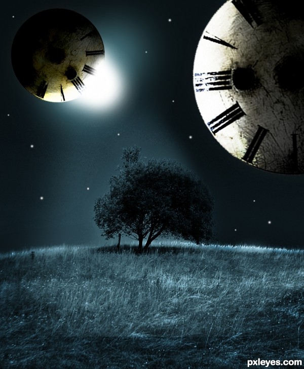
i used distort>Spherize in the filters menu to create the Clock Planet :) (5 years and 3374 days ago)
Make the moons round.
Man, this can look good and has some nice potential, for eg. I like the composition(meaning how you placed the objects) & the light cast on the ground, pretty neat.
But i don't get:
- why each moon has a diff light source;
- why did you download cosmos package, and then used only 1 moon 3 times; you know you can get moons with marque tool + desert ground + spherize & some color/lvl adjusments.
- why didn't you erase that small vertical pole under the tree - it came with the source but it's an useless distraction
And yeah CMYK's right: next time hold shift when transform so they won't distort.
It's a pretty concept but the technical flaws drag it down -so improve it if you can.
very nice lighting and cool image...gl author
Better version...GL author.
thx 
I LOVE this! I'm a huge fan of this processing! 
Howdie stranger!
If you want to rate this picture or participate in this contest, just:
LOGIN HERE or REGISTER FOR FREE

qtvr panorama view... (5 years and 3423 days ago)
nice... i never about this... hmmm... good job!
cool integration author...best of luck
Howdie stranger!
If you want to rate this picture or participate in this contest, just:
LOGIN HERE or REGISTER FOR FREE
Nice job. I like the coloring.
Fantastic work,I like the color scheme and the overall theme is well thought out.. I like the reflections of the Dragon body in the lake of water.
Sad there is no SBS and hi-res...but also without it is really well done!
Congrats!
Congrats!
Howdie stranger!
If you want to rate this picture or participate in this contest, just:
LOGIN HERE or REGISTER FOR FREE