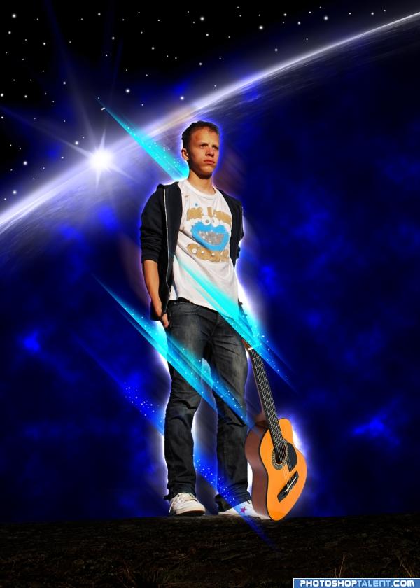
Thanks To vierdrie for the guitar image.
Thanks To barunpatro for the backgound horizon image.
(5 years and 3953 days ago)

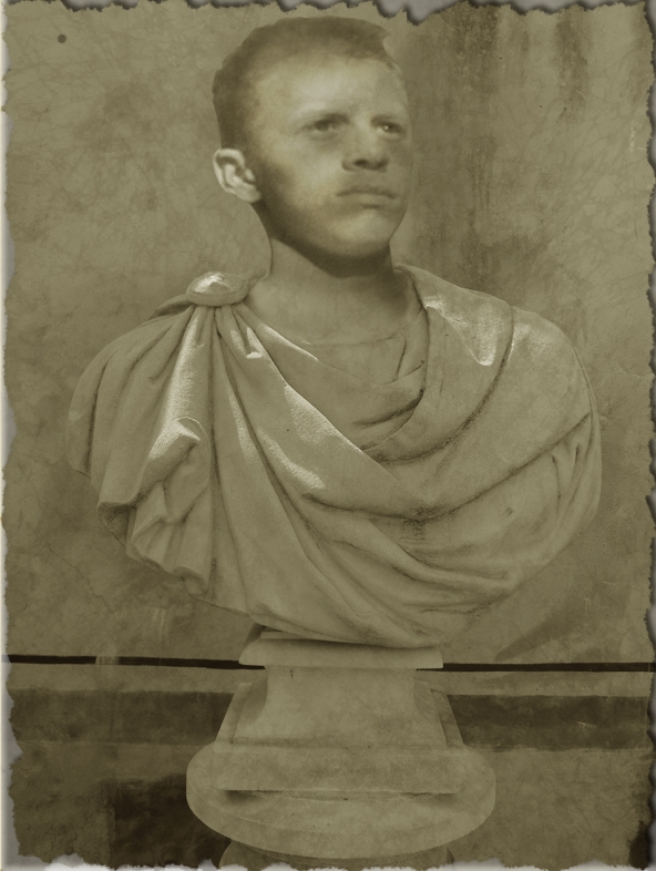
the statue is my own image and i'll post it in my stock once the contest has finished :) (5 years and 3954 days ago)
I may sound childish: First comment on the first entry !
LOL p3!!! Great idea author! Best one so far! LOL!
the neck looks just a little small where it joins the statue, very nice idea and good luck =)
Edit: much better and looks perfect, the best first entry ever =p
I agree with tapiona.. the neck area needs a little work.. try transforming the head a little bit large and use warp to set it around the neck area.. but don't overdo it.. good luck..
Good idea!
Head looks a little flat.nice idea though.GL
Definitly an original idea! I think you should burn some light parts, to look more realistic.
Congrats for the first new entry of our new beloved home. (oh and I like it too!)
Congrats for first entry 
i think the ear has too much light on it....gl
the neck area needs a bit more of blending with the body. The ear looks realistic while face looks like a pencil sketch.Try giving outer shadow to the face. Also dupicating the layer and giving an overlay style may give u some highlights on the face . gl
Cant...resist....must...post...in...first...PostPST...entry...ever...Done! And yes, also agree with Tapiona: maybe if the head&neck are a bit bigger plus you wrap the cloth a bit closer around the neck (perhaps with liquify you can push it a bit more to the right), it would all fit better. Good luck!
Love the concept... good luck 
Thanks folks for your comments ... i've listened you you and give lodd a fat head  i mean bigger head
add some contrast on the face, and if you can, make the edges sharper... see that the bottom part edges are very sharpy compared with the ones on the face
Cool very nice work Good luck!
His face expression fits perfect for something like this  Good luck!
Make the hairs more white.
very good idea! good luck!
 AWESOME! the head needs some sharper highlights to match the rest tho. and the ear is a bit to light.
Nice.
I liked this idea before and I still do...maybe needs some subtle darker areas on the head to blend (eyes, nostrils, under ear)...gl!.
it looks better than before.. u can still work on the hair region. It still looks like a pencil sketch. Give it some shadows and highlights. gl 
Maybe overlay a sandstone texture to match the rest of the bust?? GL.
Congrats of first entry 
Good job, its well 
nice one
Great idea, needs a bit more work to make him look like stone thou...GL
good job and good luck
nice work author  goodluck.
You lost the highlights on the head from your outside source pic...what were you thinking? You've had lots of time to amend this into maximum coolness...
Congratulations, celebrations, well done  Keep up the good work
congrats Reap!!!!!!! 
Howdie stranger!
If you want to rate this picture or participate in this contest, just:
LOGIN HERE or REGISTER FOR FREE
the guitar at the bottom should be behind his foot, nice idea, good luck and welcome back =)
LOL
Nice idea! Great effects too.
we miss Lodd please blend more the guitar and Good luck!
I like the planet behind him. Good luck
yeaah lodd is superstar.
You may consider the size of the guitar, otherwise it look pretty great!
Well done.
Haha, reminds me of the clip Can you Feel It from the Jacksone Five . Tapiona has a good point about the guitar, unless you may want to give it an even more mystical feeling and just let the guitar floating in front of Lodd. The guitar size is ok, just add "My First Guitar" on it
  (kiiiiddding, Lodd
  ). Btw maaaybe you can try to put a gradient in the right lower corner for the planet, so it gets more depth (for example very dark in the corner and then fade to 0%, with blending overlay or experiment with it). Good luck!
the perspective on guitar is a bit ackward. I agree with tapiona.
I agree with the above comments. I'd also take out the blue flashes - they're kinda weird!
This really does remind me of a tutorial I have seen.. GL..
He needs a space suit
The next American Idol, lol!!!
good job and good luck
almost famous yes?
very nice, I like it
Howdie stranger!
If you want to rate this picture or participate in this contest, just:
LOGIN HERE or REGISTER FOR FREE