
The logo was made using the source
SBS will be added soon
Any feedbacks are welcome (5 years and 3585 days ago)
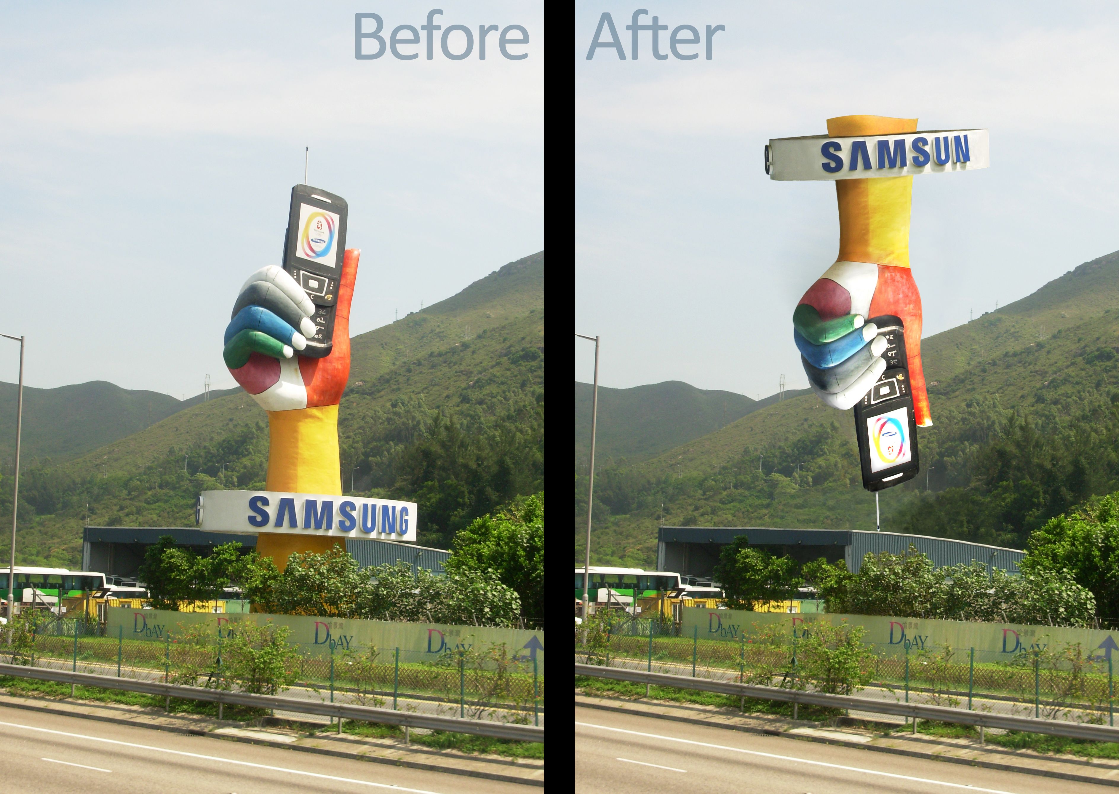
This is the photo of a factory of Samsung in Hong Kong. I tool this photo because of the interesting logo they made.
I reversed the direction of this symbol, but I decided to keep the orientation of "Samsung" to make this image more meaningful. (5 years and 3746 days ago)
You thought about the image well.. the only problem i think would be with copyright issues, perhaps just change one letter or change it to Sumsang.. good luck!
this is really great!!! and right on theme.. though I think you should make the dark part of the arm at the top the same color as the rest of the arm (it would have the same sun exposure... or remove it completely and let the sign be the topper.. not sure of the copyright thing ponti mentioned but it's better to be safe then sorry 
once again.. RIGHT ON THEME and quite funny
EDIT: MUCH BETTER!!!.. this is a very hard contest and you did a great job.. (using highlight dodge and burn is very tricky... I think this is wonderful work)
(YOU CAN EDIT your picture all you want and change it as often as you want until the close of the contest... I've seen peeps fix and edit entry tons of times each time they get a new suggestion... it's part of the fun of rechecking work.. good luck)
Thank you for your comments. I changed the photo as what you mentioned (I changed Samsung into Samsun  . It's so funny that Sam in Korean means Three, so Samsun should be "Three suns", lol.)
@Drivenslush: you're right, I was trying to corrent all the shadow problems but this still presents  , I corrected it.
I don't know why the "g" is missing but it looks good. If you fix the "g" then I think it would be good-
Missing a "g" there. Otherwise its very good.
@suicidesquid: as ponti55's comment, I remove the "g" to avoid the copyright problem (I didn't know that before starting manipulating this image)
Did you cut the letter G purposelly?
@erikuri:yes, as I mention, I remove that to avoid the copyright problem
he had to for copyright purposes. Suicidesquid and erikuri, must be pretty new here...
Howdie stranger!
If you want to rate this picture or participate in this contest, just:
LOGIN HERE or REGISTER FOR FREE

all source, couldnt think of anything to do to this source so i just used the text and used an effect (5 years and 3943 days ago)
Author.. take the image you just created and place it into the buidling connecting two of the windows.. it will make the piece more powerful and include the source.. should be quite easy.. shame to waste such an interesting work piece with out using it in the source.. good luck!!! (JUST AN IDEA) but you are going to get reamed if you don't do something a little more exciting with the source.. and I HATE THAT .. .. good luck buddy
Interesting effect. You seem to be missing a gap along the middle and the spacing is off where you cut'n'paste the joins..
it's from a tutorial isn't it? good pic, good design, but I think you could have put more work into it. not impressed.
good effect, but source image is not used.
Not enough source... But you already knew that I guess. Its a nice effect anyways.
way too dark
Howdie stranger!
If you want to rate this picture or participate in this contest, just:
LOGIN HERE or REGISTER FOR FREE

Just a green background version (5 years and 3970 days ago)
Just thought id try a different colour combo
gl
very nice
Thats cool, why a tree?
Ory, the reflection in the eye is showing what might happen if you turned from your computer and looked out the window.
good job author...maybe you could try make it imperfetc in lines...for example you can just make the L ...spin 30 degree or something see how it looks..good luck mate
Nice!
Interesting idea - the eye in the X is cool, but the red and green isn't working...and the black type needs work...
Howdie stranger!
If you want to rate this picture or participate in this contest, just:
LOGIN HERE or REGISTER FOR FREE

copy colorize ,change layer 2 color dodge (5 years and 3970 days ago)
Where's the Blue Harley?.. very good Idea.. good luck
gl
What Golem says. Not bad, but mabe not the kind of link that PXLEyes want to be connected with. Not sure if "eyes" will be still as visible in smaller version. Good luck!
Nice, goodluck.
to me it looks to dreamy....its a great design but it doesn';t represent the website...only the name maybe..but good idea and job olso..good luck mate
hop on my bike and fly like a butterfly ))
Cool!
Errrr...interesting but too basic, and more suited for a site called PIXLwings...
Howdie stranger!
If you want to rate this picture or participate in this contest, just:
LOGIN HERE or REGISTER FOR FREE
Photography and photoshop contests
We are a community of people with
a passion for photography, graphics and art in general.
Every day new photoshop
and photography contests are posted to compete in. We also have one weekly drawing contest
and one weekly 3D contest!
Participation is 100% free!
Just
register and get
started!
Good luck!
© 2015 Pxleyes.com. All rights reserved.


Howdie stranger!
If you want to rate this picture or participate in this contest, just:
LOGIN HERE or REGISTER FOR FREE