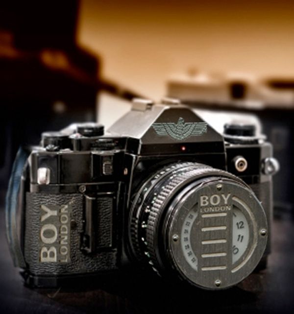
(5 years and 3694 days ago)
- 1: source1
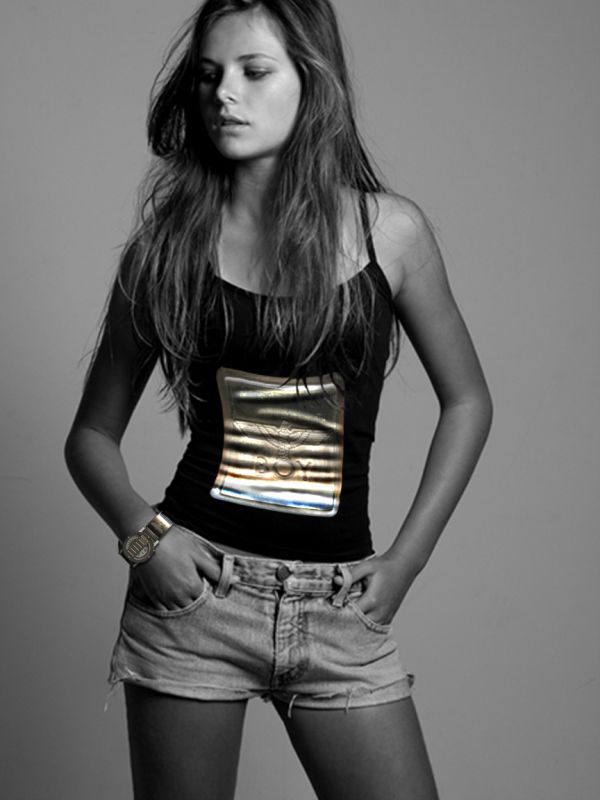
T-shirt matching watch.
For t-shirt print:
- watch logo detail
- warp tool to distort
- dodge and burn tool to make wrinkles following t-shirt's ones
- the detail was kept in color on purpose. :D (5 years and 3694 days ago)
Nice use of source, you really made it look as a shinyprint. I like it!
Would probably make more sense to use a male model...Probably get lower rating though :P . Nice result
I have to disagree with Barnacle, a girlmodel with this print is genius! It´s confusing, yes - but youthful, cool fashion.
Nice work...T shit looks great...good luck author
Nice...
You are wrong Sunzet. Would you buy a t-shirt or watch being advertised by a girl ? assuming that you are a guy. So, obviously it would make more sense, thats all I said and I was right. It's not good to disagree with someone who is right lol 
But in fashion many things are ok - like a boyish style, for example... Maybe it'd be wierd a boy using some stuff for girls, but the opposite is very common!
And... who has never seen an ad where men present female perfums or women present male underwear??? So, don't fight for it! ;D
I´m a girl and I would looove to have that shirt!  ...Author - If you ever get to print it - tell me...and send one to Barnacle as well
Thank u, Sunzet! 
I'd have to agree with you Sunzet, I've seen cologne and high fashion magazine ads with the similar direction. Metro-sexual or something like that. Author, very nice blend and a very simple but original entry. GL!
You are all wrong, obviously, again. This is a mans watch. Girls wouldn't want to wear it, ok maybe a few but generally, no!. Guys wouldn't wanna wear it because of the femanine advertisement. It's not a good idea, thats all i'm saying. It would make more sense on a man. You know i am right.
Sure you can bang on about the t-shirt - it's kinda sexy on her. Kinda like the missus wearing my shirt or something. But a watch ? nope. It aint cute, sexy and certainly not genis. :P
Hey, people, this is NOT a discussion place! And preferences are OUT of discussion... Each one has his opinion; I am a woman, and I've already used a watch like that kind. Women use soldier style boots. Women use male perfums. It's a question of preference! That's all.
I thank everybody who supports this work, and who doesn't too!
No, it´s not a discussionplace  , so we´ll leave that. As great as I think this work is done, I though noticed you might wanna turn the clock"dial"
 around, so when she looks at it, it won´t be upsidedown.
Good point, sunzet, I've not noticed that... But let's consider that this pic is an ad: the watch would be upside down to people who see the model. Am I wrong? Hugs!
Well, using that pic in an ad, it would probably be combined with a text and maybe also the watch as kind of like the "Macho Boy"-entry, and then it should be faced rightway for her. But forsay its a very very famous brand that need no more explaining, then it should be as it is, most people wouldn´t get the upsidedowner... On the otherhand they might, as me, not really notice the watch at first beacuse of the cool shirt. That makes it a brilliant ad btw...they could sell the watch as well as the shirt. 
maybe wouldve been better if the shirt was b&w or the person was in colors... I think
Howdie stranger!
If you want to rate this picture or participate in this contest, just:
LOGIN HERE or REGISTER FOR FREE
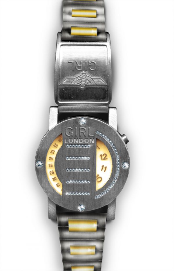
The idea was to make the watch girly using diamonds, gold and silver.
The bracelet is selfmade, the big challenge was to get the shadowing as right as possible.
Guide might come later on. (5 years and 3694 days ago)
It's stylish! I want one...
Nice touch with the diamonds.
like the diamonds, but you should have changed the way the facets are reflecting the light on each one of the four big stones.
damn girls always get bling blings....great work author
Thanks for the nice comments. Adeincyprus: I made changes with the reflections but I am not sure it did any better  Erathion: Yes, we do - and we damn worth it!
Nice twist! I like it a lot!
Howdie stranger!
If you want to rate this picture or participate in this contest, just:
LOGIN HERE or REGISTER FOR FREE
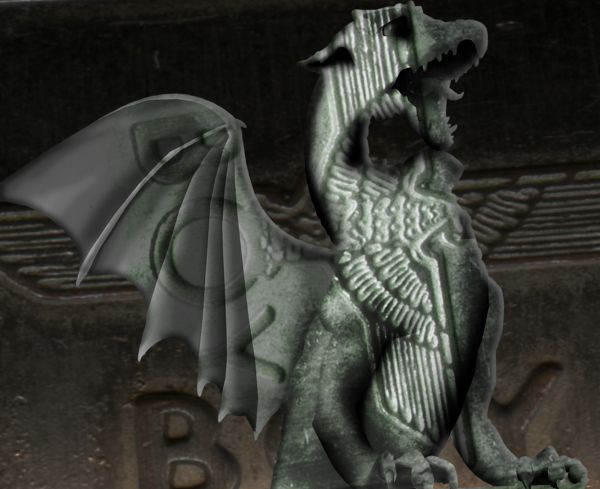
Using simple techniques, i have created moy BoyLondon Dragon Statue. Hope You like! (5 years and 3695 days ago)
Idea is nice but final product is to flat.Try using a bit more warp tool and give more roundness to the edges...and add your source image.
Feels a bit masked... IMO
Howdie stranger!
If you want to rate this picture or participate in this contest, just:
LOGIN HERE or REGISTER FOR FREE
(5 years and 3695 days ago)
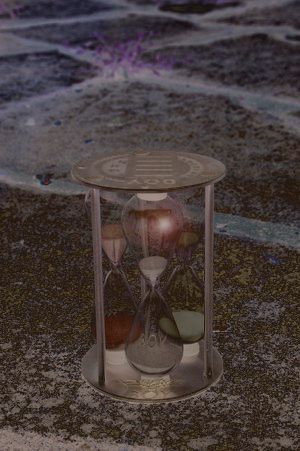
:dev Xerostock: thanks to him for the hour glass
to simple...needs a high resoulution.And why is lends flare there...?
the lens flair is to show a light that fall upon the glass..adn falired
Nice!
Howdie stranger!
If you want to rate this picture or participate in this contest, just:
LOGIN HERE or REGISTER FOR FREE
Genius! well-thought and well-executed~!
Very nice and cool idea. The only thing maybe is that you should work with the "BOY"-text so it have the same perspective as the camera. But I def. like the lense a lot, and how you used the sources overall.
Royal Cam... Love it...!
Very nice work...high resolution would be great...good luck author
Good...
Thanks everyone!! I appreciate all the comments
Thanks everyone!! I appreciate all the comments
Please upload higher res!
cooll
cool!
Howdie stranger!
If you want to rate this picture or participate in this contest, just:
LOGIN HERE or REGISTER FOR FREE