(5 years and 3111 days ago)
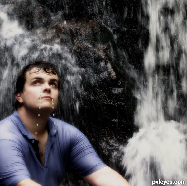
plz watch in high resolution than vote.... (5 years and 3146 days ago)
Howdie stranger!
If you want to rate this picture or participate in this contest, just:
LOGIN HERE or REGISTER FOR FREE
(5 years and 3198 days ago)
Howdie stranger!
If you want to rate this picture or participate in this contest, just:
LOGIN HERE or REGISTER FOR FREE
(5 years and 3202 days ago)
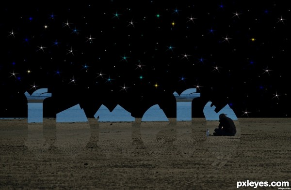
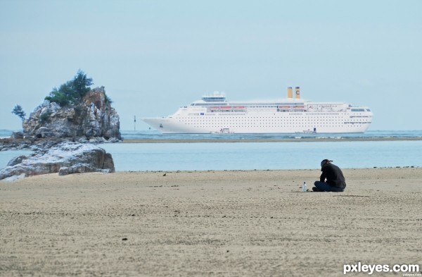
i just want to mention that, a man missing his trip......because he too late to take a ship.......and all image i uploaded are my own photo! thanks!
inspired by Latest Blog Posts? well done, author!!!
Sort of like "The day my ship comes in I'll be watching it sail off". Good vision.
Howdie stranger!
If you want to rate this picture or participate in this contest, just:
LOGIN HERE or REGISTER FOR FREE
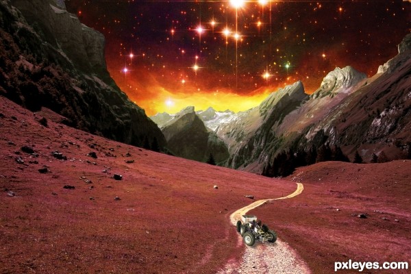
What a spectacular view this little rover has on one of its many trips. (5 years and 3258 days ago)
Good idea & execution...maybe just soften the edges of the mountains a bit. GL author. 
Well done, good explination of what you did in SBS! I agree with CMYK46, mountain edges could use a tad attention.
Howdie stranger!
If you want to rate this picture or participate in this contest, just:
LOGIN HERE or REGISTER FOR FREE
Thank you so much for the suggestion!
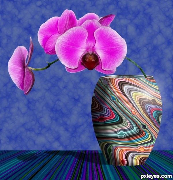
Good design but rather flat looking, needs shadow under the vase, the stem should be leaning on the opposite side inside the vase as the weight of the flowers would designate
If you look, perhaps checking the Hi-Res, you will see that the shadow is to the left behind the vase. Since it is sitting on a level surface, there is no shadow beneath it...
The stem is curved from the weight of the flowers, and hence bends from the base on the left inside the vase, to the right, with the arc then continuing back to the left outside the vase...
Creative and cool. Would love to have seen slightly softer edges to the vase and where wall meets surface. Perhaps a slight soft darkening on right side of edge of vase to show more cylindrical shape...but nonetheless...very nice job.
Since it was supposed to be a tabletop near, but not up against the wall, a softer edge would have helped, you're right.
A shadow on the right side of the vase would have been difficult with the light source highlight where it is, but possibly down near the bottom...
Thank you all for your comments, it is SO helpful to get the viewpoints of other eyes than my own, and helps me improve my skills with every entry!
good try
Great work. Artistic and creative. Fab colours and it includes my favourite subject - flowers!
Howdie stranger!
If you want to rate this picture or participate in this contest, just:
LOGIN HERE or REGISTER FOR FREE