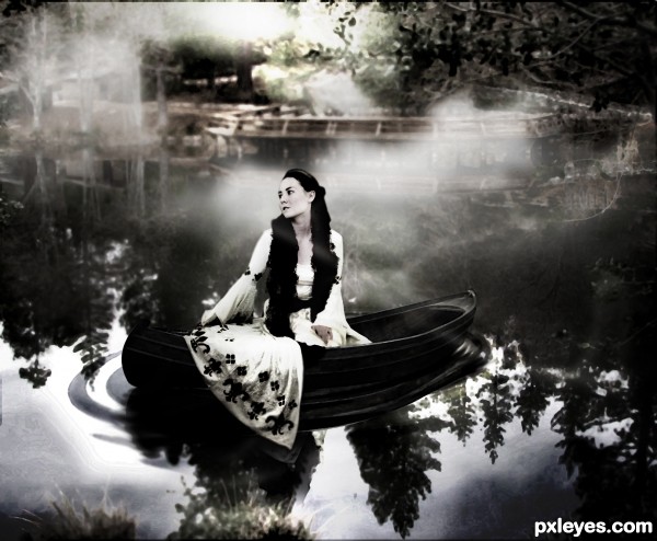
hey i used ps ,i know this is not so great but i still tried
credits
1.magikstock
2.malicia-stock (5 years and 3275 days ago)
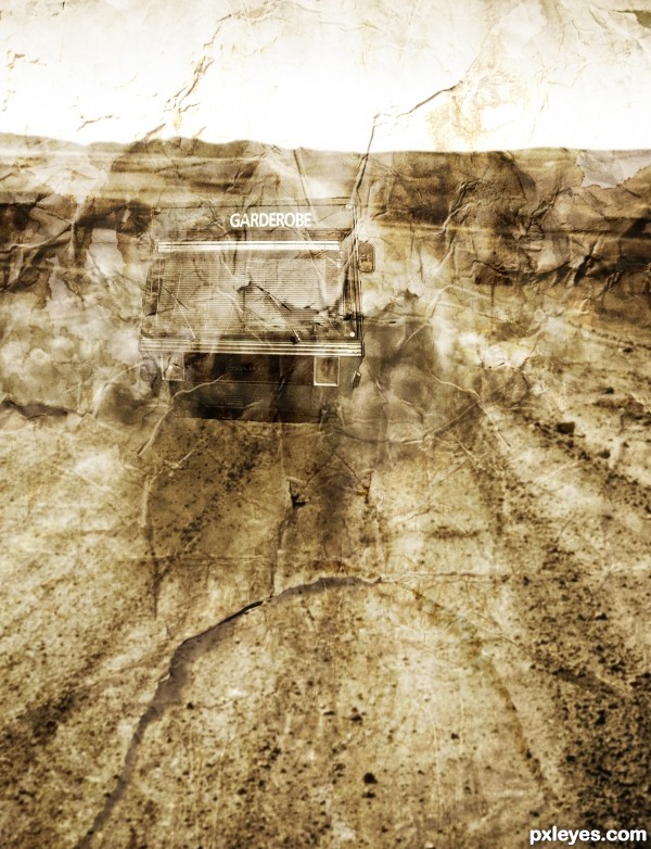
A bus traveling down a lonely desert road featured on crumpled paper (5 years and 3338 days ago)
good effect
Howdie stranger!
If you want to rate this picture or participate in this contest, just:
LOGIN HERE or REGISTER FOR FREE
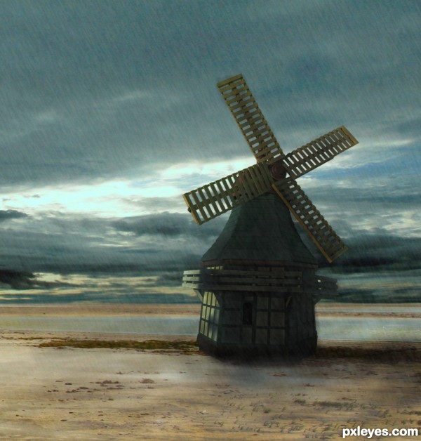
~Revised Version~ (5 years and 3366 days ago)
It's really artistic to me!
Very very nice work author...Mood is great...well done
Howdie stranger!
If you want to rate this picture or participate in this contest, just:
LOGIN HERE or REGISTER FOR FREE
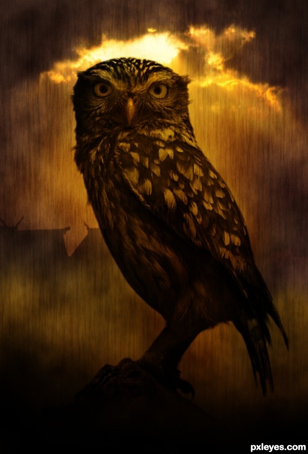
Credit to :
1.flordelys-stock.deviantart.com : Owl brush.
2.guttmann@www.sxc.hu : for sunset image. (5 years and 3385 days ago)
Those look like roof tops in the back ground, which are not included in your sources.
Amazing image! Love the background and the texture too 
I like this = )
Howdie stranger!
If you want to rate this picture or participate in this contest, just:
LOGIN HERE or REGISTER FOR FREE
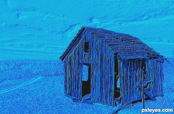
(5 years and 3422 days ago)
Don't take this wrong, but it's kind of like a "plain filter entry". Since there's no (more) rule about posting filter entries, i guess you can do that, but make it more interesting.
You could: use different tonalities of blue, like a mosaique; make a blue dust cloud that swallows the image, make a floating in the sky shack, etc. Make it cooler.
LOL! "Plain filter entry." Funny after all these years filters still are so denigrated.
Yes, I could have made this a CBR and then applied filters, but I was inspired by a two-page Adidas Ad in Sports Illustrated, that simply embossed a building, made it gold, and put a frame around it, with a photo of Derrick Rose in a gold suit with two fistfuls of money on top...So I played with the emboss filter and a few effects. The Fractalius effect provided a nice pseudo-linework effect, with a bit of color for accent.
Sometimes, "less is more." After 15 years with Photoshop, having been to the extremes of "filters are EVIL," and seeing the "chopped beyond recognition," "warped out of shape," "desaturate it and make it too dark to see," and "add exploding bits and light swirls," forms of "trendy" chopping, I'm now starting to see filters making a quiet comeback. They might not be as "interesting," but that doesn't mean they're not cool. Especially when you don't just click the button, but add gradient masks, adjust contrasts, and work with multiple layers. When Adidas takes out two pages for a colored emboss with a frame on it, I figure subtle is okay, sometimes...
No offense taken, greymval. Thank you for taking the time to comment!
honestly its nice but for the contest i dont think that this is the right entry.. no offense i know you know what it takes to win a competition. 
It might be "just filters", but it's an interesting use of them. I like the monochrome with blacks.
ART comes in different kinds of shapes, colors and forms. I think, "even" if you used a filter or a "bevel and emboss" for your work. I love the blue colors and the outcome of your work. Good luck.
Howdie stranger!
If you want to rate this picture or participate in this contest, just:
LOGIN HERE or REGISTER FOR FREE
I thought there would be more entries like this, very classic concept and quite nicely done, best of luck
thanx
Perfect taste! GL!
thanx
Evokes a nice feeling. Nice job, author!
thanx
Howdie stranger!
If you want to rate this picture or participate in this contest, just:
LOGIN HERE or REGISTER FOR FREE