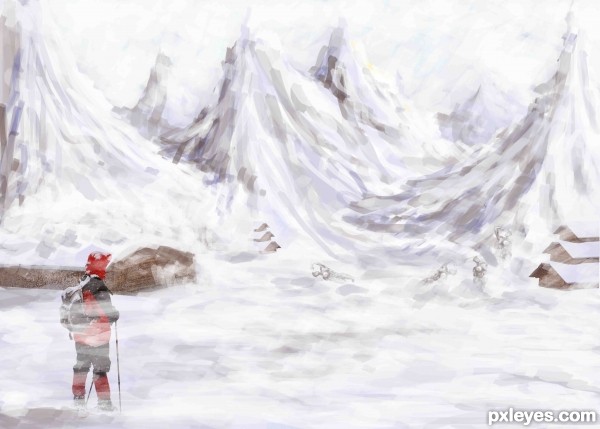
lone hiker looking on contemplating the long journey ahead of him.. many have perished... he can see the frozen bodies..the houses long abandoned...but there is no turning back
Onwards through the snowy waste (5 years and 3261 days ago)
(5 years and 3331 days ago)
I'll just turn around thank you very much LOL very neat Idea author.. good luck
very good idea and neat work author...mood is very very nice...IMHO this could be your best entry for now...best of luck
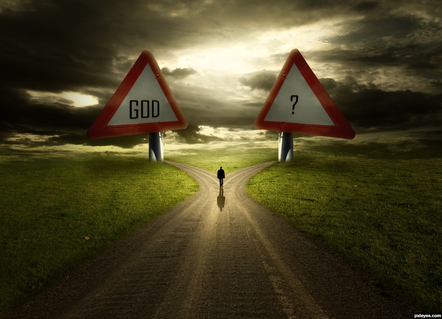
I suggest you have a look again at the traffic signs, the positioning and perspective is completely wrong. Not to hard to change that.
It's very nice, just fix some things, I think the size is too exaggerated, the screws lose the sense at this size, and I think that would give you center a little more plates to the base. GL
Wanna see the SBS too, i will hold my vote 
very good concept.. good luck
Agree with above, especially the perspective.
There's no difference between "GOD" and "?"...just a matter of perception. But please try to revise the image as per the suggestions above.
I like it and the idea is great.You got my vote.
@erathion Wow...thanks mate. @petersheep You're right about screw. It fixed.
Thanks everyone for your words. And to point out mistakes about perspective. Can you clearly describe .. ?
Hi author, i see the modification...nice!!! about the perspective, I think if you centralize the center of the plate with the base would be perfect.......nice Job GL!
Hi author, i see the modification...nice!!! about the perspective, I think if you centralize the center of the plate with the base would be perfect.......nice Job GL!


great image!!!
Excellent work, loved the lighting! Dramatic and expressive! My fav!
Love the idea and the lighting. Would have loved it even better if the source was a finger post and not a warning sign. But since it is, I find this just great. 
congratulations...
Congrats!!
congratulations...
very nice.., congrats
Howdie stranger!
If you want to rate this picture or participate in this contest, just:
LOGIN HERE or REGISTER FOR FREE
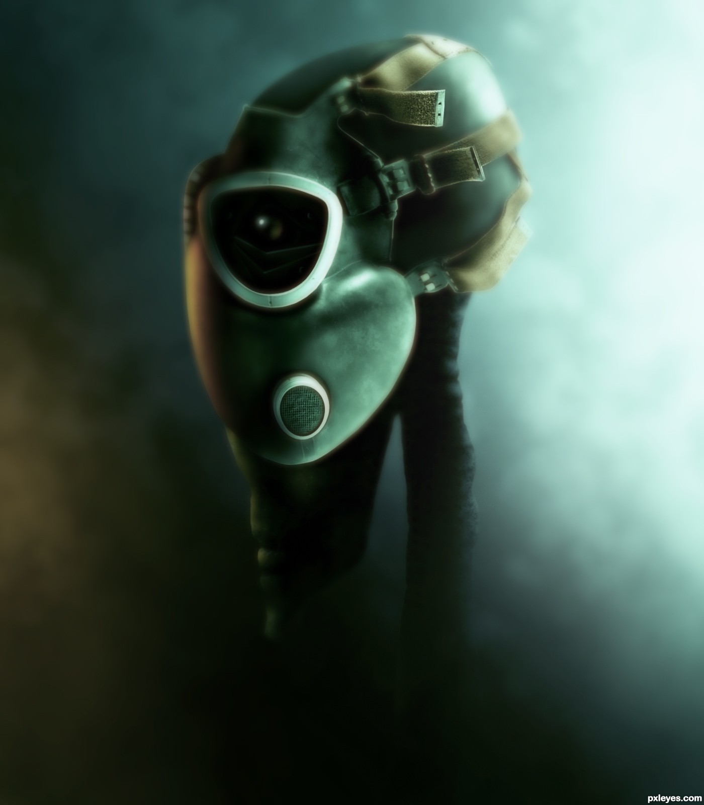
Friend or foe? (5 years and 3425 days ago)
Good transformation of the source, good mood & color.
I like this a bunch, the title took me a second to get, but it's very clever, and I like how you did the dof here, well done = )
I really like this...Well I really like aliens hehe. This is really very well made, and love the mood of the image. Nice imagination.
Very very cool !
 !
!
tight!
Fantastic Work!
The mood of this work is awesome. Well done and nice transformation of the source. good luck!
Nice alien
very very good work author...with perfect mood...well done
Very dark!! GL
Congrats for a great third place!
congrats...
Congrats...,
Congrats!!
Howdie stranger!
If you want to rate this picture or participate in this contest, just:
LOGIN HERE or REGISTER FOR FREE
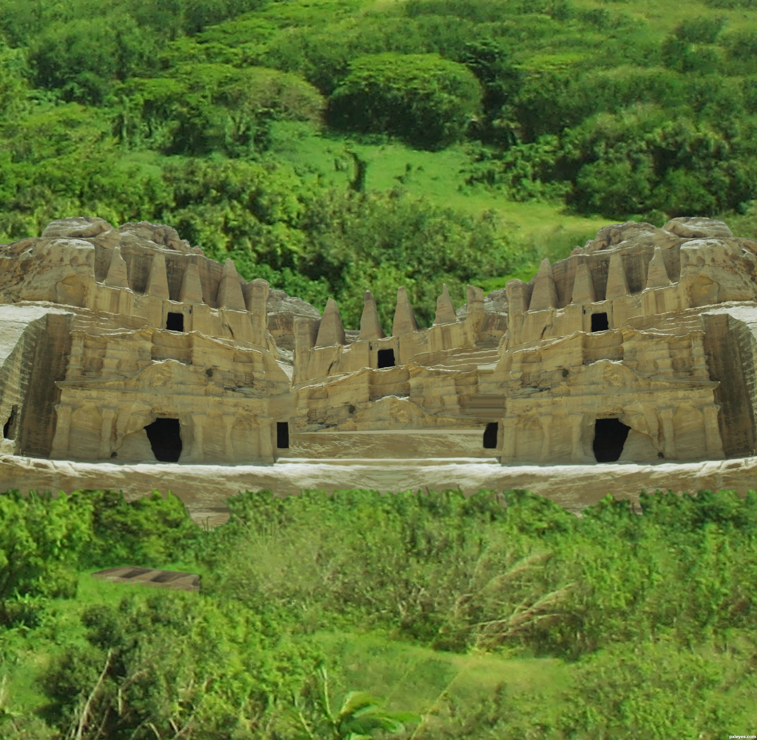
Spec Thanks to JakeRome
for his picture Green Forest
found on Flickr photo sharing.com & jakerome photostream (5 years and 3516 days ago)
coooll image i like it . g l
cool.
good idea
nice idea and cool colors but demand more work...its always hard to separate trees,bushes and similar objects from background...use this tutorial as a guideline for masking a trees http://www.pxleyes.com/tutorial/photoshop/1272/How-To-Mask-A-Tree-In-3-Minutes.html...For your entry,bottom part of the bushes is to sharp,when u do things like this,u could use smudge tool after to add some curves branches and that kind of stuff..sorry for my nagging but i hope this is gonna help u in the future...best of luck
Hey Thanks erathion for info and thanks everyone else for coments
Howdie stranger!
If you want to rate this picture or participate in this contest, just:
LOGIN HERE or REGISTER FOR FREE
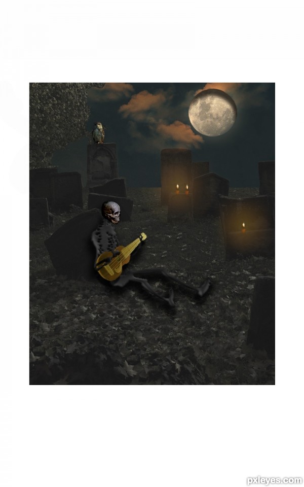
(5 years and 3543 days ago)
um... not a bad entry, but it would be cool to give the skeleton some shadow to make it look a little more realistic but its still pretty cool!
Thanks for the tip=)
The whole image is interesting, but background, skeleton and guitar are blurry. Btw, skeleton link?
Thanks for the tip...both...i try to learn more...and the best thing to doing it is when you get a feedback=)...I'm sorry if I write bad English....I can not write and talk it properly=)
Howdie stranger!
If you want to rate this picture or participate in this contest, just:
LOGIN HERE or REGISTER FOR FREE
Photography and photoshop contests
We are a community of people with
a passion for photography, graphics and art in general.
Every day new photoshop
and photography contests are posted to compete in. We also have one weekly drawing contest
and one weekly 3D contest!
Participation is 100% free!
Just
register and get
started!
Good luck!
© 2015 Pxleyes.com. All rights reserved.


author in your SBS u did not show how u created the mountains. They are main part of the image and u have to show how u made them. Now is in every step same picture of that part...Image itself is very nice but u have to show how u made it...GL
Actually i did... paintbrush with chalk brush... i painted the whole thing using mostly whites and greys
Actually i did... paintbrush with chalk brush... i painted the whole thing using mostly whites and greys
No author u did not show how u made the mountains...u'r wrote how u made them but in your SBS in every single step mountains are the same...When u create something like this u have to show how u made that, maybe not every single step but the main job how to be documented...
The mountains are a bit crudely painted, and do not correspond very well with th photographic elements.
you can try with small smudge brush with strokes along the painted strokes to make more landscape feel
cool painting
thnx... js likd d effect dis way... wil try more realistic next time
Howdie stranger!
If you want to rate this picture or participate in this contest, just:
LOGIN HERE or REGISTER FOR FREE