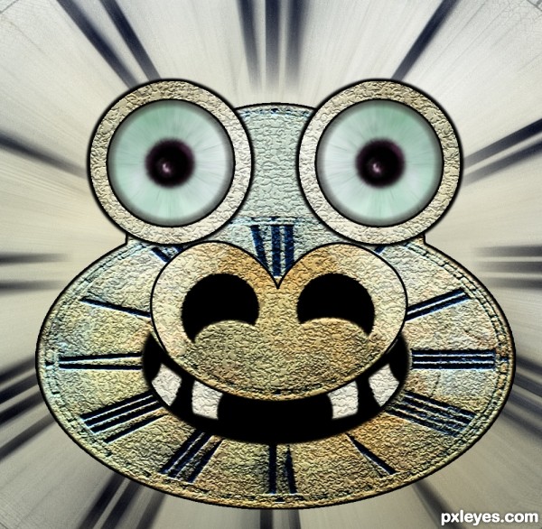
Just the source file was used to create this. (5 years and 3357 days ago)
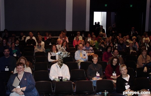
(5 years and 3402 days ago)
haha.. great idea.. but it should be hidden.. 
hahahahaha...great job author...
Howdie stranger!
If you want to rate this picture or participate in this contest, just:
LOGIN HERE or REGISTER FOR FREE
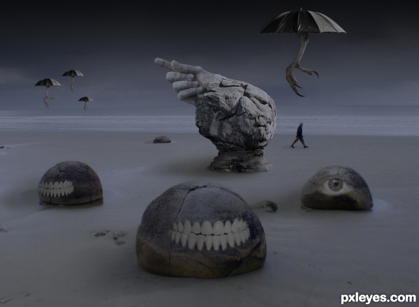
A lone figure ignores the warning of the pointing hand, and heedlessly walks on into...????
(5 years and 3420 days ago)
very surreal, I really like the oveall dark feel, and it's well put together. The talons look great.
Awesome.It looks like a Salvador Dali painting.
The talon/umbrella's are perfect. Great entry. GL
very interesting image...Umbrella is fantastic touch...best of luck author
How did I know...  GL!
GL!
This image really caught my attention!! It's fantastic....Best of Luck 
Howdie stranger!
If you want to rate this picture or participate in this contest, just:
LOGIN HERE or REGISTER FOR FREE
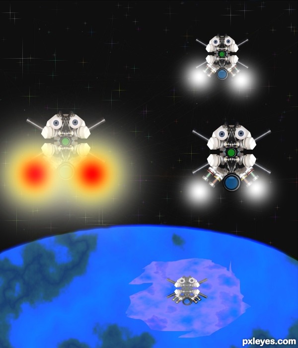
(5 years and 3504 days ago)
nice
nice...just that imo the firelooking distracts the work...just my opinion though
Hey Thanks guys I agree so I did a re do what do you think ?
Nice job Author. Redo looks much better.
looks nice.... gl
AHHHHHHHHHH INVASION!!!!!!!!!!
nice ......... 
Howdie stranger!
If you want to rate this picture or participate in this contest, just:
LOGIN HERE or REGISTER FOR FREE
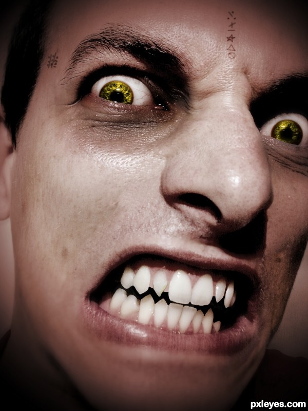
The writings on his skin are not images but just done with a brush.
Thanks you Ale_Paiva for the Person! (5 years and 3531 days ago)
Interesting chop. Maybe desaturate the skin a little to make it appear paler ? Good luck ! 
He's spooky, Cherish is right about the skin tone.
Thx I made it more pale.. 
Looks better. Just a suggestion though, Vampires don't have wrinkles and some skin imperfections, they just have the perfect type of skin, I would suggest removing all little imperfections with the clone tool, but that's just IMO. 
Eyes and teeth are good and i like the Imperfections but that is more personally preference. The writing on the skin looks to be floating just above it, maybe try a simple overlay and then duplicate the layer to improve contrast, also adjust the orientation a very small amount mainly the writing on the forehead.
Thanks for the advice  I'm working on it...
i really like the eye color
Very threatening. The skin tone could be a more ashen (less red). The tiny tatoos don't add anything IMO.
The eyes are about the only thing that make this a vamp..The teeth are just in bad need of a dentist more than anything. Although the in your face" effect you've created can be frightening and of a resemblance to a vamp, it just doesn't quite make it for me, IMO.
Howdie stranger!
If you want to rate this picture or participate in this contest, just:
LOGIN HERE or REGISTER FOR FREE
I like it
Great work.. GL author!
hahahahahaha...great job author...love it
Don't know what it is about this one but I just love it! Really has a lot of character! Really reminds me of the very old cartoons ... like Mickey Mouse "Steamboat Willie" http://www.youtube.com/watch?v=pwobPtWdGm0
Lots of fun!
Howdie stranger!
If you want to rate this picture or participate in this contest, just:
LOGIN HERE or REGISTER FOR FREE