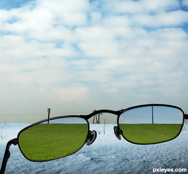
(5 years and 2951 days ago)
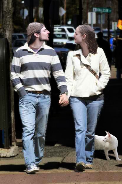
(5 years and 2986 days ago)
check the shadow of the cat... it is not as dark as all the rest of the shadows in the scene... fix that and it will be better... cat also appears to be hovering above the ground slightly...
Agree with bjaockx...I like your approach to this contest author! Nice job!
Thanks for the help!
I worked on the cat's shadow, I hope it looks better now. thanks again!
Good job, author, you got the theme of this contest perfectly. 
Howdie stranger!
If you want to rate this picture or participate in this contest, just:
LOGIN HERE or REGISTER FOR FREE
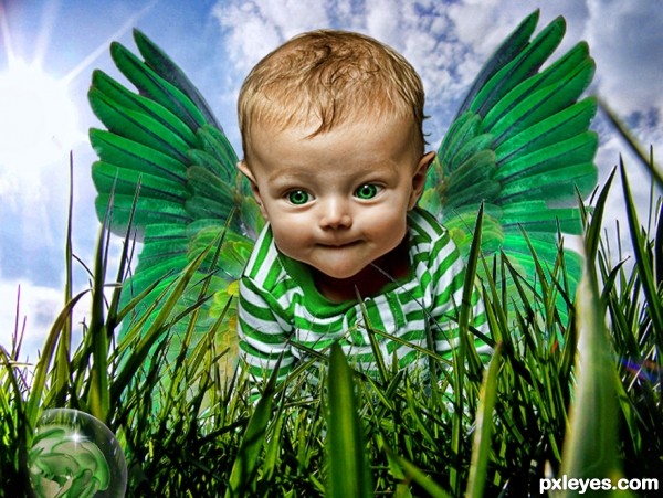
Permission for use of the Grass in SBS
Thanks to Eyefeather stock from deviant art for baby stock (5 years and 2994 days ago)
This is really cute and nicely done! You really should put up a high res version if possible to really appreciate this.
Agreed. As it is, we can't tell what's in the lower left corner.
cute, but havent we seen this before in the fairy contest?
It was pulled from that contest ... I put a lot of work into it so since it was never judged .. here it is
I like the green mood a lot  I would clean up the edges of the blades of grass though. I'm still confused about the lower left bubble too.
Just a globe with a green flower in it ...
Howdie stranger!
If you want to rate this picture or participate in this contest, just:
LOGIN HERE or REGISTER FOR FREE
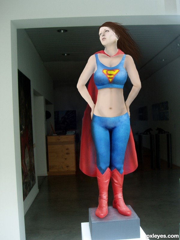
After some time in the gym, a good diet, and some therapy Super Woman got back on the pedestal. (5 years and 3041 days ago)
What's the source for the "S" on the chest, and why is the yellow area green? The red area should be the same red as on the costume, too.
Pretty easy symbol, no source. green is coming from the layer being multiplied with the blue below it. Same with the red, its the same color but just tinged due to multiplied layer.
No source? Then please show how you made it. And you could easily adjust the color to match the costume.
Adjusted colors. I'll add the symbol creation into the sbs in a few minutes.
Considering that the 'S' is a Specialized font, I too would like to see its creation in the SBS...
SBS now includes how the symbol was created.
Well now, that wasn't so hard, was it? 
The SBS clearly states you did not draw the 'S', and it is not a common font, so where did you obtain it from?
Hi Mossy,
The SBS does clearly illustrate how i created the logo. No matter how many times you say it, or accuse me of "obtaining" it, its not going to make it true. It was drawn...plain and simple. I am having a hard time understanding why that is so hard to see. As a matter of fact, it seems like it would be easier to go find a free stock image of this symbol and use it instead of creating one myself, as I did. I don't have video capture capability on this computer or i would do it that way, the best thing i can do is show you the process in the steps provided.
The Superman symbol is a copyrighted logo so really should not be used. The "S" is not a type font at all it is a hand lettered graphic incorporated in a triangular border. A type "font" is the term for the entire alphabet, numbers and symbols based on a particular design. There are "Superman" fonts in existence now based on the logo and also those based on the 3 dimensional comic book titles.
Your right it is a copyrighted image. I figured if it was drawn it wouldn't be an issue for this contest. With all the flack I'm getting for it I don't know if its worth it keeping in the image Your avatar says mod, so if you need me to take it off her I will. Just say the words.
Used the smudge tool to make the logo unrecognizable in relation to the copyrighted one.
Howdie stranger!
If you want to rate this picture or participate in this contest, just:
LOGIN HERE or REGISTER FOR FREE
"http://www.morguefile.com/archive/display/745306" Used but didn't make the final pic. (5 years and 3080 days ago)
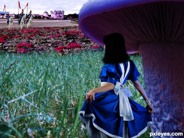
Nice idea. I think the perspective is too distorted. The castle has unreal height. The roses seem flat ( are stretched a little to much). This is only an oppinion. Good luck!
smooth brush it's bad don't use smooth brush while deleting backgrounds.
The hair looks too plain, you should increase the detail. Good luck.
this one had potential, but what was said before I'd only be repeating...
Howdie stranger!
If you want to rate this picture or participate in this contest, just:
LOGIN HERE or REGISTER FOR FREE
Good thinking...GL author!
Congrats!!
Howdie stranger!
If you want to rate this picture or participate in this contest, just:
LOGIN HERE or REGISTER FOR FREE