(5 years and 3155 days ago)
2 Sources:
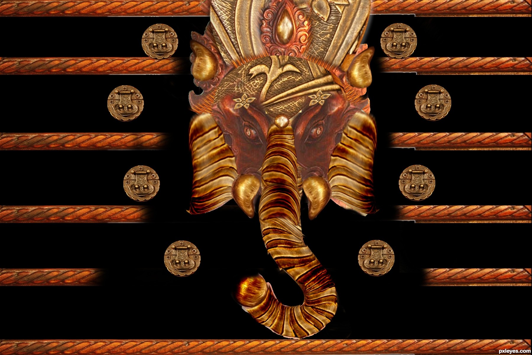
No outside source used.
Hope you like it.
Feel free to comment.
Edited. (5 years and 3211 days ago)
this is one of the best  really love this
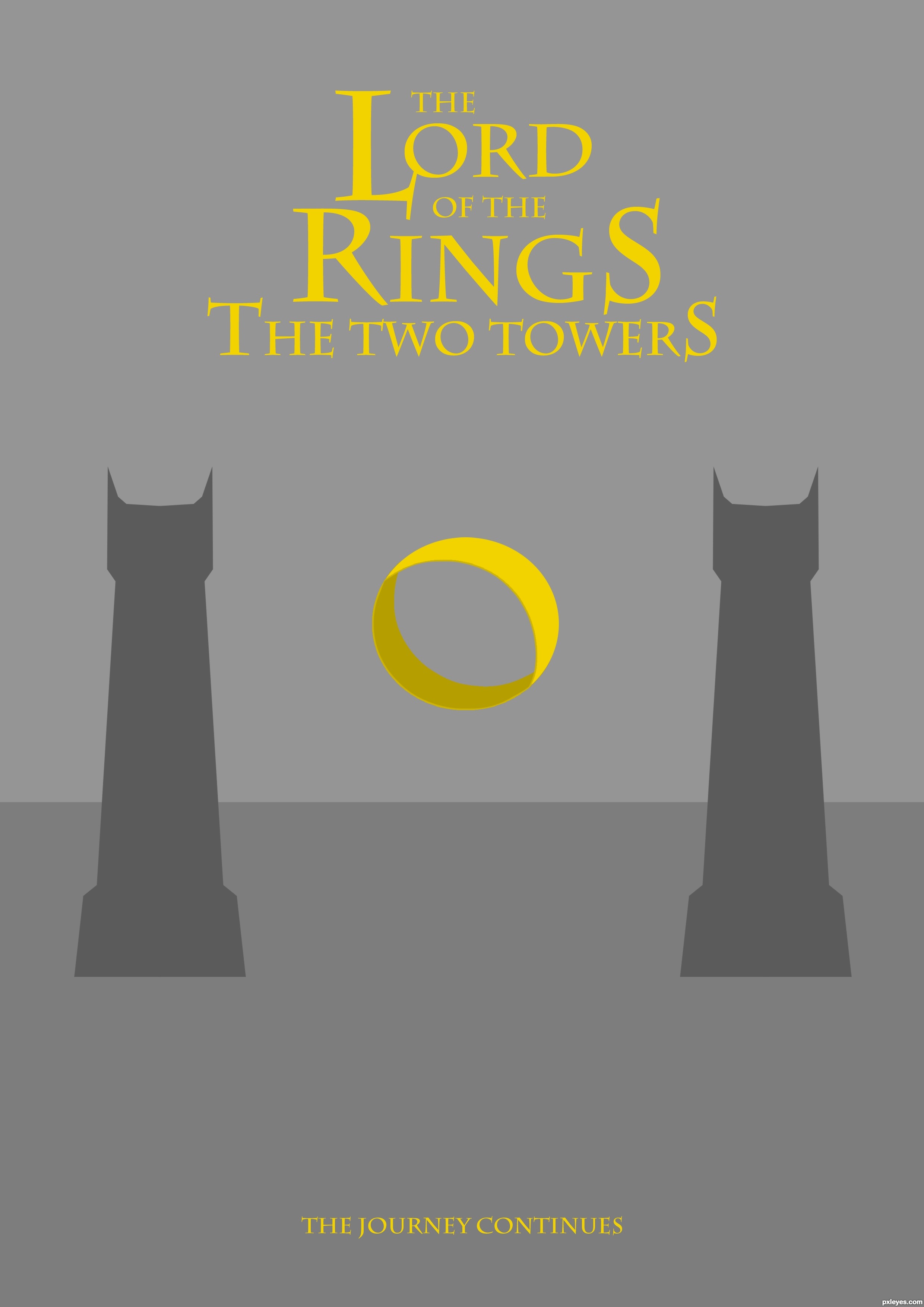
Nice use of colors. I might have put the horizon line ánd towers somewhat lower so you can give some more space to the name of the serie and somewhat more under the name of the movie. Imo a bit too much happens above now while under it's a bit too empty. Good luck!
thanks for the tip wazowski. I changed it like you said . Hope it's better, if not then please feel free to comment.
Nice visual balance, good minimal yet effective communication of the concept. Nice work!
Howdie stranger!
If you want to rate this picture or participate in this contest, just:
LOGIN HERE or REGISTER FOR FREE
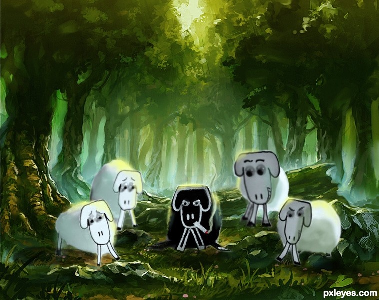
Initial Idea was The Black Sheep Forest. But it was a weird kind of title should I say.
So, I wanted to put this Tough Guy to the forest as a 'thief lord' or 'boss of the gang' or something rather than just a black sheep with a cigarette.
Done with Cintiq, I'm NOT tracing the sheep. I leave them be as a photo-graphic element. I just painted the background & matched them together with Photoshop. (5 years and 3213 days ago)
There's nothing to give the black sheep any sense of "lord" or "overlord," or leader. He just looks really unhappy about being in the forest with the white sheep.
If you want him as the "ringleader," you'll need more than just a cigarette. Maybe a crown, maybe a gangster suit with a flower in the lapel, maybe have him on a dais with the other sheep beneath him looking at him.
Just changing the background is not conveying your concept, you need to put a little more adjustment into it to visually establish the "pecking order" of the group.
Really nice painting skills! The problem that I see is that the original source has such a shallow depth of field. So the background of your painting is more in focus with a higher depth of field. You might be able to fix this with a gradient lens blur for the background, but I couldn't be sure without seeing it. Good luck!
I like the way you changed the expressions on the sheeps faces. The black sheep didn't look mad to me until MossyB pointed it out. He just looks really serious to me. And the white sheep seem a bit intimidated, which i guess is the point. Really nice painted background, too! I like it. GL
gorgeous background! really gives that oil painted feel! good luck author!
Great mood, great BG, great SBS.
Thank you, my friends... I'll take some time AFTER my recent commercial works done to put my update here FAR BETTER than that one before. I'll take your consideration about the looks of the Black Sheep Lord as my primary objective, MossyB. And some gradient blur adjustments that pointed by Chalty669.
Thanks for your kind words, Alyssadanielle & Greymval. Your comments worth thousand flowers to me. Haha... sounds like a gay. But I'm NOT.
Good Luck to everyone! I'll make my piece of sheep better from time to time.
The background gives life to the source image. Fantastic! GL!
nice background! well done!
ba ba black sheep, have you any wool? nice idea for a children picture book 
nice background compositing! like it =D
Great work and well done. I love the forest setting and The Black Sheep Lord has a very mean look!
Great approach, it's better to do a painting-like work in this case, very wise choice and nicely done. You must have nice skill of drawing with hard brush, so just participate more with drawing contests, looking forward to see you there
Thanks for viewing & voting. I don't have any time to change the picture, so please forgive my unaccomplished promises. Next time, I'll do the best for my entries as well.
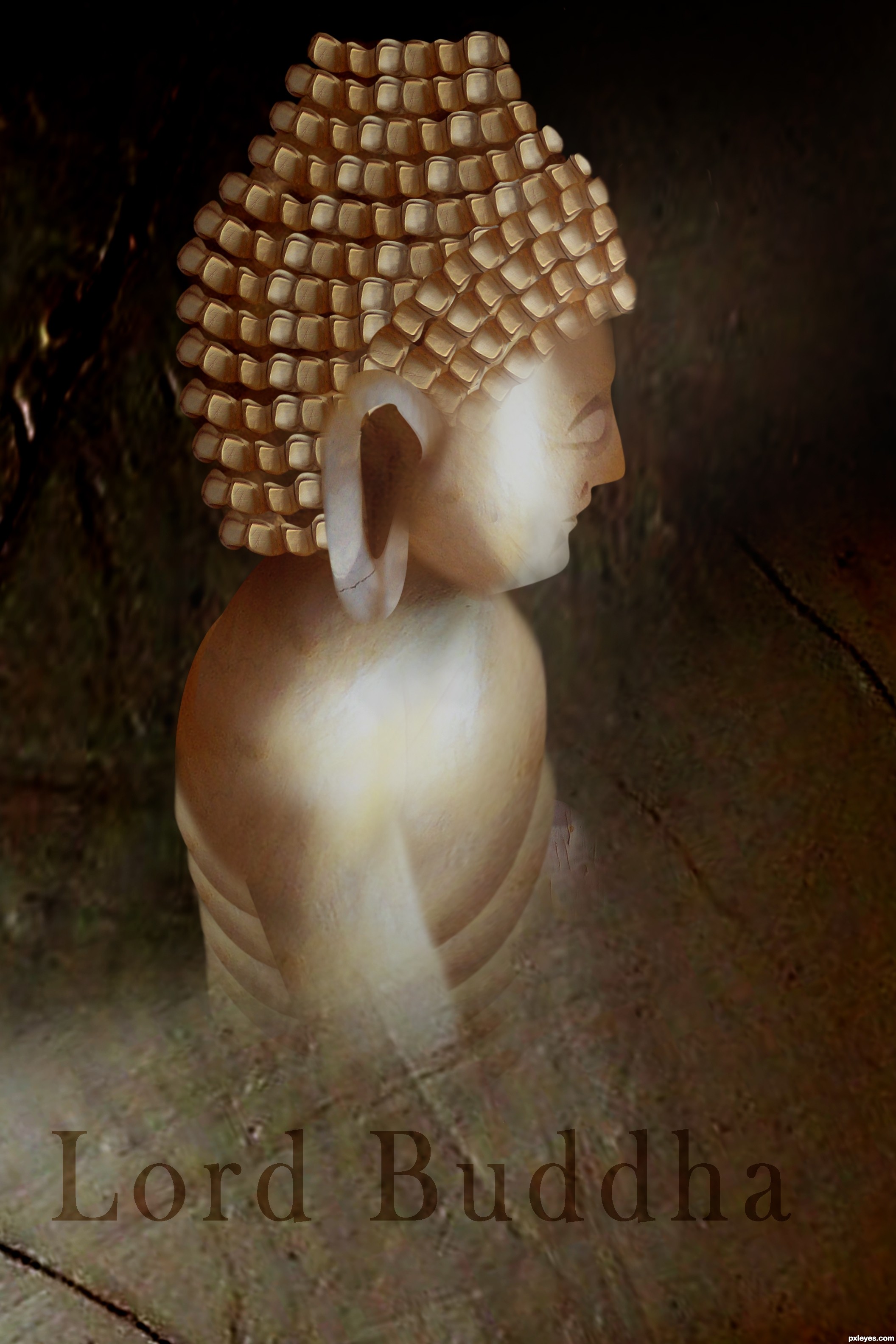
@ arca; it doesn't seems like a Lord to others. But thanks for the comments, appreciated so much. (⌒˛⌒)
@ langstrum; I'm very glad that you like my kind of painting style. It's been a while that I make scenery scene. I'm doing the drawing contest as well with the traditional drawings. Most of my works play the role with digital painting, concept arts & a little of 3D matte-painting; so pardon my poor photoshop skills of combining stuffs like photo-manipulation. (⌒˛⌒)
Congrats, beautiful work
congrats!
I seen this coming  . Good work! Congrats!
Thank you, dear friends & voters. Love you all. â•(′ â–½`)╯
Congrats Hayato, I can predict your win easily, keep it up
Awesome and congrats
Howdie stranger!
If you want to rate this picture or participate in this contest, just:
LOGIN HERE or REGISTER FOR FREE
only used source image (5 years and 3217 days ago)
Very nice and very creative.. GL
Nice use of the source image, author!
Howdie stranger!
If you want to rate this picture or participate in this contest, just:
LOGIN HERE or REGISTER FOR FREE
(5 years and 3240 days ago)
Howdie stranger!
If you want to rate this picture or participate in this contest, just:
LOGIN HERE or REGISTER FOR FREE
Photography and photoshop contests
We are a community of people with
a passion for photography, graphics and art in general.
Every day new photoshop
and photography contests are posted to compete in. We also have one weekly drawing contest
and one weekly 3D contest!
Participation is 100% free!
Just
register and get
started!
Good luck!
© 2015 Pxleyes.com. All rights reserved.


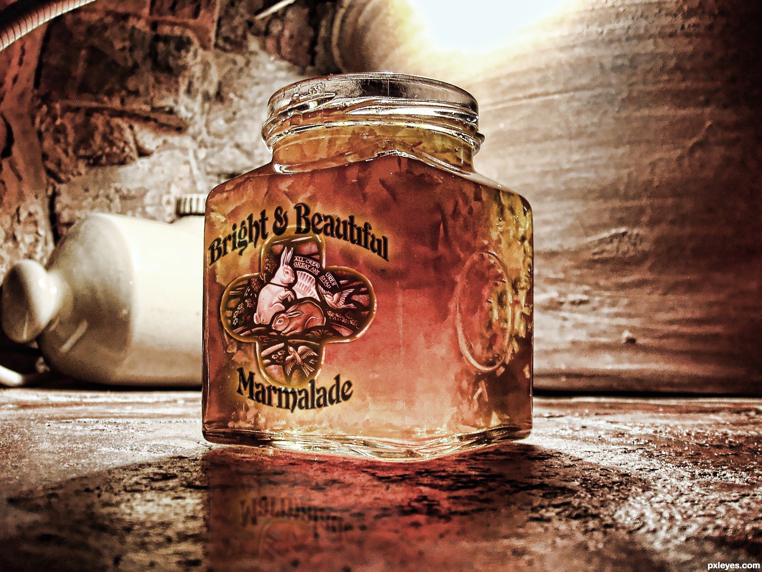
WOW! Looks extremely real!! Could've fooled me!
Cool, but I wonder why the labeling on the front of the jar doesn't affect its shadow.
Nice one!...
This is wonderful, like something you might find at a farmers market.
very nice...
nice..
colors and lighting are superb author
Definitely wonderful work!
Author, I like this !
Congrats!!
I would have banked my money on yours winning! GL on future projects, and congrats for 2nd
Congrats on your Win
Howdie stranger!
If you want to rate this picture or participate in this contest, just:
LOGIN HERE or REGISTER FOR FREE