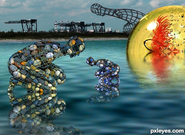
source and my photos (5 years and 3287 days ago)
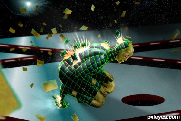
(5 years and 3291 days ago)
wow thats pretty awesome author..great image
Cool design! You pen tooled the wire-frame, dang that must have took you some time - i guess color range or wand were not too helpful here.
I like the paper flying things around the character and i think it would help if:
1. you color the other hand too or some part of it
2. you make the exploding pieces further away from the body, and at different heights, while also keeping the light rays coming from their breaking holes.
Neat, and indeed looks like that would take a long time to cut out the frame =)
Very nice effective different work...best of luck author
thanks for the suggestions , made some changes 
and yes pen tool took me a fair amount of time , just enough to come up with an idea 
Very very cool! amazing idea! excellent entry 
thats really cool 
Fantastic work! Very futuristic and interesting. Love the colors.
Howdie stranger!
If you want to rate this picture or participate in this contest, just:
LOGIN HERE or REGISTER FOR FREE
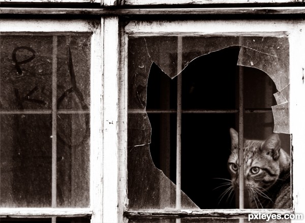
cat, window, (5 years and 3342 days ago)
Good idea & mood! 
Agree with CMYK...perhaps experiment with slightly blurring the cat face...to give just a bit of depth. The window is entirely in focus and would create some depth if the cat were just a tad out of focus. Just a thought...nice job regardless!
EDIT: Yesssssss! I think it looks  Great job, author!!!
slight blurring, thankyou
One of my favourites in the contest. Nice composition and very well put together ... has considerable impact and depth as well!
Good idea, feel sorry for the poor cat 
i like this one...nice job
Agrees with Bob. very convincing blend! GL!
Great work! Love the sad and retro mood 
Fantastic work author...well done
thankyou
Howdie stranger!
If you want to rate this picture or participate in this contest, just:
LOGIN HERE or REGISTER FOR FREE
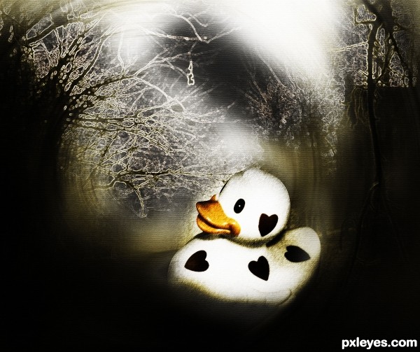
(5 years and 3353 days ago)
very nice image author...lovely mood too...best of luck
Cute, I like the minimal use of color, makes the duck's "smile" more prominent. 
Howdie stranger!
If you want to rate this picture or participate in this contest, just:
LOGIN HERE or REGISTER FOR FREE
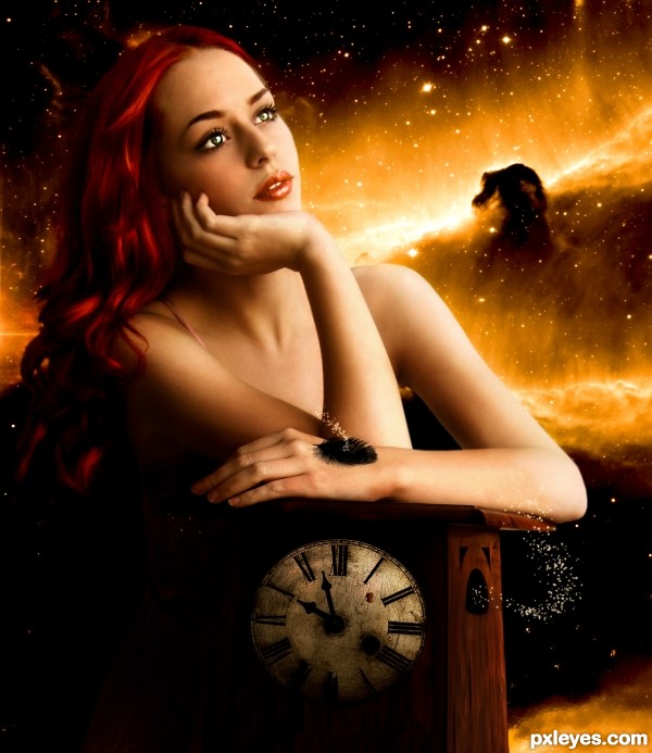
Credits and thanks to:
- faestock.deviantart.com
- daisuke-paster.deviantart.com
- catherinetodd2
- dozystock.deviantart.com
- dark-yarrow.deviantart.com
- dollieflesh-stock.deviantart.com
- http://budgie.deviantart.com
- http://sunira.deviantart.com/
(5 years and 3362 days ago)
Now that's how you want to look is you ever get lost in time.
Good job
Awesome
nicely pulled off !!!!!!!!!!!!
nicely pulled off !!!!!!!!!!!!
Brilliant editing.. the model looks fantastic and the background is magical  Great job!
Great work author, fantastic result 
- Changed background;
- A few more changes in lighting.
I don't really understand what the black fuzzy thing is on her hand?
other wise, very dreamy. I love it.
It's a black feather ~~
very good design it makes me thing or go out in a dream which i'll never come back
I've always told myself that if I was ever lost in time, I'd want a little black feather that blows bubbles as a pet. 
Fantastic piece author...Mood is perfect...love the color choice and your work on a model is great touch...best of luck
Nice! Love her eyes..
awesome 
I know cmyk fantasy is not your strong...
wonderful image ..... 
Very good.
Congrats for 2nd, great pic
Congrats Akassa...great entry...
Congrats on 2nd!
Congratulations!
Howdie stranger!
If you want to rate this picture or participate in this contest, just:
LOGIN HERE or REGISTER FOR FREE
Amazing how there are mirror smooth reflections upon "choppy" water...Woo Hoo!
Haha, i love the humour here. Lovely vibrance and a very original use of source (as always!)
awe.. Ponti got attacked by the thumbs down monster... LOL.. really cracks me up LOL
super cool coloring and perfect water reflections...i have to learn how u always achieve perfect reflections...best of luck
For those wondering, I think you have to use displacement map for the reflection, distort -ripple might work too, but whenever i used displace on water it looked marvelous.
Then you could try edit - fade displace if you want less of that effect.
Maybe author can help more.
aaaand the pettiness continues, haven't even been back a week
Howdie stranger!
If you want to rate this picture or participate in this contest, just:
LOGIN HERE or REGISTER FOR FREE