(5 years and 3597 days ago)
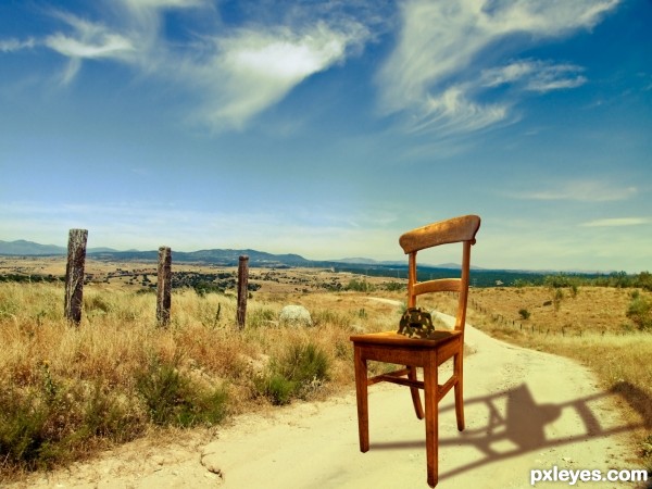
HI everybody, this is my first competition entry and I hope you like my work.
Basicly for this image I got a nice countryside backround. Found a chair and cut it out. Onto the chair I put the competition image, firstly though, I cut it out and puppet wrapped it so it looks like a helmet. Then I added a camo texture to the helmet and played around with the different blend modes. Lasty I put everuthing together by adding some extra shadows, and then I added a nice Brown and Orange gradiend and blended that to look nice.
Take care! (5 years and 3600 days ago)
Welcome to the competition. Just a thought for your entry... The shadow on the chair doesn't match the high noon image it is placed on. It also looks like you distorted the image of the chair (if you hold down shift while resizing the aspect ratio will remain constant thus avoiding the distortion).
Also a high res copy would be nice so that we can see what you did with the turtle shell. 
Cheers and good luck.
Have to admit, the shadow is fascinating  . It's not correct, but on the other hand...who cares
  . A high resolution version would be nice though (if you want that, then go to topnavigation My stuff - My contests, there you see your entry and then you can check the option High Resolution, something like that...). Good luck!
good luck
Howdie stranger!
If you want to rate this picture or participate in this contest, just:
LOGIN HERE or REGISTER FOR FREE
all my photos (5 years and 3629 days ago)
lol
Haahahahahahhahahaaha, really good! Awesome work, I admire it! 


I'm a little of a head-replacer myself... But I suck. 
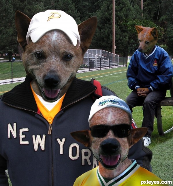
few minor lighting issues here but overall look is great.Play a bit with levels and maybe with photo filter on this 2 nearest dog heads.Or better,add maybe 2 or 3 adjustment layers.My advice for sure is one of them be dark brown color layer with low opacity,this will made blending better.
Gave the two front dogs some more brown, I have a tendency to go to colorful (look at the back dogs hands) so I better stop before they end up looking like a rainbow threw up on them (the front one still cracks me up LOL)
woof woof
They are so crazy...ll...Mad dog team...if u cannot beat them,join them...Great result author...they are so funny...good luck
Very creative and funny and nice 

Poor Jimmy,whahaha,very good 
this is funny stuff. i love the look on poor jimmy.

 Good one. Good luck
 .
.
very nice work....  ... gud luck..........
Funny entry author.good work.
This is great....Good Luck.
 DD those guys r really funny... gl author
wooooooooooooow
Howdie stranger!
If you want to rate this picture or participate in this contest, just:
LOGIN HERE or REGISTER FOR FREE
(5 years and 3634 days ago)
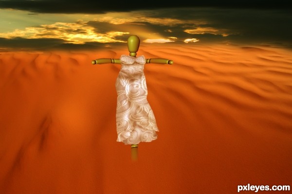
Figure is a giant...scale it down & work on the edges.
The background image is very low quality.
Nice idea and good work 
Thanks, matteo, i changed the bakground, bob, i worked a bit on edges. hope it looks better 
nice work....
nice idea 
NIcely done! GL... 
good luck
Howdie stranger!
If you want to rate this picture or participate in this contest, just:
LOGIN HERE or REGISTER FOR FREE
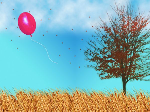
A lost balloon on a windy Autumn day... (5 years and 3659 days ago)
grass looks repetitive.
At first glance, your grass looks like cattails. In fact it almost looks like some cattail tops within. Chopping in some random cattail tops & a bit of green on the lower portion of the leaves could really break up the repetition referenced in the previous comment and add nicely to your composition.
the best way IMO to avoid this repetition is by transforming the sizes.. hope you got the point.. and leave some spaces..
Very nice different image...good luck author
less is definitely more.. good luck author 
Howdie stranger!
If you want to rate this picture or participate in this contest, just:
LOGIN HERE or REGISTER FOR FREE
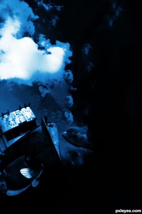
Nice idea, but it would be nice to have more image on the right side. Maybe crop it if your not going to add anything there. Good luck.
Is it just me, or does everybody else not see the stairs? Huh....
@Toothpick: the author used only the sky (I suppose...)
i just don't get when people shoop a picture and use all kind of external stuff and pretty much use the original image as an unimportant part. it seems like the contest should revolve more around doing something to or around a picture rather than taking it apart.
just sayin :p
75% stairs(main object) 15% wall 10% sky
You CBR'd the source! Once again, source image contest you want to keep the original source recognizable. If I have to go to the SBS to find it (which I do) you didn't use it.
I was just hoping I wasn't the only one that couldn't see the source.
Howdie stranger!
If you want to rate this picture or participate in this contest, just:
LOGIN HERE or REGISTER FOR FREE