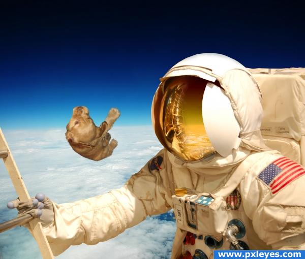
In the space, the astronaut lost the dog for ever!! (5 years and 3904 days ago)
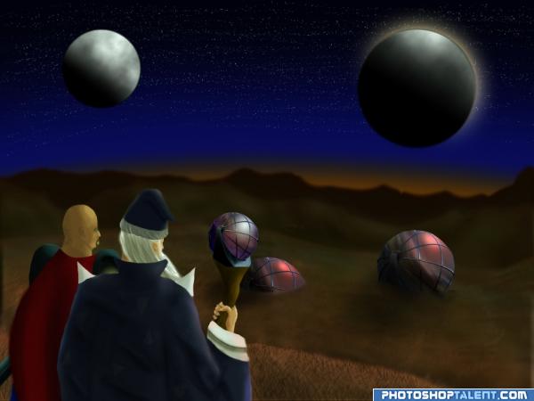
It's a little random, but the moment I saw this image, I got this idea of a lord of the rings/magical land of the lost idea. Don't ask where it came from.
Everything was painted in by hand, except for the source of course.
Let me know what you think, I really do want to know. Good, bad or otherwise, leave a comment and let me know. I love photoshopping, and I'm trying to get better. (5 years and 3932 days ago)
very nice author.. I like the over all feel.. the precision of the edging could go both ways.. I LIKE IT.. hehehe.. might want to move the ball under the wand more into view and give the ball on top of the wizards staff a white ness to match the two moons .. but that is your choice.. the overall effect is quite nice.. good luck
EDIT: Wow..Nice changes... good luck.. it's much much more balanced now.. GOOD WORK AUTHOR
Nice draw!! the only thing i really see wrong with it at first glance is there prbly shouldnt be stars coming through the moons IMHO...Good luck!!
Sweet looks like a book's story illustration, great work!
very neat i like it
Thanks for the comments so far, especially from GolemAura and Jbern. I fixed the problem with the moons and added some extra color effects.
nice mood
Great artwork...!
Great scene, but the spheres dont really look like moons. You could make them smaller, especially the big one. If you change the shadowside color of the moons to the same as the darkblue bgcolor they will look further away. Also the brown color behind the dark mountains looks a bit static, you could make it more interesting.
nice
very nice image. great idea and great draw, u do it very well done. good luck. 
Good job! The large moon looks like a disc, not a sphere, because of the dark edge at upper right. Everything else is fine...good luck.
Congratulations for 2nd
congrats!
congrats!!
Congratulations.
Congrats!
Howdie stranger!
If you want to rate this picture or participate in this contest, just:
LOGIN HERE or REGISTER FOR FREE
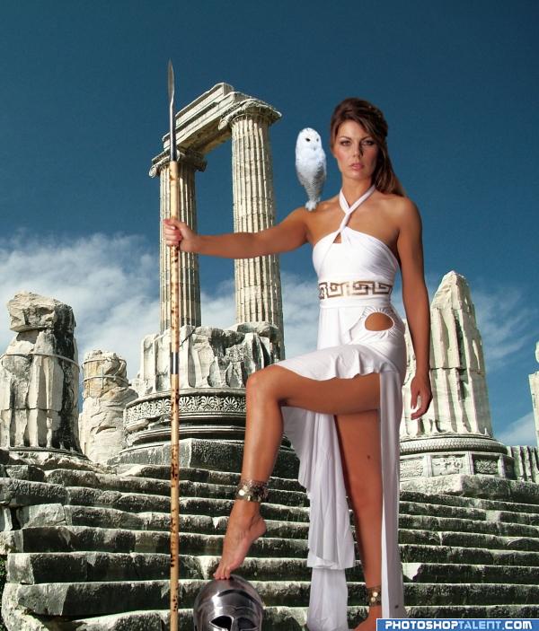
Athena - Goddess of Wisdom, Goddess of Military Victory (war with good tactics and winning strategies, not just fighting, like Ares), and Goddess of Crafts.
Thank you Marcus J. Ranum, dieraecherin and photodreamstock (5 years and 3942 days ago)
Compare your image to the source pic and try to fix the distortion...
Step 3 is better.
The girl is looking quite flat? I agree with CSevrip - stick with the same as step 3. Just refine the edge so you dont see the white outline!
Fine choice of imagery, have to agree that step 3 is looking good
she's stretchy.. Reed Richards in female form...
HUGE IMPROVEMENT.. really has depth now!!! good job author
what they said^^ plus, i don't think the shadow is where it should be.
Oh now it looks fantastic
sorry, was on medication and it doesn't always let me see straight, all fixed now. I got up this morning and looked at it only to wonder how the heck I messed it up so much =0
good work
nice
Nice idea. The owl still looks somewhat distorted (but seeing the original image, it looks kinda weird too...). The light in the background seems to come from up left, so it's unlikely that you see a shadow from her foot on the stairs. Good luck!
this is really nice .. but i think the owl is too small
Good looking image..the only thing that lets it down for me & to echo what reaprevenge said i too think the owl is to small.
owl and shadow fixed
Spear gets lost against column (shrink background and crop). Color hues of Artemis and owl seem inconsistent with background which makes it all look fake. Edge blending issues with her hairdo. Not clear why Artemis is posing in front of ruins instead of college professors, an army, or scrapbookers. While owls are cool, I admit I equate them more with Harry Potter than Greek mythology.
Her face looks way better now, it got smushed last upload! I love this one, reminds me of Jason and the Argonauts.
Howdie stranger!
If you want to rate this picture or participate in this contest, just:
LOGIN HERE or REGISTER FOR FREE
(5 years and 3945 days ago)
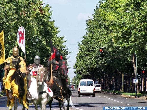
A very good idea, but only one horse has the required number of legs to stay upright. If you have a look at the yellow and white knights horses on your source image, you can see that their left hind legs are partially obscured by their right front legs, both right hind legs are visible as is the yellow knights left front.
no, we have to go now to left!  good luck!
LOOK OUT! 
This is a cool looking image good stuff! but you need to fix the legs of the horses tho

I would like to see whole horses with hooves on the payment so the knights look like they're in the picture, not just in front of it.
good work
Some missing legs added 
Howdie stranger!
If you want to rate this picture or participate in this contest, just:
LOGIN HERE or REGISTER FOR FREE
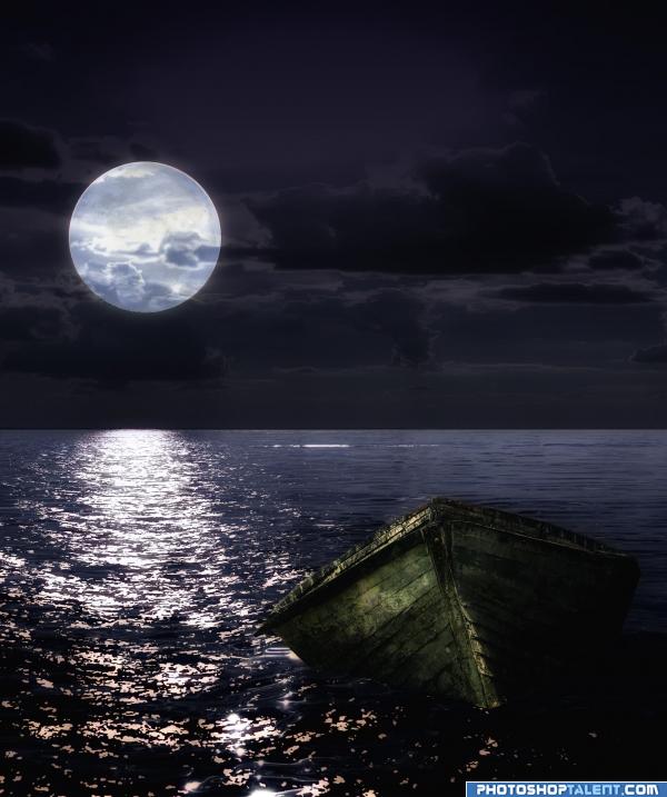
Combination of three pictures.
Thanks to Stock.xchng and ilco and coniferine for the nice pictures.
I have put some clouds in front of the moon. (5 years and 3948 days ago)
good work, but clouds should be in the front of moon.
i love the night ! as was mentioned, the only thing that i can say is to put some of clouds in front of the moon imagining the clouds are moving... nicely done
Very good!
im glad you changed the clouds to infront of the moon  good job and goodluck
Perfect for a wallpaper :P gj
Nice mood from sources.
nice job
nice idea but i think the front of the ship would be in shadow seeing the moon is at the rear .. but good idea
Nice combination. In highres there's a bit of clean up needed (left from the boat), moon is a bit roughly masked. But nice mood and colors. Btw you made the image some longer, no? In my opinion it would work too if you'd cut of some of the right part, so that there's more balance in the image (left the moon and right the boat, now the boat is in the middle). Good luck!
Thanks Waz, it is much better now, imho
nice mood
Very nice.
Howdie stranger!
If you want to rate this picture or participate in this contest, just:
LOGIN HERE or REGISTER FOR FREE
Dog needs a reflection in visor...
I think you would see the reflection of the dog in the helmet head.. you can see the astronauts arm... good luck.. very nice image
It's a pretty strange idea, but i agree with the others, a reflection of the dog is missing on his visor
coool
the reflection of dog doesnt can be viewed because the perspective dont permit... the reflection is the other side...
Nope, sorry...if you can see the ladder & the astronaut's arm, you would see the dog. It doesn't matter anyway, because we'd see the dog's belly in the reflection, and you can't show that.
no, author, your perspection is bad... if the dog is at any positive angle to the surface of anything in front of it that can reflect, it will be in it. if it was a foot more to the right you may be correct, but its not.
Howdie stranger!
If you want to rate this picture or participate in this contest, just:
LOGIN HERE or REGISTER FOR FREE