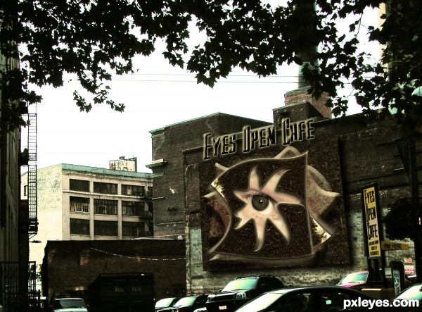
Scanned image of a baggie of coffee grounds (fresh) Chock full of Nuts...My Picture of a back alley in Seattle, basic PS WORK, My picture of an eyeball (5 years and 3434 days ago)

Thanks MAXFX. (5 years and 3489 days ago)
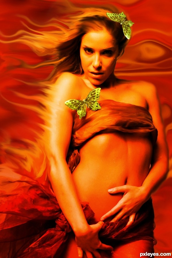
I like the way her hair blends into the fire...great pic.
very good, i like it good luck!
Nice work! GL!
Great job author...very well done
Howdie stranger!
If you want to rate this picture or participate in this contest, just:
LOGIN HERE or REGISTER FOR FREE

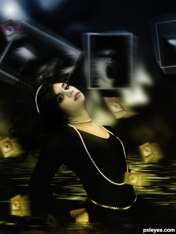
A mix of a lots of stuff that live deep down in the museum of our minds. (5 years and 3627 days ago)
Nice work, quite surrealistic  . I suggest to make the water surface around her to be more consistent in sharpness, look like the water in front and behind her are not continuous. Also, seems like you used only ONE WORD for searching in Flickr, but the contest rule mentioned that you have to use TWO WORDS.
I've used two words: the word "dark" and the word "girls".

I am going to sharp a little bit more the water and see how it turns out...
Thanks a lot.
cool one author!
Our mind can play a trick on ourselves! Nice entry, I like the colors. 
luv da colors.......its grt...wrk.....
hot hot hot...great composition author...well done
scarily seductive....... Very well done 
Howdie stranger!
If you want to rate this picture or participate in this contest, just:
LOGIN HERE or REGISTER FOR FREE
hahahahahaha...unique idea author...gl
That is interesting, well done! I have one suggestion though, for the bevel highlights on your overlapped shapes on the wall, try using a different blend mode or colour so that the highlights don't look so whitish. At the moment they look like they're kind of floating on the wall. Same goes for the main cafe text. Good luck !
Awesome SBS, but the coffee grounds are so dark, they are very hard to make out, and the tree leaves look black.
That was the idea MAD, I wanted it to look like it's a 3D floating sculpture (letters and all).. and MossyB, if your monitor is on the wrong tilt it's very dark.. but the High Res you can see the coffee quite clearly, (the original back alley picture is very dark as well and the leaves were very black to begin with.. )

thanks for the help, I'm glad you like it
Very nice signage. I wish it was a little easier to see. Graphically very well done. Good luck!
Clever concept and great scan idea.
Eye can relate!
Howdie stranger!
If you want to rate this picture or participate in this contest, just:
LOGIN HERE or REGISTER FOR FREE