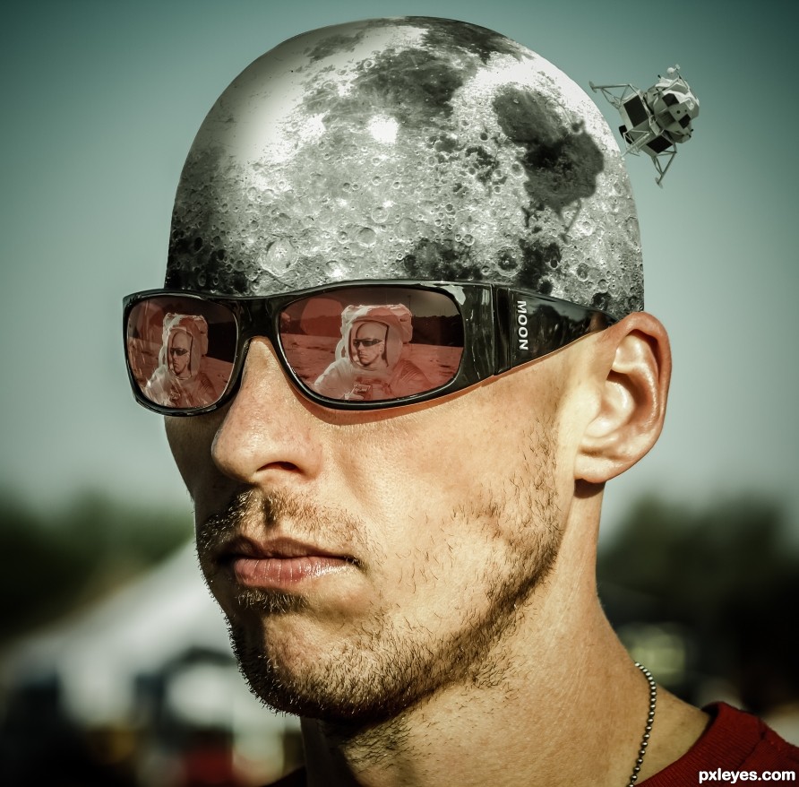
You can explore all you want but I won't let you in. (5 years and 2504 days ago)
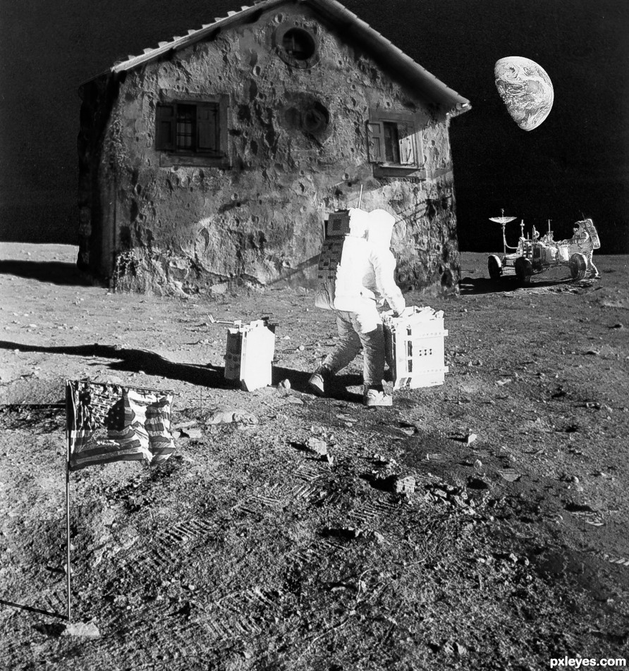
(5 years and 2542 days ago)
Shadows of craters on house don't match light source.
Thanks, fixed.
There should be more contrast between the light and dark areas on the house to match the other elements.
The house is made of moon substance and note that the moon doesn't reflect light the same way that man-made substance does, not as much contrast.
Congrats on this 3rd spot 
Thanks!
Congrats once again Randy!!
Thanks!
Congrats>
Thanks!
Congrats......!
Thanks!
Howdie stranger!
If you want to rate this picture or participate in this contest, just:
LOGIN HERE or REGISTER FOR FREE
(5 years and 3106 days ago)
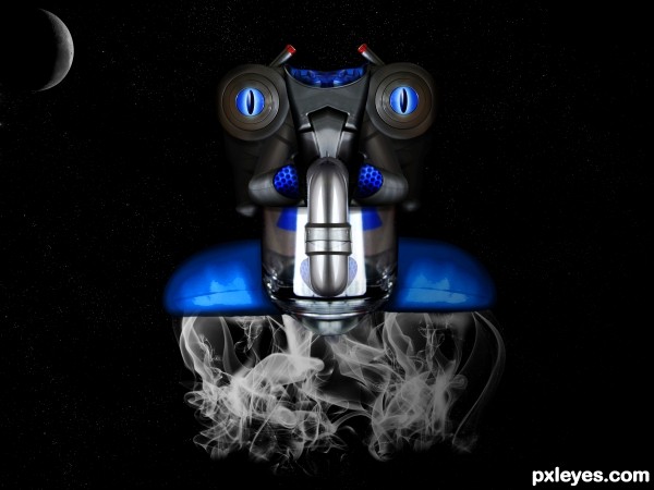
nice entry.just a personal opinion, your vacuum creation and moon fight for visual attention. Soften the moon to the background more.
fun work author , love the eyes.
GREAT CHANGES AUTHOR, much better. 
thank for you opinion
should be flames coming out...not just smoke... but the render of the Bot is fantastic! 
Congrats good work !!!
Congrats
Howdie stranger!
If you want to rate this picture or participate in this contest, just:
LOGIN HERE or REGISTER FOR FREE
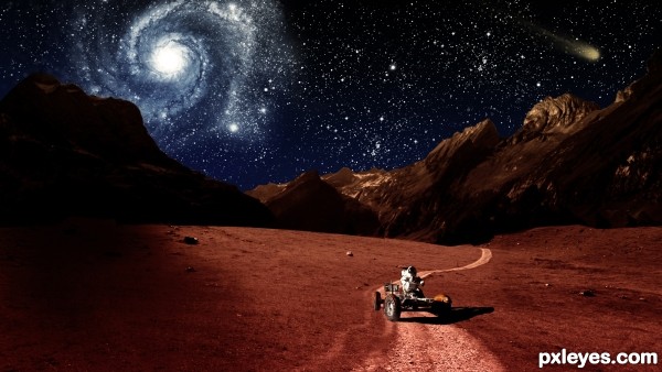
The planet Mars, crimson and bright, filling our telescopes with vague intimations of almost-familiar landforms.
Using NASA Imagery
http://www.nasa.gov/audience/formedia/features/MP_Photo_Guidelines.html
(5 years and 3282 days ago)
Link 1 doesn't work.
Thank you! It should work now.
Fixed now.
would be nice to see a SBS or hi-res
Author this is cool work with a lots of potential and just few tweaks are needed to become awesome...First thing, Nebula is closer to the left side of the mountains but they are in the dark, light them just and u gonna get more realistic and effective image...also u have to blur just a bit edges of the mountain between them and the sky because now is to sharp and look a bit copy/paste...U could tone down a bit brightness of the stars because now IMHO they are to bright and they create small distraction from the main part...Sorry for the nit picks and best of luck...
I love criticism of my work. It's the only way i can improve my work. 
Thank you. I'll let you know when I have made some changes.
I think your lighting is just fine the way it is. 
I think it looked better before you darkened the sky. The thin atmosphere of Mars would offer spectacular night skies.
i agree it looked much better before
Version 1 back!

Thank you! 
Howdie stranger!
If you want to rate this picture or participate in this contest, just:
LOGIN HERE or REGISTER FOR FREE
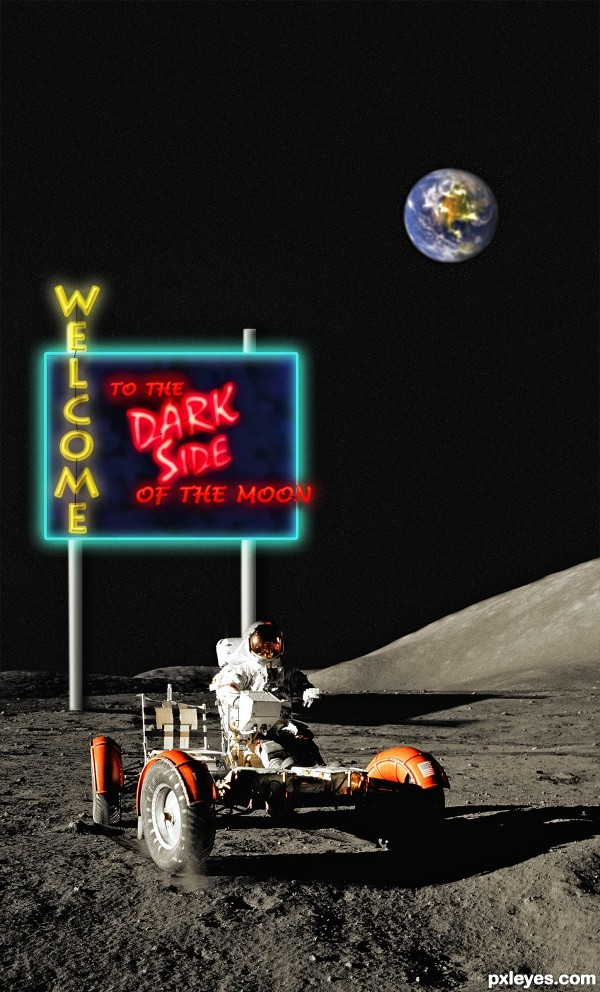
Sign drawn with Photoshop. (5 years and 3327 days ago)
Either this astronaut built and put the sign here...or he has some unexpected company...either way...
Good job but I think the Earth would be bigger and maybe not as blurred.
Very good.............Good Luck..
Great thinking author...well done
Fun concept!
Congrats...
Congratulations!!
Congrats Ichappel!!
Congrats!!
Congrats man 
Howdie stranger!
If you want to rate this picture or participate in this contest, just:
LOGIN HERE or REGISTER FOR FREE
This is so cool! Great concept. Well executed.
Thanks, appreciated!
Congrats once again Randy!
Thanks!
Howdie stranger!
If you want to rate this picture or participate in this contest, just:
LOGIN HERE or REGISTER FOR FREE