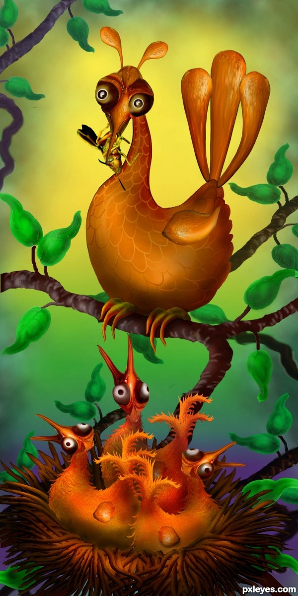
No outside sources used. Birds are made from parts of wasp which they are now eating for lunch! (5 years and 3160 days ago)
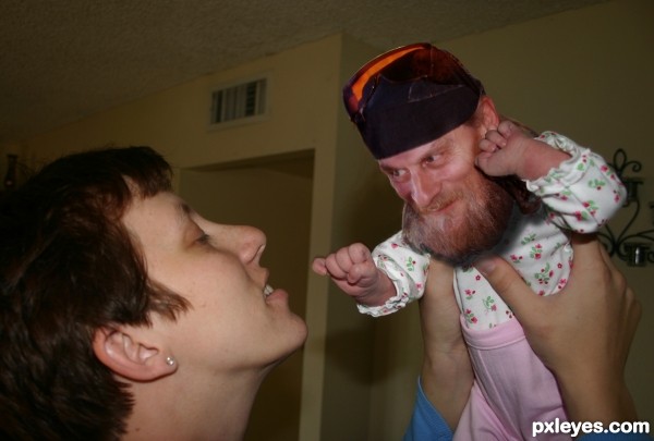
I miss ya Bro! (5 years and 3318 days ago)
Sorry about mixing it up all. I need to learn the ins and outs of the copyright flow.
Well done, the site line is perfect!!! he really looks like he's looking at the mom
Thank you Drivenslush; I love it when a plan comes together... lol
This is so great author...ultimate humor IMHO...well done
Howdie stranger!
If you want to rate this picture or participate in this contest, just:
LOGIN HERE or REGISTER FOR FREE
(5 years and 3402 days ago)
this is cute
this is cute
nice one!
i like!
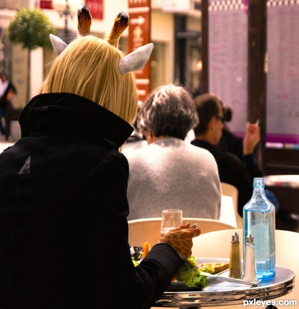
Nice idea, and it is all blended well. Not sure about the giraffe having fingers... but I guess it's a bit hard to hold a fork with hooves 
Great idea, author  ,
,
Very original and subtile  Good luck author
VERY CLEVER IDEA! 
very nice neat work...best of luck author
Cool! 
Congrats for your second place!
CONGRATS!!!
Well done on your second place!
Howdie stranger!
If you want to rate this picture or participate in this contest, just:
LOGIN HERE or REGISTER FOR FREE
(5 years and 3416 days ago)
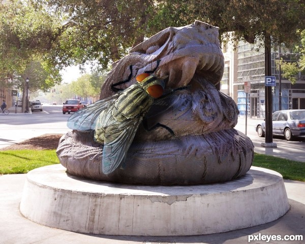
Great entry. Perhaps the fly could stand out from the statue more though? I actually missed it on first glance. GL author
The fly needs a shadow.
Don't change a thing! The fly is perfect, in that it DOESN'T jump out at the eye. Flies are like that when they are "normal" sized.
The fly has a shadow on the statue. Possibly a bit more for the bottom of the wing on the right, but otherwise the perspective is spot on.
I especially appreciate the translucence of the wing on the left, showing the road behind it.
This is delightfully "icky!" The only way it could have been better would have been if the statue was a stone hamburger or something. Very nice work!
There is a bluish fringe where it hasn't been extracted from the source image properly... and there's also an issue with light direction and the 'footing' of the fly on the statue... other than that, it does need a shadow but more a 'profile' added to the shadow being cast on the floor...
EDIT: the flys shadow would actually need to be profiled on the shadow being cast on the first flat surface... not the floor...
Ha, fitting, that statue does kinda look like poo at first glance, is that why you titled it Lunch Time? hehe. Good idea!
Fantastic! Well done. Fav from me!! GL 
Creepy fly! 
very nice detailed work...gl
Congrats for your third place, Rick!
And congrats to you too!
Congrats to you 
Congrats...
Congrats...
Congrats!!
Howdie stranger!
If you want to rate this picture or participate in this contest, just:
LOGIN HERE or REGISTER FOR FREE
(5 years and 3435 days ago)
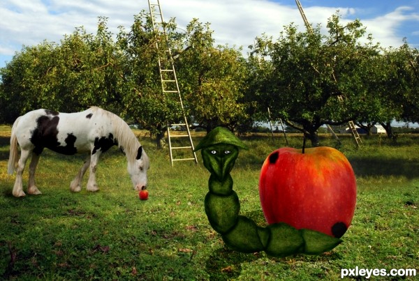
You added a shadow for the worm but you've forgotten the horse's one >.
nice concept, but I would blur a bit the shadow of the worm and add a shadow to the ladder 
The worm's face reminds me of the Grinch hehe. Interesting piece.
Howdie stranger!
If you want to rate this picture or participate in this contest, just:
LOGIN HERE or REGISTER FOR FREE
Funny image, but I'd really get rid of the different clouds background. It's too recognizable as standard clouds render and imo wont support your own creations. Good luck!

EDIT: background looks better this way, imo
CUTE!
Will see what I can do with the background, Wazowski. Appreciate your advice!
How Cute!!!
ooh... another cutey! ... only suggestion, make the wings less sharp and a better blending to the bodies
super cool funny image author...great usage of the source image...best of luck
Funny & original
Awesome!
Adorable - love this concept! Love your colors for the 2nd background.
The early bird catches the first wasp, he-he-he
Yuk! I don't think I'll be early then!! lol
Thanks for the kind comments everyone.
Congrats!!
Howdie stranger!
If you want to rate this picture or participate in this contest, just:
LOGIN HERE or REGISTER FOR FREE