(5 years and 3590 days ago)
- 1: Busy Bee
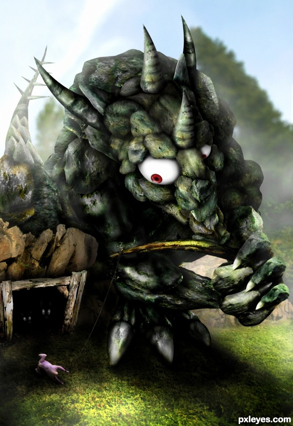
Credits to foxstox and temabinastock on Deviantart.
(5 years and 3600 days ago)
magnificent author
nice 
Great job!  Some sbs would be nice
why doesn't the monster just eat the Chicken?... hehehehe.. great job
Now this is greeeeeeeeeeeaaaaaaaaaaat 
amazing  FAV
FAV
Oh, that´s so cool. Very good blending. I like the effort and sbs as well, nice done!!!
wow ! impressive work , well done 
Its lunch time.  Great work author
Pretty cool chop.Blur the tail a little bit and will be perfect.
Great job author...I like the details in the construction and lovely imagination.High marks from me and fav of course...good luck
Make the string a bit more visible, and the background tree a slightly different green than the monster, to create depth. Otherwise it's a great job! 

Thank you guys, I've made some changes according to Jaskier and CMYK46  . @Drivenslush: 2 foxes are better than a chicken in both quality and quantity, my stone dragon learned the basic Maths and Economics
That's cool funny!  I love it...
you are amazing
Amazing work author. Good luck.
up...up....up....and never look down.......... An amazing work........ No ..... An outstanding work...... And i would like learn something from here,,,.not maths and economics...  .....
..... 
awsome 
lol cant stop looking to this work , gl author
excccccelent job
lol I love it great chop Author
nice idea......... 
really great stuff
Good luck to you, very nicely done.
AMAZING... what else can i say...
Congrats for your first place, Langstrum! 
Congrats for your first place
congrats.....
Congrats langstrum, great job 
Congratulations for 1st
congratulations!! for good work....
Thank you all very much 
Congrats for the first ! 
Congrats on 1st place my friend!!! very well done!
Congrats!!!! 
congrats dear.... this week is yours..... 
Congrats!!
Howdie stranger!
If you want to rate this picture or participate in this contest, just:
LOGIN HERE or REGISTER FOR FREE
source only (5 years and 3614 days ago)
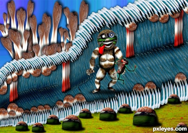
cool shapes author...damn u use tree to look like a hairs...he,s face is just fantastic,but body looks like Ron Jeremy...lol...best of luck
hehehe.. I reduced his size specifically because he looked so hairy.. EEKKKKK LOL
HR is amazing =P
Thank you Sophia (HR is much better then the thumb)
Haha, great ! 
fantastic work.... (you are amazing) 
smoke and mirrors Anoop... smoke and mirrors (thank you.. means more then you know)
He's still a gorilla (I mean hairy)... hehehe... 
Howdie stranger!
If you want to rate this picture or participate in this contest, just:
LOGIN HERE or REGISTER FOR FREE
Source Only
(5 years and 3627 days ago)
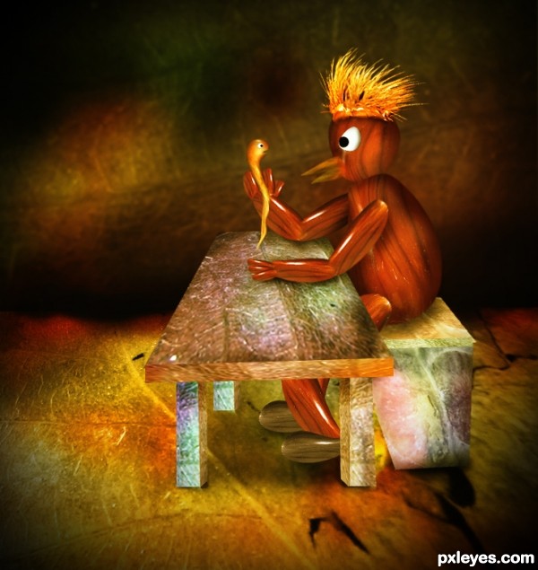
Funny image, but table & bench have no thickness.
Hmm, bench has a little thickness, but table is totally flat... But the concept is very funny! 
Thanks for your great advice, I have made fixed my entry as per nitpick. 
lol cool bird, too bad for the worm. good luck

looking better 
fantastic work...  GL
GL
very very nice work...good luck author
Much better now that the table is thick.. great job
Howdie stranger!
If you want to rate this picture or participate in this contest, just:
LOGIN HERE or REGISTER FOR FREE
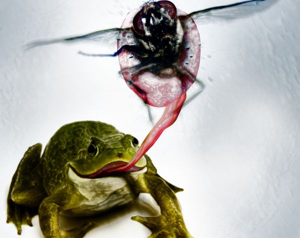
Nothing better on a warm summer day than a fresh bit of lunch.
Please view in hi-res!
Special thanks to topfer, frecuencia, coscurro, krits on sxc for their fantastic stock photos! (5 years and 3629 days ago)
Your main problem is the source for the fly is the photo with shallow DOF but the frog's one is not. Imagine that if you place anything behind the fly, it will become blurred (so your image is wrong in term of DOF, Depth of Field). You can fix that by blurring all the area behind the fly or re-create the blurring part of the fly (mush tougher). However, the idea is very good 
Langstrum is right about the source and DOF, however IMO I would perceive the blur of the fly (legs and wings) to be motion blur. The fly would be the only thing moving rapidly at that point, so although closer would be the most blurred.....Great entry 
thanks for the comments!!! ;] Geexman is correct that the legs and wings of the fly are from motion blur, as you can see in the source for the image... I do understand what you are saying about the DOF but i think that i have created the depth needed with the small amount of blur i have added to the frog and tongue already... they would be relatively close as a frog's tongue would be no more than a few inches in length. I appreciate your time viewing my image!!
I see what Langstrum is saying, but I can forgive any problems with the DOF. The picture is meant to look cartoony and caricature-like from the start so I don't think the DOF is too much of a problem.  IMO, of course. Very creative and very well executed. Good luck, author.
I think this is a great image...good idea and well executed..GL!
cool execution!
I like this one! It looks like the fly was smashed against a piece of glass. I especially like the spit/guts spraying... Nice idea, and nice job on it. Maaaaybe you could add a small shadow (burn) between the two tongue pieces, to create a shadow above the top one. Just a thought. Great work and good luck!
lol this is great . Looks like the frog is enjoying the splat.
nice image ... imo ithink DOF is OK because if the eye OR lens is focused on the frog, then what is behind AND in front will be out of focus, in re-creating a photo-realistic image - well done ...it's all down to ISO, shutter speed, etc.
I like this one, I think it's funny, and well done. This would not have came to mind for highspeed motion, so this is very clever hehe.
Funny and creative..... and GL .....
good one 
congrats! 
Congrats  .
.
congrats 
Great!!
congrats good win !
Congrats! 
Gratz!! I'm sure that frog is happy.  I doubt the same could be said for the fly.
Howdie stranger!
If you want to rate this picture or participate in this contest, just:
LOGIN HERE or REGISTER FOR FREE
Nice...
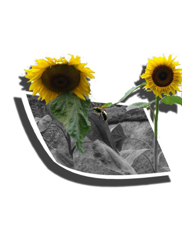
the idea is nice, but you get the full effekt if you only shadow the sunflowers into the pictureas well. Also, don´t have so dark shadow on the sunflowers outside the picture - for two reasons - it´s not nescerrary when the background is such a space, and also doesn´t lift the cropping so much as now. Give the wasp a small shadow also.
GL
idea is perfect author,but u have to work a bit more on this.First thing is bad sunflowers crop-ing,use pen tool,with this u will be way more precise.Second thing are shadows.Make tiny shadow under the picture frame and watch at sunflowers,in source image light coming from the left front side,so shadow need's to be behind the sunflowers but right from them.And IMHO maybe would better if shadows are not intense like they now...I will hold my vote because i like the idea so much and will wait for some improvement...Good luck
where do I go to mention the author's name? please help me
stock Photo by tiwi
you can mention it in your description......... (sunflower is still a bad cut... you can make it up..) good luck
good idea................
Nice idea....gl
cool
Howdie stranger!
If you want to rate this picture or participate in this contest, just:
LOGIN HERE or REGISTER FOR FREE