Photoshop Pictures: Lurks


results 1 - 2 of 2

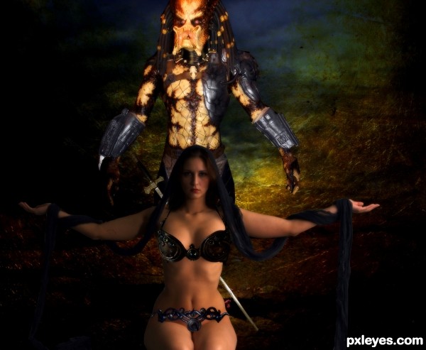
danger lurks - created by SHIPLEYGIRL


danger lurks
Favs: 0SBS: 2Hi-resRank: 5/6Score: 59.4% (0)7868 views

thanks to marcus j ranum
Colourize-Stock,MD-Arts
penywise ,muttstock
fantasystock


if anyone is interested in using the predator pic i have a better one and i dont mind .because i have a hard time finding pics like this one.we took them on a trip to gatlinburg tn wax musuem (5 years and 2645 days ago)

7 Sources:

avatar rjapzdesign

Nice work, where did you get the girl photo Shipleygirl.

author says:

deviant art i posted link and thank you

(5 years and 2643 days ago)


avatar Christy
Christy says:

Creative image, I did notice the girl's head is blurry but her neck and below isn't blurry at all. Her arms are also blurry. The pieces you are using to cover her 'lady parts' need to be blended more to make them not appear as if they are floating above her 'lady parts'. You need to mess with the perspective of each piece so they appear as if she's wearing them. Good Luck

Howdie stranger!
If you want to rate this picture or participate in this contest, just:

LOGIN HERE or REGISTER FOR FREE


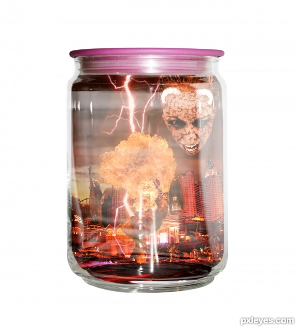
Beware of the evil that lurks - created by abby182000


Beware of the evil that lurks
Favs: 0SBS: n/aHi-resRank: 6/6Score: 51.4% (0)9947 views

Enjoyed this quite a bit; however it proved extremely challenging and almost beyond what I have taught myself in photoshop. I kept with it.

Please comment to let me know what you think!

Thanks (5 years and 3339 days ago)

7 Sources:

avatar pearlie
pearlie says:

I like your concept, however the main part of the jar appears to have no thickness. If you could move the images 'inside' up from the bottom and in from the sides to give the glass more dimension, it'll be more believable that these are in the jar. I'll wait to vote - GL!

edit: yes, that's lots better! now, if you can move the image inside to the right a tiny bit to make the glass thickness a little more even, and bring up the opacity on the sides like you have the bottom of the jar, that will be a huge improvement!

avatar wazowski
wazowski says:

Apart from what pearlie said, I think it will help too if you remove the dropshadow. Right now the shadow makes it flat. Good luck!

author says:

Thanks pearlie I went back and brought the image in so that it gives the glass more dimension. I also added a few filters to give it a distorted look like real glass does.

wazowski that you so much I also removed the dropshadow and I think it looks better!

I love comments since I may think something is done only to find out I may have missed something small. Helps me get better. I appreciate it.

EDIT: Brought the inside image to the right a bit and raised the opasity just a tad. Thanks again pearlie

avatar erikuri
erikuri says:

Different and modern approach.

Howdie stranger!
If you want to rate this picture or participate in this contest, just:

LOGIN HERE or REGISTER FOR FREE