(5 years and 3457 days ago)

(5 years and 3461 days ago)
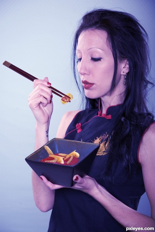
Chopsticks need a shadow also. (Pauzinhos precisa de uma sombra também.).
Very creative and fun concept, but the chopsticks are too small (and need a shadow as CMYK46 noted). [I'm afraid my português is very weak so I can't provide a translation like CMYK46 did.  .]
.]
I use this for translations, Dan.
http://translation2.paralink.com/
They look al dente. a lot!
Good idea agree with cmyk46 about the chop sticks. They are floating a shadow will make them look more natural in the image. Good entry.
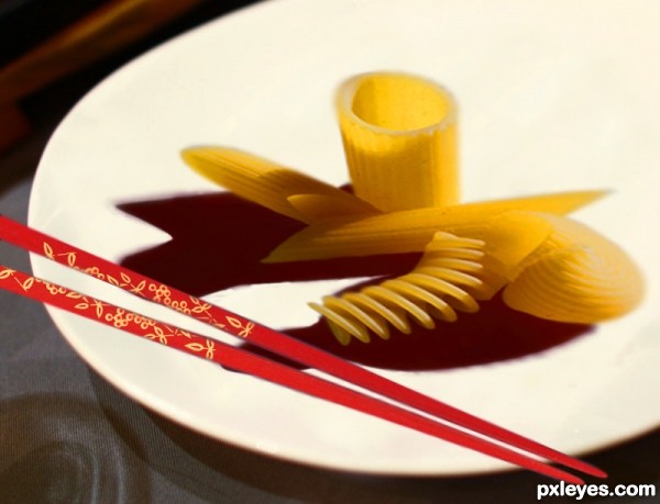
Not bad. I think the pasta is a bit distorted though. I would suggest resizing it using the transform tool by holding the shift key. GL !
(Não mal. Penso que a massa é um bocado alterada embora. Eu aconselharia alterar o tamanho dele usando o instrumento transformar mantendo a chave de turno.) 
Pasta looks a tad...odd. Chopsticks look out of place. The idea is good.
Howdie stranger!
If you want to rate this picture or participate in this contest, just:
LOGIN HERE or REGISTER FOR FREE
The woman's skin tone is too cool and blue looking, while the pasta is too warm toned. I'd suggest warming the skin tones with a warming filter layer.
It's an Asian Marilyn Manson
Howdie stranger!
If you want to rate this picture or participate in this contest, just:
LOGIN HERE or REGISTER FOR FREE