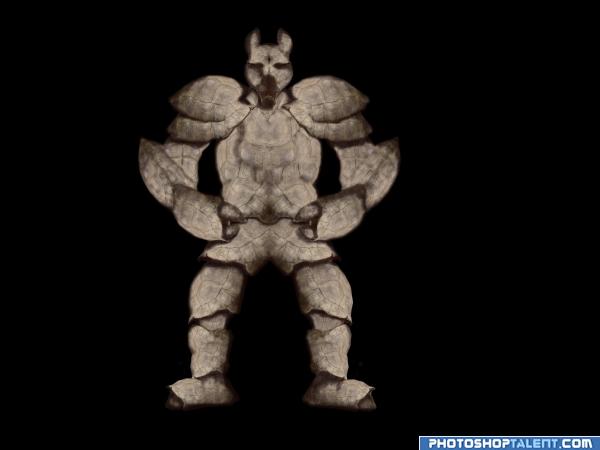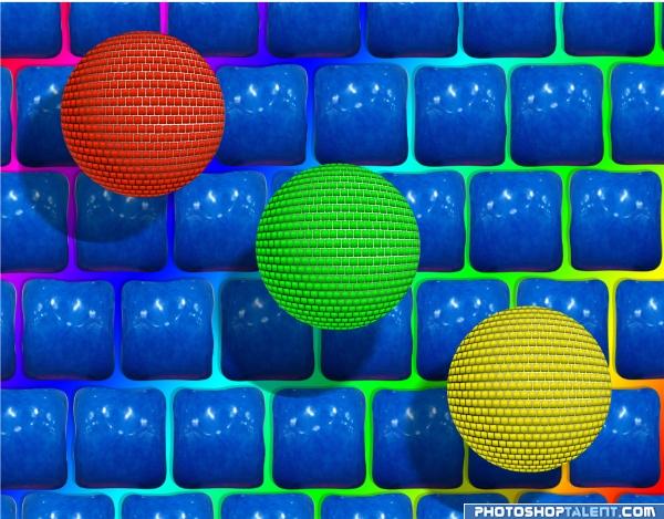
Well not one of my best work... And looks unfinished... But alas I don't have no more time T_T
Used only the source images... Will Include a sbs soon... (5 years and 4048 days ago)

wanted to make something simple and stopped before I ruined it :)
simple constructions but a nice effect I feel (and FILLE you are a WISE BUTT.. hehehe) (5 years and 4060 days ago)
Nice idea is very cool ..Good luck!
hahaha, shadows are not correct  very great! good luck!
nice Idea ....waiting for SBS....
is it something like disco balls? or just balls? or neither? i like tho...GL
I like it! GL 
good luck and i like it =)
Nice background  . The spheres are not bad, but for some reason it still misses some kinda depth. If I see your step 1 the left part of the image looks way rounder than what you finally made. I think it has to do because you still see too much from each of the squares in the final image, while it should be more distorted. What you cà n do is take those original squares, make a sphere with them and ie with liquify push more of these squares together around the egdes, so you get a more distorted effect...if you'd like that. Good luck!
I can guess who made this one!! GL.
Interesting shapes. The lighting on the blue squares is a bit too uniform perhaps...and wouldn't be lit where the shadows from the spheres fall...
very interesting...im not sure wat exactly it is but it sure is eyecatching! Good Job!
nice one.. u got to work on the shadows, from the direction of the light u have used, the lower ends of the ball should be dark.. gl 
nice
Very nice!!
I like this, nice work 
giggle.. 
It's a cool looking image  If I can make a suggestion: The shadows of the balls (globes) on the background need a little adjustment - there would be no shadow in the gaps of the square blocks - I think it would make the background look less flat then. Just my opinion
Nice art.
creative and well done
I prefer the squared gum over the balls, so this is awesome, lol!! Good luck! 
Nice entry, to criticise a little I would suggest adding more shadow on the globes 
nice
I like this for its richnessof color...the little kid in me.
pretty colors
very nice
nice
Very striking! More daring shadows over the balls! Good luck!
Nice. Good Luck
Howdie stranger!
If you want to rate this picture or participate in this contest, just:
LOGIN HERE or REGISTER FOR FREE
can't really give suggestions at this late of an hour..just say good luck and hope for the best.. the background is a bit dark... good luck
@GolemAura hehehe I know... I thought of making a diff background... But I was procrastinating... And when I started working only 3 hrs something left
Idea is good, need to improve
Oh damn... I forgot that one couldn't edit one's entry after the submission timeline is over... I wanted to include an sbs, but alas it's too late T_T
Howdie stranger!
If you want to rate this picture or participate in this contest, just:
LOGIN HERE or REGISTER FOR FREE