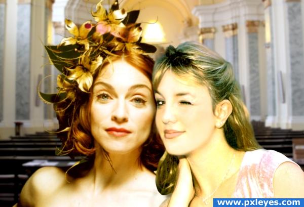
Leann Rimes and Suri Cruise by Raphael (5 years and 3180 days ago)

(5 years and 3338 days ago)
very cool pop art author...gl
wheres the birthmark authorrr?? lol..beautiful image
Congrats!!
congratulation...
congratulation...
Congrats on your win
Howdie stranger!
If you want to rate this picture or participate in this contest, just:
LOGIN HERE or REGISTER FOR FREE

This idea came out of the blue! Just finding the right image, thanks to PXL stock, made it happen rather quickly. I hope you enjoy it as much as I do!
The only sources used were the contest image and the stock image. See SBS . (5 years and 3830 days ago)
Very pretty, good luck.
Nice job...please list source for small crosses.
good job
Thankyou for the comments......CMYK, the crosses are self made. Check the SBS (which was probably not finished when you looked at this entry)
Extraordinary!
This is great work,well done author...
Beautifully well done...
Excellent use of the source.
Beautiful entry! 
Congrats 
Howdie stranger!
If you want to rate this picture or participate in this contest, just:
LOGIN HERE or REGISTER FOR FREE

old passion????? (5 years and 3916 days ago)
might want to blur madonna a bit to match britney's blur.. but heck in a hand basket.. working with two different web pics is a bluddy night mare.. good luck on this
To me, this looks more like a mildly edgy pose than a couple. Better matching of the skin tones/textures would not change that fundamental fact.
DanLundberg britney is blinking the eye and thinking she´s mine  , the skin tones will never match madonna is mutch more white then britney ,i think what doesn´t match is light is being difficult to fix that, thanks for tip and help
cool image though a different background would be cool:0
i'm not too keen on the background either, but the rest looks great.
well they already got it on so what the hell lol... guess it makes sense then
ok so i had a different bckround and a little make up to britney hope is better now,thanks for tips
Good change, the background looks good now Hehe 
Howdie stranger!
If you want to rate this picture or participate in this contest, just:
LOGIN HERE or REGISTER FOR FREE
Leann's face is off-kilter in perspective, with the face too forward facing, rather than the 3/4 view perspective of the painting.
The retention of the unadulterated third figure highlights both the un-painterly aspects of the first two figures and the incomplete (but already incoherent) overall concept.
Howdie stranger!
If you want to rate this picture or participate in this contest, just:
LOGIN HERE or REGISTER FOR FREE