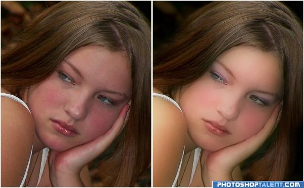
The source image I used is my own. (5 years and 3930 days ago)
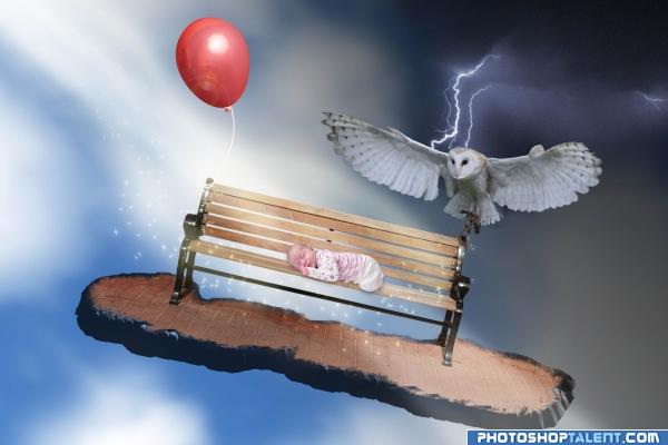
Just a random idea I came up with. Extracted bench with vector mask using pen tool. The "brick island" effect created with bevel and emboss layer style and layer mask. Add stars with a paintbrush and painted in light streams on separate layer and set to soft light. Edited to credit NefaroStock (at deviantArt), I included the link to here and their page. Thanks CYMK46, I hadn't noticed that. (5 years and 3939 days ago)
good
very Slavador Dali' esque..... I like the LACK of distortion or melting.. hehehe.. once you melt something.. Ya GOTTA MELT EVERYTHING LOL... good Luck.. Lots of fun here
great idea! the ground could be a piece of bread, then it would be even more syrreal.. :P
Nice work, really like where you went with this, its like the baby is dreaming of those things 
that looks like the owl from the labyrinth movie with david bowie !! haha miss that movie
Please credit the owl author as per request. I'm not a fan of sparkly fairy dust, but it almost works here...
neat picture.
This looks really good, but I would have used an eagle instead of an owl...for the impression :d but that's just me 
Howdie stranger!
If you want to rate this picture or participate in this contest, just:
LOGIN HERE or REGISTER FOR FREE
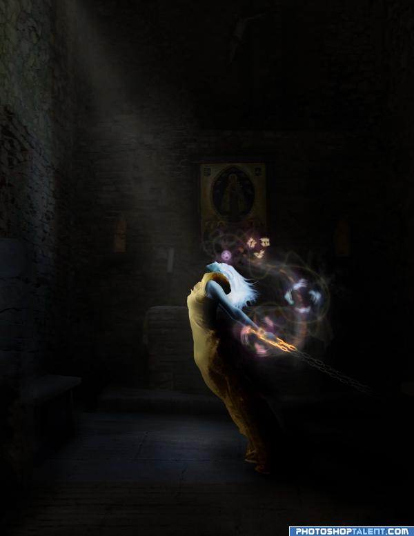
Thank you to Herman Brinkman (hbrinkman) for the medieval chapel shot.
Thank you to Karin Lindtrom (mjio) for the Ruined castle shot.
Thank you to Antje Hilgenfeld c/o CG textures for the old rusted chain texture.
Thank you to Jeff Prieb (ctechs) for the Old Ball and Chain shot.
SBS to follow. (5 years and 3940 days ago)
good work. Atmosphere you created is good, only thing is, too much light on hair. reduce it
Thanks for comment so early but the glow on hair is meant to be from power within. Her hair is not being lit by the beam of light.
I really like this .. and I usually shy from bondage images.. to much emotion.. this has just the right touch.. (I like the glow.. shhhh.. dont' tell gopan..hehehe)
Good Luck 
great choice of colors
Sampson's sister? Very interesting pic. I don't think I'd mess with her. That whole aura of energything is pretty cool.
Great mood here...IMO, make her bigger...so she is the focal point....because the composition is brilliant, but I think it cud be bigger...GOOD WORK :d
cool coloration
nice!!
Howdie stranger!
If you want to rate this picture or participate in this contest, just:
LOGIN HERE or REGISTER FOR FREE
(5 years and 3941 days ago)
nice entry!
a very sweet and gentle entry.. THEN BLAMMO.. we are in outer space.. what a trip
idea is ok, but need to improve
nice!!
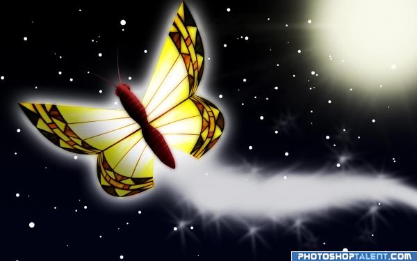
cool butterfly  Does it not need oxygen
I love this 1 but its not the best but good luck
Howdie stranger!
If you want to rate this picture or participate in this contest, just:
LOGIN HERE or REGISTER FOR FREE
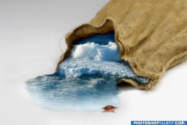
Edit:
Fixed depth (waves,shadows,blur) (5 years and 3945 days ago)
I really like the idea - very creative.. Pay a bit more attention to your depth of field. Your bag opening starts to blur with distance, but the sea within is still sharp.  Nicely done!
very cool.. I could see the water flowing even more toward me, but not necessary and what animmax said..  .. he has much sharper eyes then I do
nice idea, good execution
beautiful image 
Extremely creative. Water flows. I'd suggest making the watter spread out more as it comes out of the bag. I like this. Good Luck!
beautiful...
nice
Nice idea. Apart from what animmax says, maybe the suggestion to only let the lower wave get out of the bag and leave the big wave behind inside the bag. This, since that wave is further away from the opening, you may create more depth this way. I like the seastar in front  . Good luck!
very different concept.......in LOVE...
liked this one.......................nice job......gl
brilliant idea :0 goodluck mate 
Original, but I feel that the shadowline around the water could have been stronger.
Very Creative!! Good Luck
Looks really nice i like it alot. good job 
Howdie stranger!
If you want to rate this picture or participate in this contest, just:
LOGIN HERE or REGISTER FOR FREE
nice work glow added a new look congrats
Image source?
good work
i think the "after" looks too blurry
a bit too smooth to be real, but nice work
i agree the after is too blurry
nice
Howdie stranger!
If you want to rate this picture or participate in this contest, just:
LOGIN HERE or REGISTER FOR FREE