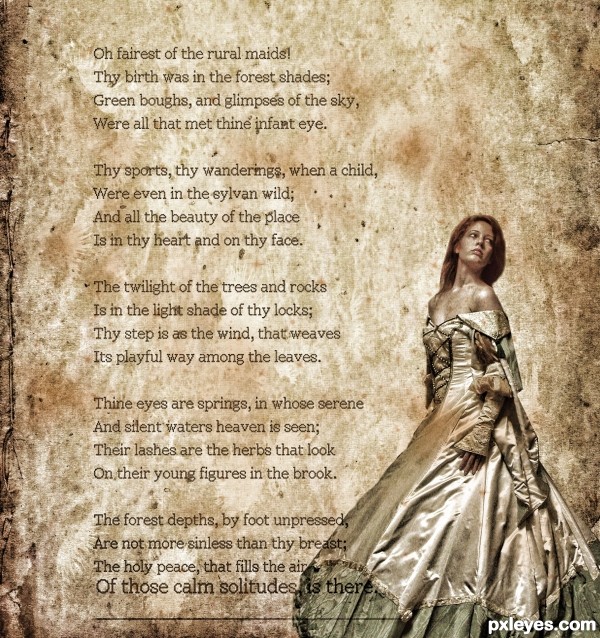
thanks to lockstock,poetry foundation,ba1969 (5 years and 3022 days ago)
- 1: model
- 2: poem
- 3: grunge texture
- 4: brushes
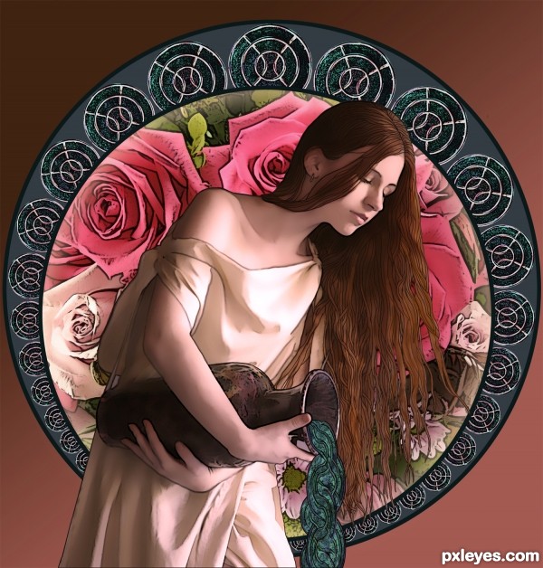
(5 years and 3196 days ago)
Of all his stock, this one is my favorite. I could just never figure out what to do with her. You did and you did it beautifully. Adding it to my favs. If I could add it twice, I would. 
it is amzing
Wow it's so pretty..I love this kind of work...high vote and fav 
Beautiful image, well made SBS...mucha luck, author! 
very nice piece of work !!! love how you've made spilling water ... GL!!! 
Thanks everyone!
Derdevil, the water was the first thing I saw in my mind when I looked at the contest source, imagining "waves" from the curves of the power supply. It took a bit of work to make it look more organic in form, but I'm happy with the way it turned out, thank you for noticing!
Yeah..cool thinking. 
I think that the water was an especially subtle and creative use of the source image. This is a really wonderful piece of art!
Fantastic Work........ Love the concept. Good Luck Author.
Awesome Work!!! Love the SBS, certainly a teaching tool for me! I am learning as I go through experimentation and I don't have photoshop so this entry just amazed me. Then to see the SBS...all I can say is WOW! Good luck, truly a fantastic entry.
The concept is nice and the SBS is very helpful.
Adding it as one of my favorites. Very nice job done.
All the best for your future works.
Beautifully done. Your SBS are very informative. Good luck!
beautiful view, love the ancient Greek mood, good luck 
One of the best and surely a winner for me. Instant fav here author. 
Wow, it looks great. It reminds me of Aquarius image and the effect is brilliant. Two thumbs up - well done
This work is beautiful, and good 


Good job showing something recognizable from the source in an artistic way.
Appealing, but the slightly colorful background, particularly the pink roses, grabs my eye before the water maiden's muted tones.
Although the roses may grab your eye before the maiden, I doubt your attention stays there, since the maiden is in front of the roses...This then pulls your eyes to the maiden, her hair and the pouring water, which then makes your eye go to the circular pattern containing the source image, which is echoed in the water, directing your eye back to the background roses, and your eye begins the journey again...Notice that the pale roses (which match the maiden's dress) are at the bottom. The roses were deliberately rotated to place the colors that way...
That's the concept behind the composition, and why I selected the roses as well as the pink tones - to keep the focus from settling upon the maiden with the background as an afterthought.
beautiful
Really nice work, author, good use of source image. I especially like how you made the water. 
Great clean work....should of been top 3 in my eyes.,
Howdie stranger!
If you want to rate this picture or participate in this contest, just:
LOGIN HERE or REGISTER FOR FREE
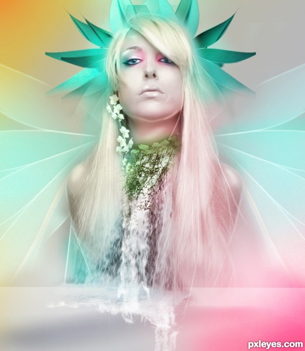
credits and thanks:
http://fetishfaerie-stock.deviantart.com
http://www.cgtextures.com
http://xxmynightmarexx.deviantart.com (5 years and 3301 days ago)
There is a distracting "leaf" above her head to the left (as viewed) that is "chopped off," rather than tapered like the rest. Otherwise, this is a truly lovely chop.
wonderful color palette! really brings everything together and creates a wonderful composition! good luck author!
agree with MossyB, the top leaf should be adjusted. suggest make the leaves above her head a little transparent at the edges -- a little like feathers feel, now abit harsh-stiff...
otherwise, perfect 
agree with MossyB, the top leaf should be adjusted. suggest make the leaves above her head a little transparent at the edges -- a little like feathers feel, now abit harsh-stiff...
otherwise, perfect 
Lovely!
Howdie stranger!
If you want to rate this picture or participate in this contest, just:
LOGIN HERE or REGISTER FOR FREE
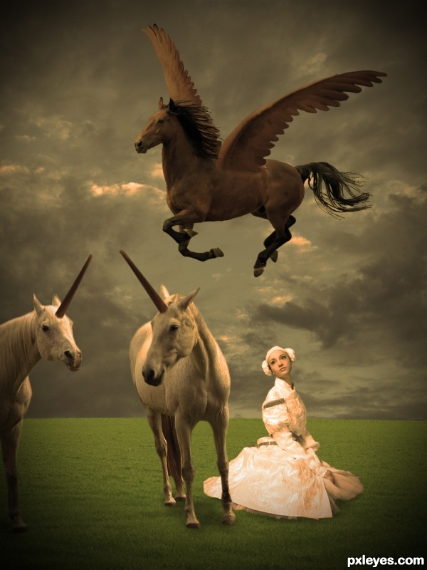
A maiden with mythic creatures (updated).
Thanks to:
- Theheijt @ Stockvault;
- Lara604 and Henrik THorn @ Flickr;
- TACLUDA and scottmliddell @ RGBStock;
- Andrey Kiselev @ Photoxpress. (5 years and 3617 days ago)
Some nice mood. Either the woman is huge or the horses are small. Horns and wings don't blend into horses convincingly. Everything in the composition seems to be equal so I don't know what to look at. Why not put the woman in the foreground at 4 o'clock, the two unicorns together in the background at 8 o'clock, and Pegasus at 1 o'clock (perhaps partially out of frame)? Except looking at light sources suggests that Pegasus could use a horizontal flip.
good mood...
While I love the mood of this image and the colors, I have to agree with DanLundberg about the proportions and the blending.
Would be cool if the pegasus had a shadow, and it looks a bit like the maiden is floating...
Think because of the shadow beneath the dress, what is impossible because the dress is on the floor.
But I like the mood and the surrealistic scene  !
!
Gl author 
Well, I hope it's better now! Thanks for the suggestions. From the middle to the end, I had to redo everything; I didn't know what I did when I saved the PDS file last time, when I opened it again to fix the image... it was lacking a part of the work (no field, no girl... omg!) I think I was sleeping! 
WAY better now !! I'm glad U hadn't vote yet 
GL 
i like this entry (the shadows arent that convincing, but that can be fixed easily! awesome image author!)
I very good entry... I like the mood.
GL Author.
very nice work author...sky looks great and Pegaz is well made...good luck
beautiful .......... 
good and nice and welld one and wonderful and beautiful and.. .. and.. and.., good luck 
and LOL...........lovely mood
Howdie stranger!
If you want to rate this picture or participate in this contest, just:
LOGIN HERE or REGISTER FOR FREE
Thanks to:
- *fetishfaerie-stock (http://fetishfaerie-stock.deviantart.com)
- msmaiden (http://msmaiden.deviantart.com)
- *lilnymph (http://lilnymph.deviantart.com) (5 years and 3973 days ago)
Great image, wondeful use of a very difficult source to work with. Good luck!
Nice image, but there are a lot more colors in the source pic...
I know there were more colors but i wanted it to be green... guess yellow/brown laves wouldn't fit much anyway.
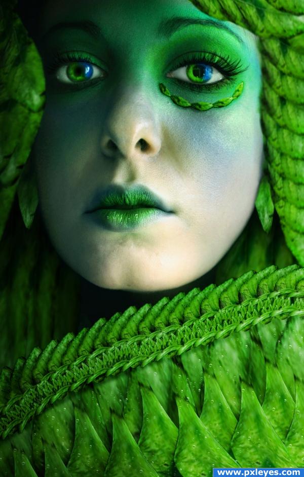
the EMERALD leaves maiden... (throwing rocks instead of kisses.. hehehehe WINK)
she is stitched together beautifully
I like it! very nice.
very intersting!
good image!
great image
Nice job! I like the abundance of green. Especially the lips! 
Congratulations for 2nd
Congrats for your second place, Akassa!
congrats
Congrats!
congrats
Howdie stranger!
If you want to rate this picture or participate in this contest, just:
LOGIN HERE or REGISTER FOR FREE
The mood isnt bad, but please spend some more time to cut out the model better, this is really too roughly done. Also, the begin of the poem is harder to read, cause the background is darker. Good luck!

Edit: looks better already
Nicely set out, paper texture a bit much, sky or clouds would probably gone better, or even a park picture
Howdie stranger!
If you want to rate this picture or participate in this contest, just:
LOGIN HERE or REGISTER FOR FREE