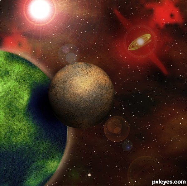
All CS5 No external sources. (5 years and 3319 days ago)
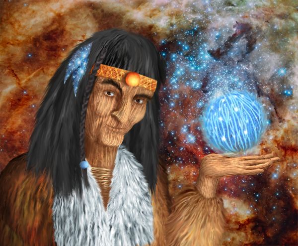
Thanks to hubblesite.org for the background image (5 years and 3828 days ago)
Lovely entry and great idea! I'm totally in love with the two blue feathers in the hair and the sphere. (I love blue, so it's easy to impress me  ) And of course also a great job in creating the person. The only thing, that (IMO) could be improved is the hair on the right part of the persons head above the "headband". It looks like you forgot to smudge a part there. In case you wanted it like that, just ignore me
  Good luck!
Thank you, Lelaina 
Nicely done 
good use of source!! GL
This is great work...maybe the best in this section,love the colors,love the creativity...and one minor observation,his left eye should be sharper,just a bit.....still high marks from me for this great entry
Nice wizard! 
You used some real creativity with this. Loved the way you put this together, GL
Congrats 
Howdie stranger!
If you want to rate this picture or participate in this contest, just:
LOGIN HERE or REGISTER FOR FREE
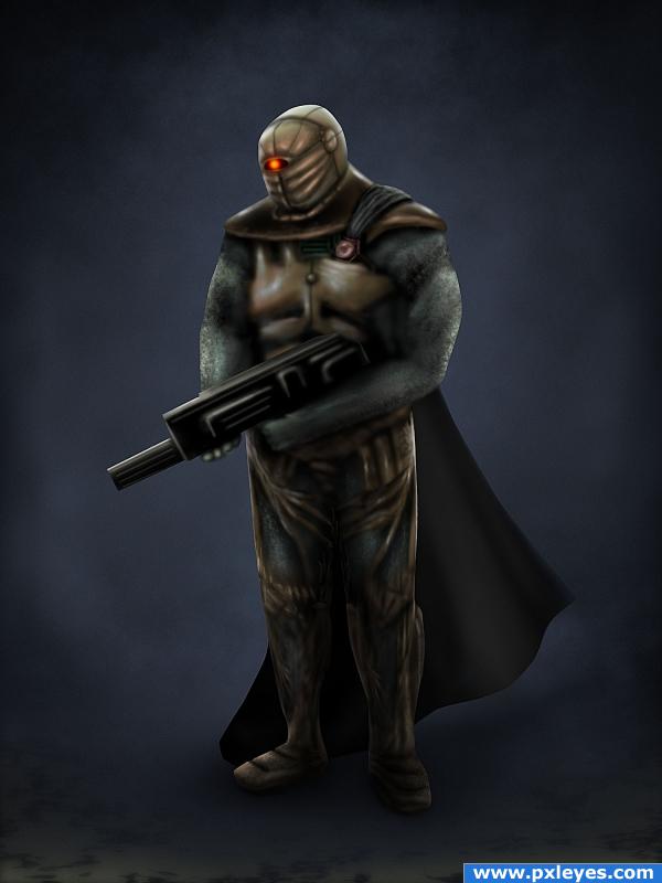
This is a made up character for a made up sci-fi game.
Game Title: Alien Encounter
Sub-Title: The Forgotten
The character shown here is supposedly the alien villain. His goal is to eliminate any species capable of surpassing his technology. Humanity is next on his list.
Everything was painted in Photoshop cs4. (5 years and 4014 days ago)
hey nice work author
Thanks 
very good work and your SBS is very well put together... all the hand work is very much appreciated in understanding how you came about with your image
Thank you GolemAura
very nice charector. good mood
cool
Although some highlights on the frontal area would "round" him out a bit, this is a nicely done character. 
Howdie stranger!
If you want to rate this picture or participate in this contest, just:
LOGIN HERE or REGISTER FOR FREE
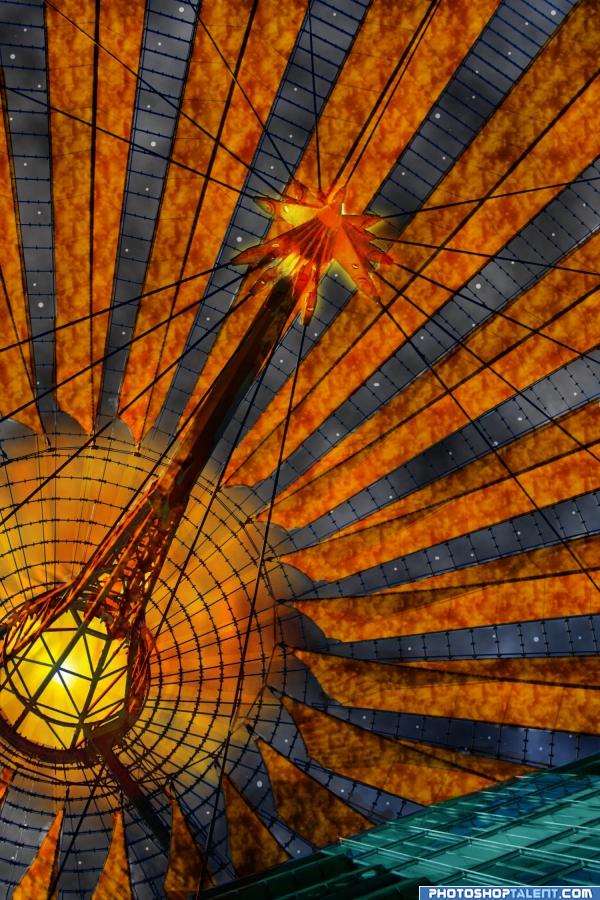
dome reversed in space making stars (5 years and 4037 days ago)
nice work.. good luck
nice colors
Nice.
I like the way you used the colors in this to enhance the composition. 
Great idea for this source...I would take out the building thing at the bottom of the image...good luck 
Howdie stranger!
If you want to rate this picture or participate in this contest, just:
LOGIN HERE or REGISTER FOR FREE
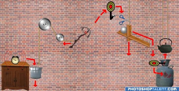
Well, I pretty much ran out of time trying to make it look nice, so here's what I got:
When an alarm clock rings - it crawls down the table (from vibration) and falls into a bucket.
The bucket pulls the rope, which in turn pulls the trigger of a crossbow.
The crossbow releases the arrow, which hits the target.
The target falls, hitting the scissors.
The scissors cut the rope, and a trapdoor falls, releasing the ball on the shelf.
The ball rolls down the shelf and falls on another target, which serves as a lever to the gas bottle.
The gas ignites, boiling the kettle.
By the time you get out of bed your coffee is piping hot!
Once again, I ran out of time, so don't look for nice shadows and stuff )))
PS: used a lot of sources, just for the fun of it. Gas bottle photo is from my backyard. (5 years and 4041 days ago)
Nice idea, would obviously be better if you had more time to finish it off, but nice concept 
Nice image but how does the gas bottle ignite?
Paulus - well, there was supposed to be a match thriggered by the gas tank release.... ran out of time (((((
I would definitely want this! Does it work for tea and hotchocolate as well?! Well done 
I'm more of a tea drinker myself - hence the teapot )) Had to call it 'Coffee maker' to try & please the PST crowd 
good work
nice job 
Howdie stranger!
If you want to rate this picture or participate in this contest, just:
LOGIN HERE or REGISTER FOR FREE
My immediate reaction is 'less is more.' The star with the spiral around it is particularly distracting. The moon has a white outline and I'm disturbed by its crispness against the blurry planet (or is that the result of the planet's atmosphere?) A greater color contrast between the moon and planet would be nice IMO.
Great title, really cool space scene, fabulous SBS! I kind of like the spirally thing, don't find it distracting at all, in fact my eye is drawn to it. The gaseous clouds are a nice touch. Well done, author.
like a scene from Chaining the Lady!!! SAVE THE METAL BOWLING BALL that doubles as a Body Guard! (Love Piers Anthony) hehehe
Fantastic scene author, title is top notch...Usage of the lens flare is perfect...well done
Great SBS, nice dynamic composition, the sun looks really good.
It looks 3D to me. Great job
Howdie stranger!
If you want to rate this picture or participate in this contest, just:
LOGIN HERE or REGISTER FOR FREE