(5 years and 3184 days ago)
(5 years and 3186 days ago)
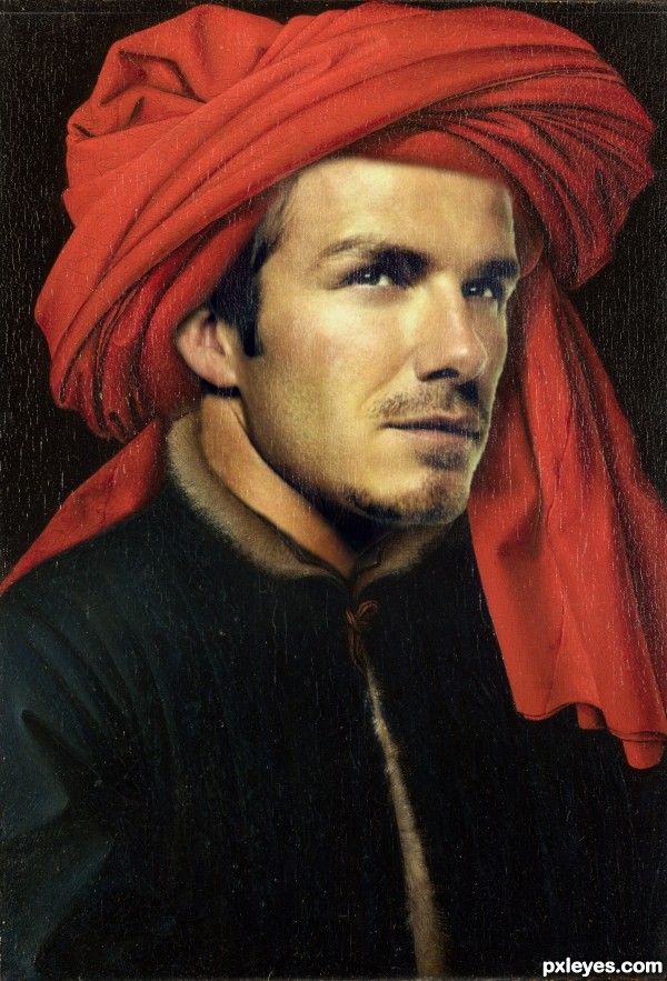
The face is too large on the body. Notice where the chin and the eyes fall in the original portrait.
Great image choice, but the disproportionate sizing makes Beckham look like a bobblehead.
If you overlay both images in Photoshop, the disproportionate size of the face is more than obvious. But some people like bobblehead dolls, and think they look okay too...
@ MossyB
Thank you. I did think it was a bit large and messed around so much i lost sight of things.
Hope this is a improvement......
I don't see a problem with the head size, smaller would not fit the turban properly without adjusting that also. the original man is heavier then the replacement man so Beckham face is longer. looks very good author.
Damn IT!!!!!!!!!!!!
Thanks for the fav Missy 
geez he is a hottie 
great choice ;p
You're most welcome, author, glad I could be of help.
Great correction, very impressive work, now!
NICELY DONE!
Clearly much hotter than the original (but I would like to think the much-younger me was hotter, too  ). The turban's shadow upon his head is too weak, however—see original. Random thought: retaining Beck's cheek scratch might add an interesting edge to a formal Renaissance portrait and provide tension with the red turban. An SBS would be nice, too.
Good work...congrats! 
Congrats!!
Congrats, very well done 
I always hated metrosexuals..but football must have them right ?!
Congrats!!! and would be nice to see a ren with rooney or roy keane as a celebrity 
Howdie stranger!
If you want to rate this picture or participate in this contest, just:
LOGIN HERE or REGISTER FOR FREE
source only (5 years and 3204 days ago)
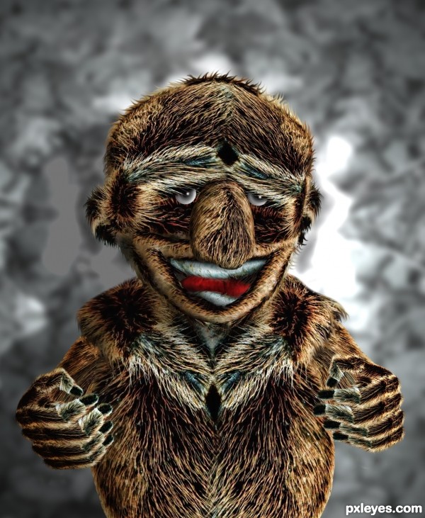
Great job, funny & well done!
hohohohooooo .... Niiice
I going to see this thing in my dreams tonight 
this one sends chills done my back, furry... almost cuddley....
suggest add a wee-bit of fur around the eyes 
Looks really soft and huggable 
good one...
He's like a walking fur coat! Good hands. 
Howdie stranger!
If you want to rate this picture or participate in this contest, just:
LOGIN HERE or REGISTER FOR FREE
(5 years and 3208 days ago)
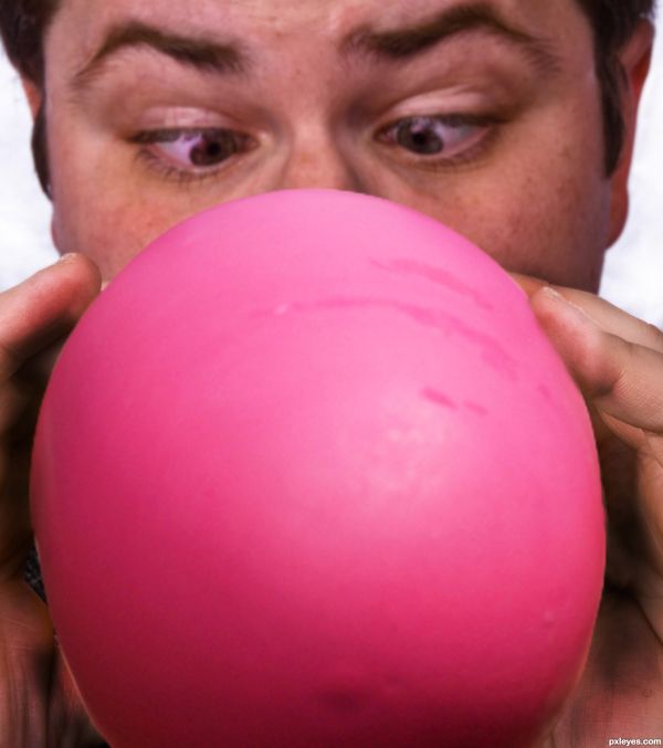
can consider, but not necessary:
1) let the eyes focus at the front, make it bloated (budging or protruded) perhaps can use "spherize" .... as if to say that the eyes are going to explode with the balloon
2) make balloon bigger
3) his face turning blue with effort
Thanks aheman, your comments are very good and I think they would add a lot to my entry. Thank you 
Howdie stranger!
If you want to rate this picture or participate in this contest, just:
LOGIN HERE or REGISTER FOR FREE
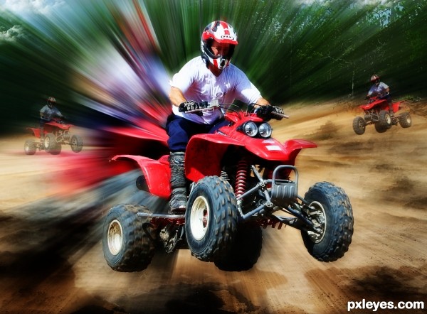
I made two steps to process my work,The first in my own way.and the second,I followed the instructions from a tutorial
(5 years and 3213 days ago)
Nice and Creative job author ....
GL ...
thank you for the nice comment,i hope it can make me,more confident here.i wish you Good Luck and take care
Howdie stranger!
If you want to rate this picture or participate in this contest, just:
LOGIN HERE or REGISTER FOR FREE
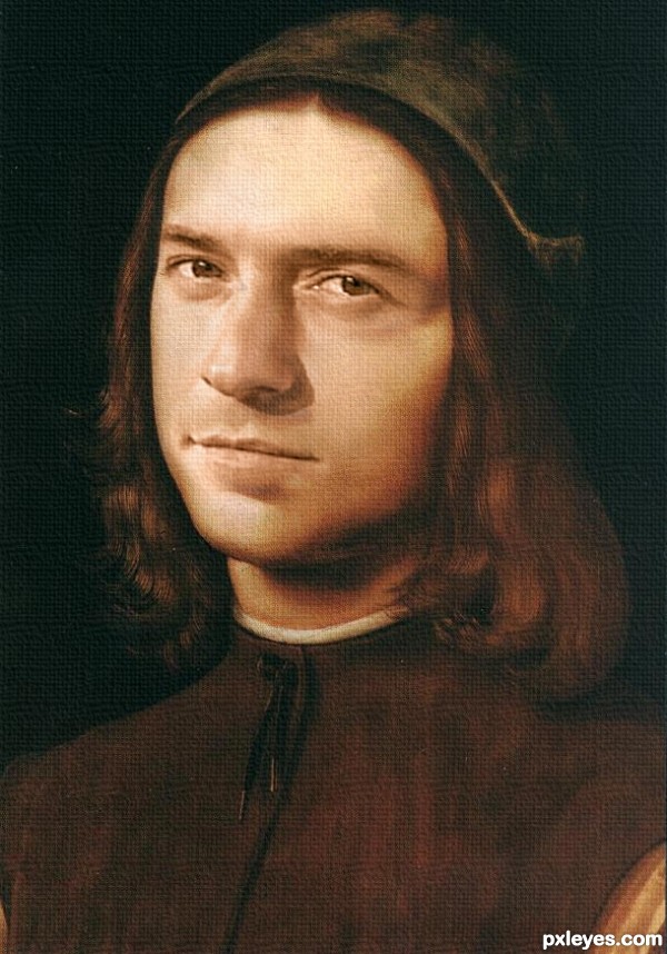
Good blend. Try to make the heavy canvas texture less obvious.
good blending author, very believable
Nice result, although the intense canvas texture is too hokey (as CMYK46 noted) and Orlando Bloom is unrecognizable, at least to me.
he has nothing to do with Orlando!
Howdie stranger!
If you want to rate this picture or participate in this contest, just:
LOGIN HERE or REGISTER FOR FREE