(5 years and 3310 days ago)
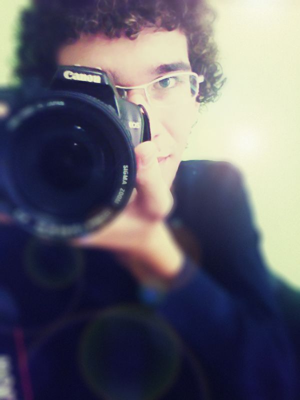
Check the SBS before commenting! Thanks (5 years and 3327 days ago)
"The idea it to make a really crappy, low quality, but still decent looking cell phone photo into something you could frame on your wall."
Last I knew, a Canon SLR wasn't a cell phone...
But the picture was not taken by canon, but by phone, Huawei ... check the SBS before commenting, thanks for the comment! 
Your SBS has no text with the pictures... It looked like a Mirror self portrait.
You have a GOOD camera on your cell phone!
okay, I put text ... thanks! 
nice effects author and cool final image...gl
Howdie stranger!
If you want to rate this picture or participate in this contest, just:
LOGIN HERE or REGISTER FOR FREE
dual till the end (5 years and 3330 days ago)
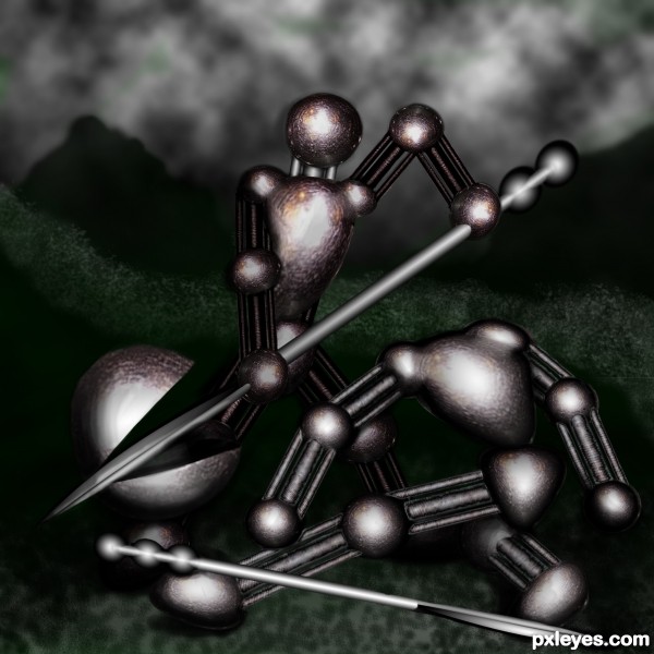
It's too dark. The viewer cannot easily make out what your focal point is, or how it relates to the title. Bring up the lighting so it's a full image, not just some light spots.
k, i tried to lighting it up some and put a litle green in the back to contrast the red...
Better, although still a bit too dark to tell much of a "story." The green does a good job of helping the color contrast, which improves the overall composition. Good luck!
Thanks - one of these days I may figure out photoshop 
Howdie stranger!
If you want to rate this picture or participate in this contest, just:
LOGIN HERE or REGISTER FOR FREE
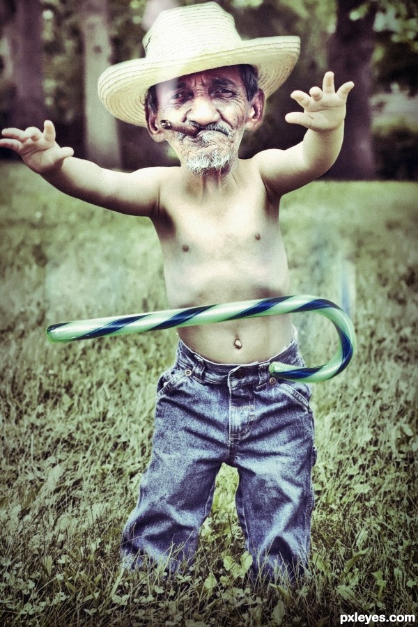
"I think he no longer needs"
(5 years and 3331 days ago)
this entry is fantastic...blend is perfect,here is a touch of humor,very important in this contest...well done author
Howdie stranger!
If you want to rate this picture or participate in this contest, just:
LOGIN HERE or REGISTER FOR FREE

this picture I have personally photographed and processed in PS (5 years and 3331 days ago)
You could use Ctrl T Warp to make that text following the shapes . It will be harder but with more impact.
...good suggestion but I have not thought about it....;:!"
Howdie stranger!
If you want to rate this picture or participate in this contest, just:
LOGIN HERE or REGISTER FOR FREE
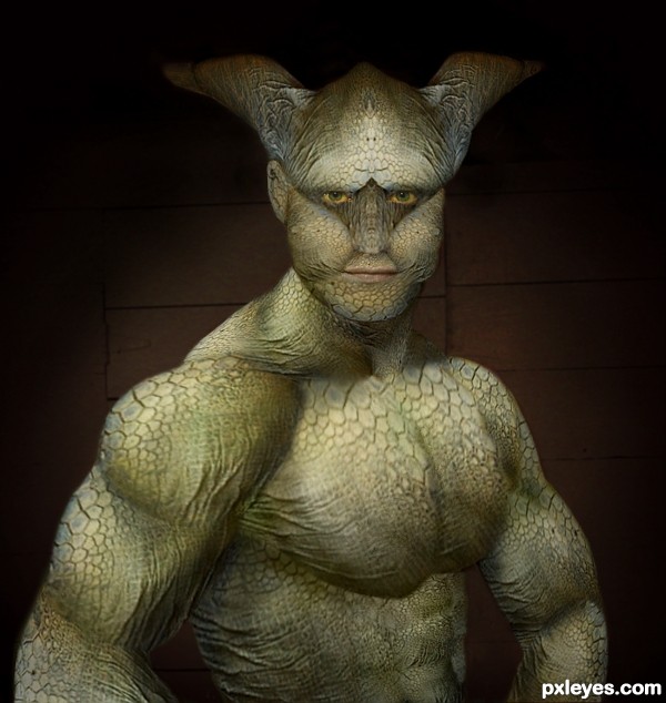
Great blend, author...I'm sure it would look even better in high res! (Hint, hint...).
What CMYK???
SO you see all my mistakes?
Hahahahahaha
The resolution on the turtle source pic wasnt that high.
Yeah I agree with you author on that! I had difficulty because the source wasn't very high! Hey! Nice Creation btw
  GL!
GL!
Thanks Toothpick
I put a high resolution pic up anyhow now.
Very nice work -- great detail
Wow! This is facinating!
Great job
Thanks for the great compliments guys and girls.
Nice blending.
Thanks Solkee.......gotta catch up with you for a beer sometime
Well done!
Changed the color of the background.....thanks sgc
Congrats Freejay, nice work
Great work man, well deserved congrats
Thanks
Congrats for the first place
Congrats!!
Congrats freejay, well deserved.
Awesome work and congrats to you freejay!!!!
Congrats on you win
Howdie stranger!
If you want to rate this picture or participate in this contest, just:
LOGIN HERE or REGISTER FOR FREE