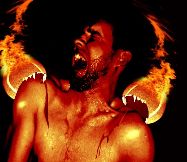
the tennis balls are torturing a man. (5 years and 3684 days ago)
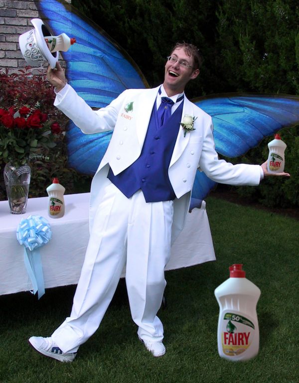
=Falln-Stock
is your stock angel-http://falln-stock.deviantart.com/
Kimberly Crick-http://enchantedgal-stock.deviantart.com/
Thanks guys for the great images...
Simple technique used here.Masking,creating shadows,bit hue and saturation and that's it... (5 years and 3694 days ago)
LOL i like this ,, gl author
haha funny one  creative


Howdie stranger!
If you want to rate this picture or participate in this contest, just:
LOGIN HERE or REGISTER FOR FREE
(5 years and 3696 days ago)
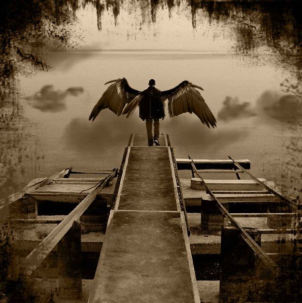
the colour its have a sad mood.
Yep, I agree... kinda sad... 
Links have to lead to the actual image or brush set used. Google images are a definite no-no. Please read http://www.pxleyes.com/blog/2009/06/how-and-where-to-find-legal-source-images/
Sorry about the problems with the sources but otherwise, I really like the picture. Well done!
good brusheeeee!!
thanks guys ...you can download the brushes from the source...you can do wonders with them
thanks guys ...you can download the brushes from the source...you can do wonders with them
You can also do wonders by posting the correct links for your sources, or your entries will be removed.
One of my favorite...good luck author!
Reminds me of the tv show Supernatural! Love it. Well done.
Thank you all for the nice comments...
and i did put all the sources...you can check again please 
This is a really nice image, but it doesn't really connote "faeries" to me. Maybe more of an angel or something
its more like a Gothic fairy 
Thank you Nator 
He's a more fallen angel...but nice work
thats my idea for a man fairy 
Well you must have fixed your sources because it's still here  Very cool image BTW
thank you  yeah i fixed it and i think is even better then before
maryabitawi, is this image available to use? I'd like to use it for my song cover art and the youtube video. I look forward to hearing from you. Thank you!
Howdie stranger!
If you want to rate this picture or participate in this contest, just:
LOGIN HERE or REGISTER FOR FREE
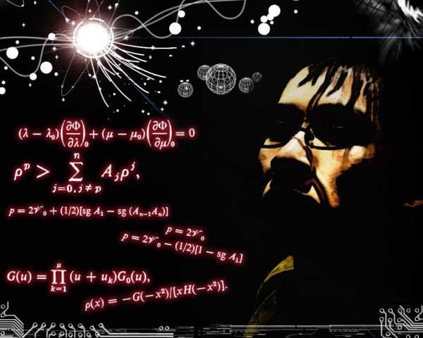
1. adding more light onto the source image.
2. Adding brushes around the image
3. Depicted as if the light was coming down on the source image.
4. Accented Edges on the Source Image and on light. (5 years and 3699 days ago)
undefined
undefined
Howdie stranger!
If you want to rate this picture or participate in this contest, just:
LOGIN HERE or REGISTER FOR FREE
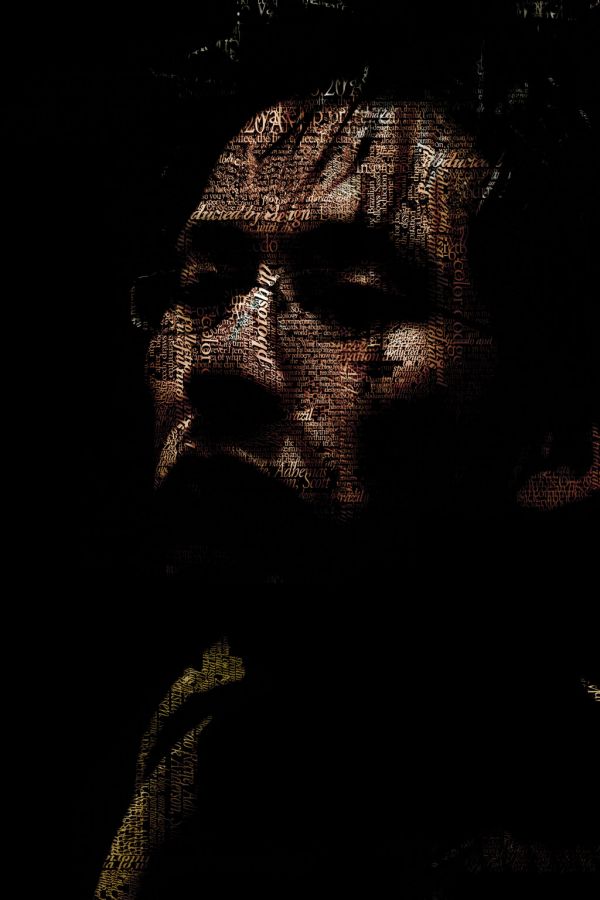
Only source image used (5 years and 3700 days ago)
very nice work...good luck author
 the effect in the result is very good, really respect the time you spent for arranging the words. However, IMO, this can be done faster by automatic software such as ArText http://www.graphic-design.com/DTG/Graphics/artext_typography.html, then you can add another PTS steps to make a perfect piece. GL, author!
Very good work! gl
if you only used the source image then where did u get the writing
Ace, he wrote them and arranged, the content of the writing is not important, seems to be easy but this took time. You can see in the SBS, he explained that
cool! i've been wanting to try this effect but never got the time lol. gj!
Nice! Good work with the lettering!
that was difficult but the more you sow the more you reap  good luck !!
nice work....
Well done
congrats on 3rd place !
Congratz!
Howdie stranger!
If you want to rate this picture or participate in this contest, just:
LOGIN HERE or REGISTER FOR FREE
author fix your sources.. don't get pulled on tech issue.. good luck
IT's GAY!?!?!?!?!?!.... bwhaaaa haaa haaaa.....
I'm gay and I don't remember ever wanting to be devoured by tennis balls.. maybe fix your hair or rearrange your furniture....but never be eaten... LOL... though I have been tempted to ask CMYK to .... whoops.. won't go there LOL
add some gradient and/or burn to the throat mouths.. will give it more depth... good luck.. but fix the sources..that will prevent from your image from being deleted
grr i tried to find them again but i couldn't and i already erased my history. its gay.... but what do you think besides the technicalites. lol.
ok thamks man
Nice.... A little twisted, but nice
Ouch!
will not play tennis any more.....? ( GL)
i think i fixed the links
lool cool
different!! need shadow in mouths, light sources wrong on balls, plus there wouldn't be that much shadow next to flames... no fur on balls
thank you Sias van Schalkwyk for letting me use you photo http://www.sxc.hu/photo/1145416
Howdie stranger!
If you want to rate this picture or participate in this contest, just:
LOGIN HERE or REGISTER FOR FREE