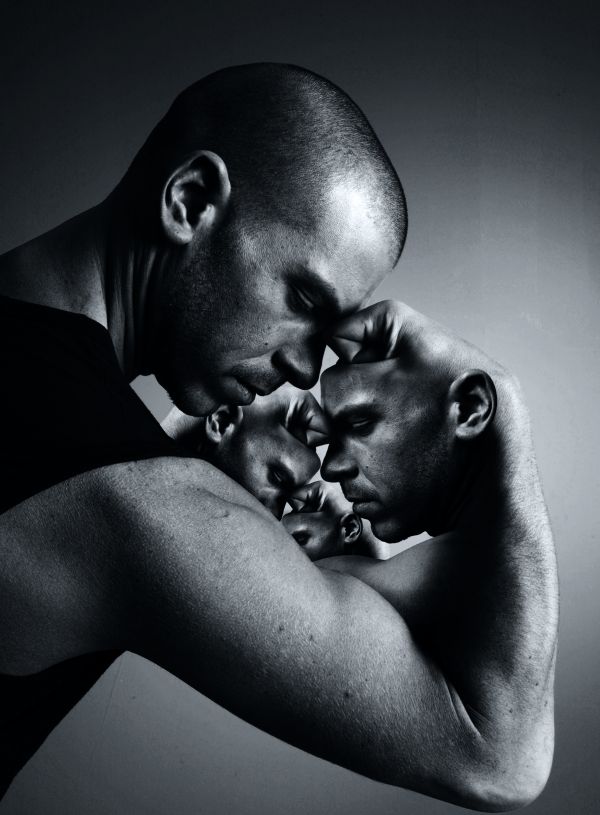
Finally I found an idea to be satisfied...
Thank to mjranum-stock for the source of the man (5 years and 3700 days ago)
- 1: The man
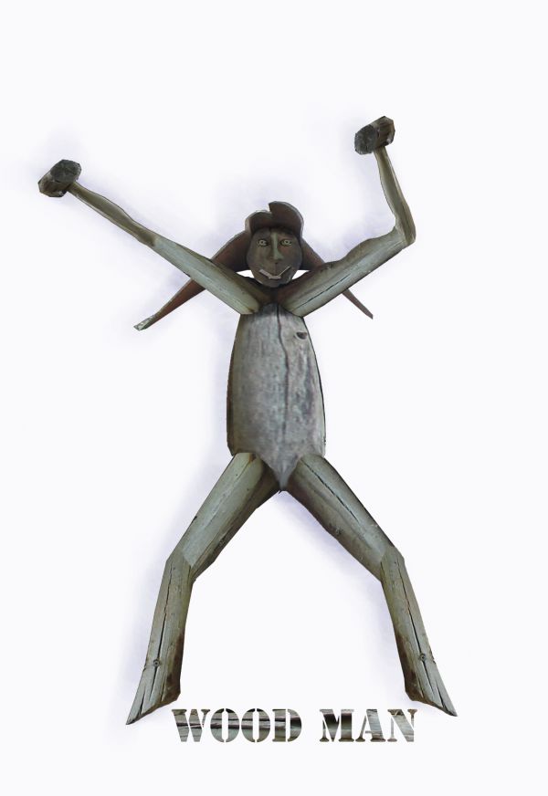
Completely made from original image. (5 years and 3726 days ago)
this is cute, looks like he's dancing...
Body is blurry comparing to the other parts...
lol...
Good work...Nice imagination...
Dada da daa da da.... Its Wood Man!! lol... cool
funny, i dont see that this man has wood :P, guess you cant show that on a family site though can you 
Howdie stranger!
If you want to rate this picture or participate in this contest, just:
LOGIN HERE or REGISTER FOR FREE
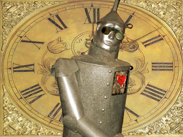
Seems to me that a Tin Man can't be anything but steampunk!
This looked a lot better with the texture I had overlayed on the image. But it's premanip that I didn't create myself. :( Maybe I should start making my own textures. (5 years and 3727 days ago)
Use Edit/Transform/Distort to get the goggles to fit better, and try to color match the lenses. Also think about making a strap to hold them on...
sooo weird :P i like it
Thanks for the feedback CMYK46 and Jellopudding. I will see what I can do. I'm not sure if I still have the PSD saved. An accident.
awesome
Thank you youri2323
Nice....but work on the goggles...
Nice...
cooooooooooool!
Howdie stranger!
If you want to rate this picture or participate in this contest, just:
LOGIN HERE or REGISTER FOR FREE
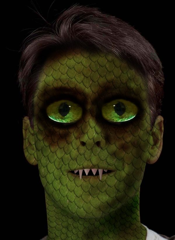
lizard man (5 years and 3727 days ago)
Displacement map would make the contour of the scales more realistic...
agrees with CMYK. You should even try dodge and burn and liquefy to shift the texture to the curves of his face. Right now it looks very flat.
put the scales pattern on a fresh layer, set it to overlay or scroll threw the options and see what looks best, maybe even change its colour a little via (ctrl U on pc or cmd U on a mac) before using burn and dodge for extra detail. Great idea though, also different from the rest too. GL 
big eyesssssss!!
Nice work.....
Howdie stranger!
If you want to rate this picture or participate in this contest, just:
LOGIN HERE or REGISTER FOR FREE
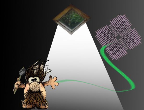
a caveman that lost his kite.
(thanks to Imamon)
btw im 14 (5 years and 3727 days ago)
i think i would've used some more time chopping 
lol..

Howdie stranger!
If you want to rate this picture or participate in this contest, just:
LOGIN HERE or REGISTER FOR FREE
Excellent...IMHO just a hint of color would make this better, but it's still a great job!
Thank you for your hint. Actually I tried the color version before deciding to convert it into BW. This one is more impressive in the aspect of showing the depth of thinking.
Fantastic image.. super creative! High marks
Great work!
This is extremely clever...very well done!
Fantastic idea
I agree, this has far more impact as a b/w than it would in or with color.
Cool effect
Thank you guys. I was worrying that this work doesn't show the true droste effect by its definition because we can't see the infinity here but my idea is we can imagine that by other angle, it's absolutely infinite. Now I feel much more confident ^^
It's true that you can't SEE the inifinity, but it still is. In inifinity, you can never see the end, even though you still know that it's there.
You can't see the end of the infinity but that's because you covered it up. Clever idea. GL!
Congratulations on the top-three place!
Congrats!
grats
Thank you, my friends !!!
Gratz! Very awesome picture and I'm glad this got to the top 3.
One of my favourite artists on the site.... congratulations.
Oh wow, this is so tripy, and I love the black and white tones here. He looks like a very thoughtful man = )
Howdie stranger!
If you want to rate this picture or participate in this contest, just:
LOGIN HERE or REGISTER FOR FREE