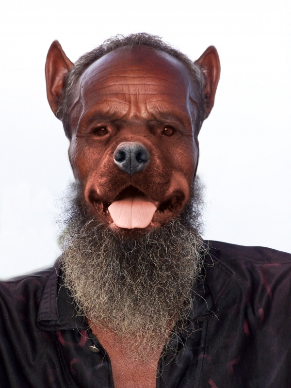
Thanks to CODYBEAR for his picture. Im back again. thanks. (5 years and 3925 days ago)
- 1: source1
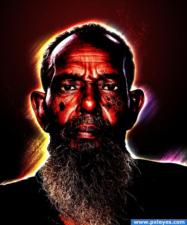
i gave him a sort of aura, used adjustments to make him mistic, used ctrl/cmnd + u to make his eyes dark and make the white of his eyes become lighter. only used source pic. hope you like it.. comments are welcome! (5 years and 3926 days ago)
too dark imo
ok
cool image
i like the tat or engraving in his cheek i think that is really really cool
I LOVE the rainbow halo around his head and neck. I agree with Tuckinator. The tatt (looks like burn scarification. I don't really know what it's called.) looks really cool and genuine. Outstanding work.
many thanks for your comments, i realy apreciate them!!
Howdie stranger!
If you want to rate this picture or participate in this contest, just:
LOGIN HERE or REGISTER FOR FREE
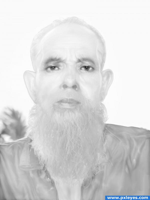
Here is my version.;-)
Only source picture was used.
SBS: Desaturate, Burn, Dodge, Smudge tools.
Different blending options. (5 years and 3926 days ago)
nice!! i tried to make a snow man.. but i cant!! i really like this!! Good Job!!
Nice idea but is a little to much of the same i.e white... need some contrast
its michael jackson in the afterlife... lol
what a creep, nice done!
Thank you guys for comments.  Warlock, it is mean to be white on white.
Howdie stranger!
If you want to rate this picture or participate in this contest, just:
LOGIN HERE or REGISTER FOR FREE
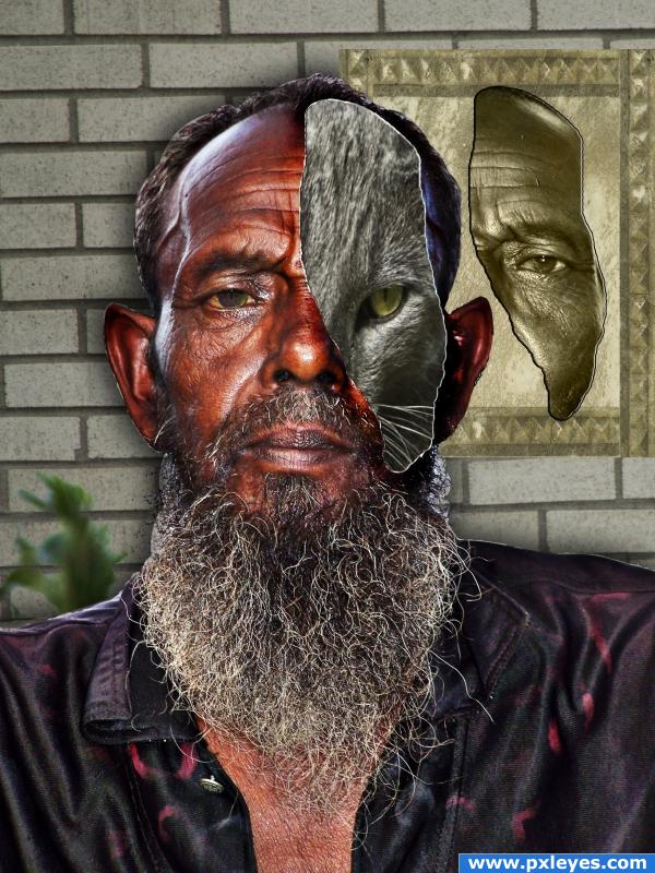
Here, the old man has part of his face ripped away to reveal that underneath he is a cat. An animorph.
I have 3 grey cats. This is Alvin. He is not the Alpha male of the bunch. But he is very kind and loving. His face looks angry all of the time, but he is sweet. I call him the diplomat. (5 years and 3927 days ago)
nice
huge marks for composition and clarity.. I'm not sure I understand the cat face properly.. if it's a mask it should have a shadow and the eye should be over the eye socket... IMHO.. it's very wonderfully well done.. it just seems that the two masks are floating in space.. if that was your goal then CONGRATS! (the white line of damage goes all the way round the cat face.. just thought I'd mention that).. good LUCK
Thank you for the comments. No, the cat is not supposed to be a mask. The man is actually the mask! When a piece of the man's face was torn away, the cat is revealed inside. That is why the tear goes all the way around.
Would've been a better look to just blend the fave with the cat...but good job all the same!
Howdie stranger!
If you want to rate this picture or participate in this contest, just:
LOGIN HERE or REGISTER FOR FREE
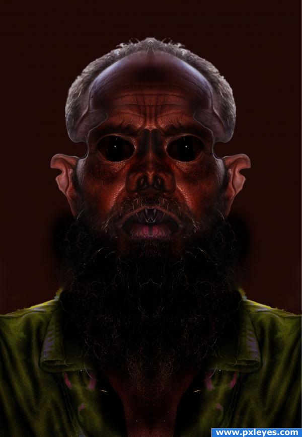
hiii everyone! this is my first entry in pxleyes.
i just did what i felt after seeing this image.
used some dodge tool and smudge.
thx. (5 years and 3929 days ago)
Cool!! Very interesting image!!
very well done!!! love the mirror effect (you may want to add a little difference to one side.. just to soften the perfect mirror effect (or create a background that is not symmetrical.) it just helps keep the viewers eye inside the piece IMHO.. very excellent job.. good luck
ewwwwww freak hahahahaha ugly creature 
cool image
thx. everyone for your comments and the needed appriciation.
Howdie stranger!
If you want to rate this picture or participate in this contest, just:
LOGIN HERE or REGISTER FOR FREE
wow great image author
Arf, arf...good blend!
 Muzzle's kinda light, though...might look better if you graduated the color from the nose to the face.
Great blending & colour matching!
Great blend, good job!!
Very will done
PXL EyesHomeMy stuff
to everyone. the adress of my source image is : http://www.pxleyes.com/pictures/3825/HAPPY.html. I wrote again and again but the adress doesnt work. but if you look in pxleyes/stock/page 24 youll find the picture. thanks to CODYBEAR.
ok. guys. thanks to mod. the problem was resolve. the link is http://www.pxleyes.com/picture/3825/HAPPY.html
Cute.
nice work tho in my observation i noticed that you madre a misrake on the left side of the face.. not sure if thios was a overlapping layer not removed out of haste ot just something u missed but o.o; it would looked a lot better if that had been ok, also now i am being picky, i find the hairs at the side a bit fuzzy had they been morre sharp it would been better in my opinion.. I love the idea, the ears are so funny lol
Howdie stranger!
If you want to rate this picture or participate in this contest, just:
LOGIN HERE or REGISTER FOR FREE