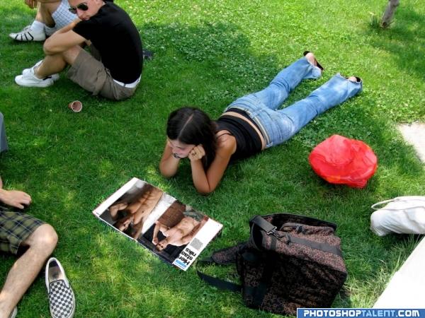
simple cut & paste (5 years and 4026 days ago)
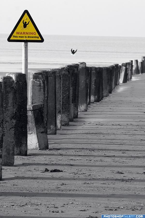
thanks AP-TURE (5 years and 4026 days ago)
I was about to say you need to blur the guy out at sea a bit, then I realize what you done and just started to laugh.. next time include a humor bar.. this is very twisted fun
Funny! 
Sure He will survive. Someone changed the sign board in between, still he is on the top.
Haha!Great idea!
simple
LOL!!!
Ahahaha!! How clever
Heh, nice humor
Oh lol, nicely done 
Howdie stranger!
If you want to rate this picture or participate in this contest, just:
LOGIN HERE or REGISTER FOR FREE
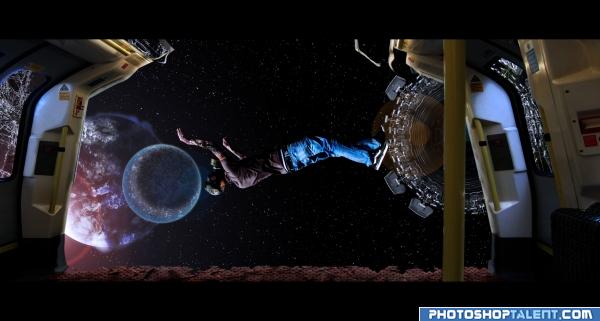
Was just playing around with pictures and came up with this... And I thought it might go with this contest theme... So here it is...
This is my first time creating a space environment... Also I have never been to space :P So I don't how lights really work out there( was too lazy to see any reference either)... So I would very much welcome hints and advice, so I can create much better space environment in the future...
Also there are more than 10 sources used in this work... So I will list theme here...
http://www.sxc.hu/photo/492500
http://www.sxc.hu/photo/716897
http://www.sxc.hu/photo/1196227
http://www.sxc.hu/photo/1176536
http://www.sxc.hu/photo/938993
http://www.sxc.hu/photo/874127
http://www.sxc.hu/photo/964989
http://www.sxc.hu/photo/945506
http://www.sxc.hu/photo/1189372
http://www.sxc.hu/photo/1182942
http://www.sxc.hu/photo/1191524
Also one of the source is graphic in nature... So viewer discretion is advisable...
Also thanks to Ivan Vicencio, Cherilyn Derusha, David Ritter, Raul Baldean and Michelle Dennis for some of the great free stock photo... :D
**note: will provide an sbs soon**
***edit: sbs added and corrected*** (5 years and 4026 days ago)
Dead in less then 90 seconds.. they just did an entire show on this on the Discovery channel about survival in outerspace.. the catches that theme.. good luck
cool love it
good work
great
cool
I don't get the black bars across the top and bottom -- or really much else, for that matter.
Nice blending but if someone where to be caught in space they would actually freeze so he should be icey looking or freeze dried...LOL....Good Luck
Thanks christy for mentioning about the freeze thingy... I did managed a bloated dry look at his hand and neck using the scab source... Will keep in mind the freeze thingy... 
Really cool! I like it!
gl
Howdie stranger!
If you want to rate this picture or participate in this contest, just:
LOGIN HERE or REGISTER FOR FREE
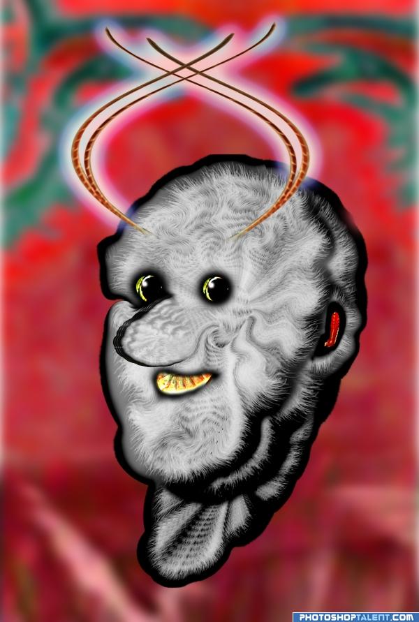
All source (5 years and 4029 days ago)
ok...
grasshopper man - he is so fleecy, i imagine how wind loves to play with him:P and he is happy as we can see
good
hahah funny
Weird
suits for a children's book good job author
Howdie stranger!
If you want to rate this picture or participate in this contest, just:
LOGIN HERE or REGISTER FOR FREE
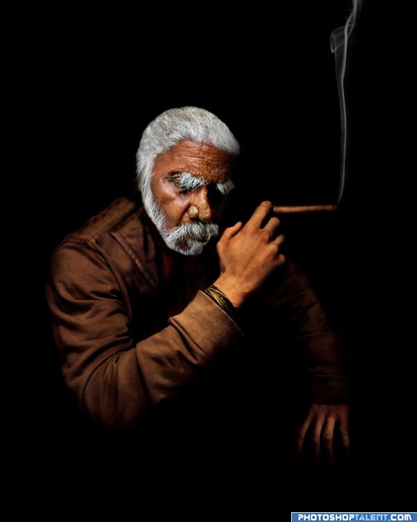
Just for fun!!
(5 years and 4030 days ago)
Great idea,maybe make the hand of the man a bit darker/more brown.
I like this! Just two things: There should be some collar from your source pic to our left of his head instead of a shadow that doesn't go with the light source, and it would be way better if the cigar were lit and had smoke rising from it.
Edit: On second look, a darker shadow on his forehead would match the deep shadow below, IMHO. I'd love to see this image improve! 
Nice idea, but really not a lot of work is it? I agree with CMYK on the blending head vs the body, it could be better. Use a brush to repair the hair. Put in an interesting background...
This could be a great image but what you posted now looks like the first step to it.
Hope you take some time to improve.
Hey, YOU GOT your HEMMINGWAY in my REMBRANDT (you got your chocolate in my peanut butter).. the Head to hand proportion is just an itty bitty teenie weenie bit off.. but barelly noticeable.. Infact I didn't notice it at all (I was too busy looking at the hair line, amazing).. My brother agreed that the head is a tad small, but first said cool Picture.. so there you go 
Keep going! Yes, the head could be bigger...Golem's bro is right. And the smoke...well, find some smoke brushes and make it more interesting.
Good job , I like the background like it is you don't need a distacting one...looking good 
Just for fun, my Aunt Myrtle. This is gorgeous! One small quibble...the hair. Try taking the natural brush 12 set at 50% and go around hair and beard and just flick it inward, not much, just a little, to break up the uniformity. Try it and if you don't like it, you've only lost 5 minutes. This is a fine entry.
Some slight shading where the beard goes under the jaw might be beneficial here(or not).
very nice change. good work
great
great image


very nice love it
Nice cuban feel.
you did very well
Howdie stranger!
If you want to rate this picture or participate in this contest, just:
LOGIN HERE or REGISTER FOR FREE
simple but good idea
kudo's for humor
lol.........what an idea...
LOL
nice
Howdie stranger!
If you want to rate this picture or participate in this contest, just:
LOGIN HERE or REGISTER FOR FREE