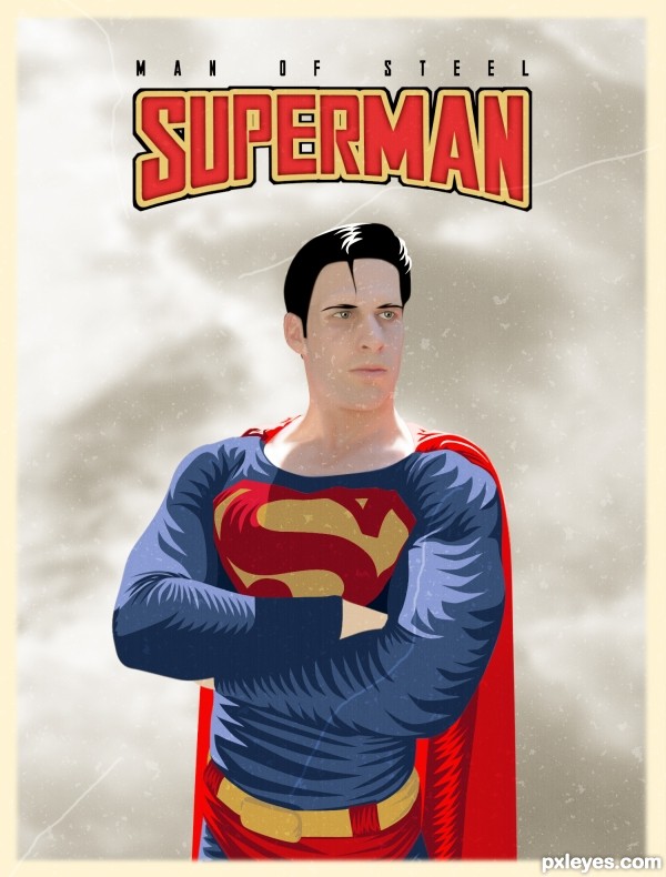
(5 years and 2925 days ago)
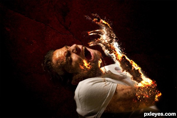
I've used my own source photos in this one
Mainly the model.
Four photos of sand.
Composite background texture.
The fire effect achieved with layer mode using smudge tool.
(5 years and 2931 days ago)
Author, you need to post your uncut photos in a step-by-step guide.
how could I do this I seems that I skipped this step!!
how could I do this I seems that I skipped this step!!
very impressive! and fun! (not the greatest feeling LOL but I think that was the idea  ) GOOD LUCK!
thank you for your comment I do appreciate it
Ouch is the first word that came to mind, cool art work =)
Indeed a well done effect, would have loved to see in HiRes. Good luck!
Howdie stranger!
If you want to rate this picture or participate in this contest, just:
LOGIN HERE or REGISTER FOR FREE
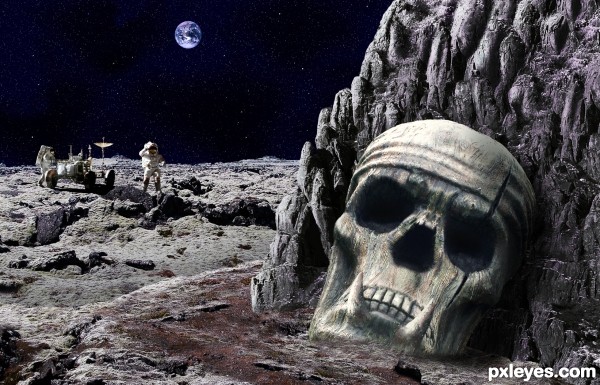
The last Moon mission was over many years ago and we found out as much as we could...or did we? (5 years and 2938 days ago)
Howdie stranger!
If you want to rate this picture or participate in this contest, just:
LOGIN HERE or REGISTER FOR FREE
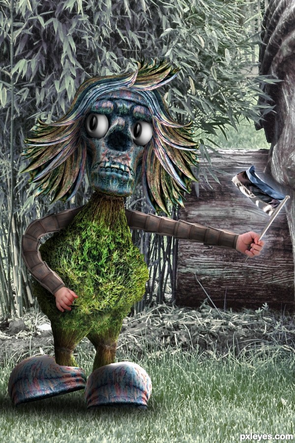
Estonian Folklore (5 years and 2939 days ago)
Howdie stranger!
If you want to rate this picture or participate in this contest, just:
LOGIN HERE or REGISTER FOR FREE
(5 years and 2951 days ago)
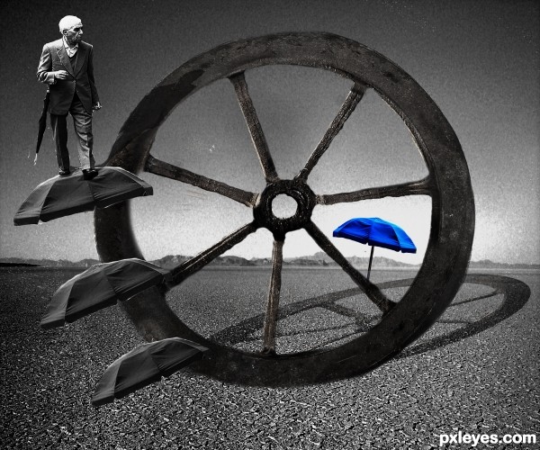
Wheel needs a better chop or masking. And I can see two white lines crossing the lower part of the image.
Thanks for your feedback erikuri, i had a hard time shaping the wheel exactly the way i want but i think it still looks good after the new changes 
Howdie stranger!
If you want to rate this picture or participate in this contest, just:
LOGIN HERE or REGISTER FOR FREE
Great Job! may want to equalize the letters PER so that the Stroke equalizes (clean line over the top) and the letter E should be symmetrical and the R is a bit weird. (It's still awesome, I'm just pointing out what a client would zoom into.. and they do.. over and over and over again) hehehe

Love the yellow border and the aging process (a blur scrub over the scalp line might soften a bit)
Good luck and good job, and always IMHO, fun image
The text has been changed, I also added a bit of blur to the top of the head. Thanks Driven!
MUCH CLEANER!!! when I do poster art I get hammered by clients for nasal passages looking to venty LOL.. great fix and good luck
Links don't work.
I just tested all the links and they seem to be working okay on my end. Thanks for bringing that to my attention. I wonder if anyone else is having that problem?
Weird...they just worked for me now, and I checked them twice before commenting...Sorry!
That's alright CMYK, sometimes weird things just happen in the computer world.
super!!
Nice job integrating the model with your painting!
Howdie stranger!
If you want to rate this picture or participate in this contest, just:
LOGIN HERE or REGISTER FOR FREE