Photoshop Pictures: Manipulation (page 7)


results 31 - 32 of 32

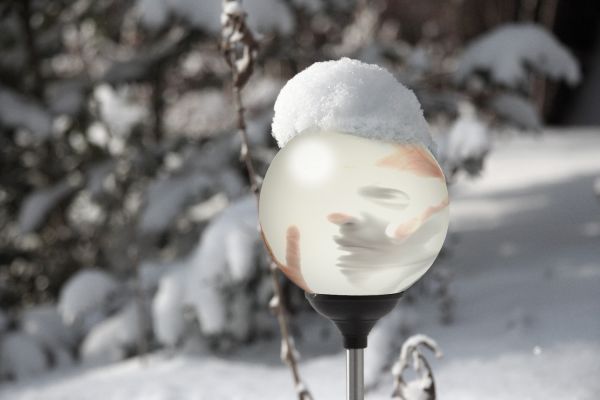
Simply Trapped - created by Surrealist1970


Simply Trapped
Favs: 0SBS: n/aHi-resRank: 16/19Score: 53.7% (0)13297 views

This is a photo-manipulation using 2 images, and a glass globe made completely in Photoshop using layer masking, filters, shading, and transparencies.

It is exactly where I would not want to be... trapped in a snow globe...it does seem to be a nice day to be aoutside though!

I just hope everyone likes the simplicity of this, and I think the globe actually looks like it belongs in the image... (5 years and 3565 days ago)

2 Sources:

avatar erikuri
erikuri says:

What a despair! I'm getting without air...

avatar loopyluv
loopyluv says:

Nice...

no avatar
cosmosis says:

this is genius!! GOOD LUCK!

Howdie stranger!
If you want to rate this picture or participate in this contest, just:

LOGIN HERE or REGISTER FOR FREE


All Glitters is not a Gold - created by tahseen


All Glitters is not a Gold
Favs: 0SBS: n/aHi-resRank: 19/19Score: 52.5% (0)14651 views

Hey guys,
i waz Looking at the bridges for sometime then i come up with a expression tht is
Behind Every Simle theres not a Delight

Hope u will like my Image... (5 years and 3719 days ago)

2 Sources:

avatar CMYK46
CMYK46 says:

Background figure is too large, and probably wouldn't have a shadow if it's transparent...

avatar GolemAura
GolemAura says:

You really need to upload a HIGH RES image so we can see the image better.. you've got a great idea here... (High res images get better votes because it helps peeps to see the work) it's a good start.. I can see Lots of potential.. just need to be able to see the work)

EDIT: THANK GOD FOR HI RES... I love confusing weird wonderful entries like this.. now that I can see it.. it's a gazillion times better....

be careful of jewelry... It can destroy an image (In theatre.. you'd be fired if you walked out on stage with the wrong ear rings).... but it is your vision... go for it (masking out the jewelry would be helpful just because of the way it dates the piece.. but that's just me)... (god I am a yapper arn't I? hehehe)

avatar pixelkid
pixelkid says:

I think this image would have been FAR better without the subject on the bridge! Without it...it might seem simple but very effective! With it...it seems convoluted and distracting. Just my opinion...

author says:

Thanks Guys for ur Suggestions, ill take care in future...

no avatar
ice says:

I like the idea of the girl in the forground, but I am very confused by the girl on the bridge, or rather why shes transparent.

author says:

girl on background is a soul who is in deep pain but she is hiding by her fake smile

avatar vladimir735

The name is awesome! And yes. The ghost thing is too large compared to the bridge and the other girl! Other then that, great job. Good Luck

Howdie stranger!
If you want to rate this picture or participate in this contest, just:

LOGIN HERE or REGISTER FOR FREE