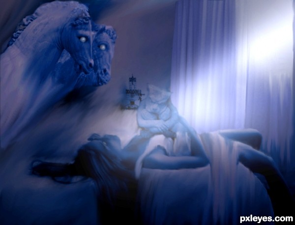
always wanted to do this photo by henry fuseli glad for this contest
thank you
sammydavisdog,gabriellaraujo@flickr and thanks to vclare@sxc.hu for the photos (5 years and 3397 days ago)
3 Sources:
- 1: girl on bed
- 2: horse statue
- 3: gargoyle


The image is a little flat, needs some work on highlights and contrast.
Great painting, yes. Your interpretation is nice too, maybe as ibmaxed said could have some more highlights. What bothers me a little bit is the composition, everything happens on the left side, in the right corner it's as good as empty. Rest space is important, but since too many things happen on the left side, I expect *something* too on the other.
You changed the position from the horses a bit compared to the painting, which shouldnt be a prob for being an inspiration. What I think works great in the painting is that the horse really deems up from the dark and faces the woman, while the woman tries to be as much as possible with her face to the other side. In your entry, it looks like (or how I see it) as if the horses are looking at the gargoyle, observing what it's doing with the poor woman. Perhaps you should reconsider the position of the horses, but I leave that up to you...
Ow, step 6 is can be nice too for being dreamy, though I would make it less liquified then.
Good luck!
I never thought I'd say it about an entry here, but too light...
The Fuseli image has the objects within "the dark of night." These are all placed within a quite bright and smudgy looking background...
I agree wholeheartledly with Woz, the "flow" of the composition is off. You image starts at the upper LH side with the horses, and runs diagonally down to the darkened RH corner, where the eye essentially "falls off."
The original has a more triangular flow, with the figure grounding the eye's movement, and the gargoyle bringing it back up towards the horse's head.
An interesting homage, tho.
added the curtians back to the picture and filtered in some light
played with the eyes a bit to
i am still learning..... lets see what you guys have to say now,
be kind guys im a novice
Why not imitate the original composition? Two horse heads? Woman & gargoyle facing the wrong way?
Great work at recreating a difficult image.
always loved the fact that he made several versions of his own creation.. adding to the mix is quite refreshing.. good luck author.. really enjoy your take on the subject
It was good, but I think you should try to give a bit more sharpness to the image! good luck!
Howdie stranger!
If you want to rate this picture or participate in this contest, just:
LOGIN HERE or REGISTER FOR FREE