thanks to Csaba Szilvási
http://www.sxc.hu/profile/cybersb for splash source (5 years and 3229 days ago)
- 1: oldman hand
- 2: woman hand
- 3: teeth
- 4: splash source
- 5: diamonds
- 6: woman glass

thanks to Csaba Szilvási
http://www.sxc.hu/profile/cybersb for splash source (5 years and 3229 days ago)

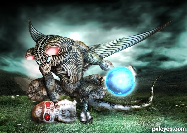
Only given source was used to construct the alien.Original is 35mb, so I hope this is large enough to show all details.
Credits to :
heelontheshovel from DA for clouds image
night-fate-stock from DA for mountains image
The-strawberry-tree from DA for cliff image (5 years and 3311 days ago)
Nice looking alien...GL author! 
Very Cool..GL
My thoughts, too, Bob - looks like an H.R. Giger creature. Great background find, stacking and warping, author. Love step 5 showing how you made the spine especially.  LOL@your title.
This is freaking awesome! I want to be this good some day!
WOO HOO!!! that about covers everything 
is that alouwd the background is premade, nice work
very very good work author.........GL
Agree with all! This is some awesome work!!! Good luck!
really awesome>>>>
Fantastic job......Good Luck Author.
great job........ 
Nice job 
Great job author and fantastic construction...beast look fantastic and glowing sphere is fantastic addition...u did really really good job with the background too...best of luck
Nice Chop....congrats
Beautiful entry.... congrats for third...!
Congrats, very well done
Congrats on your win
Congrats for the 3rd place..., great entry
Congrats!! Really well crafted!!
Congrats
Howdie stranger!
If you want to rate this picture or participate in this contest, just:
LOGIN HERE or REGISTER FOR FREE
hillarious
zanbrottix, I don;t find flat the glass. And this kind of comment comming durring votting days and not in submmitig days is meant to get down an entry, not to improve the work. Especially when it commes from a person who has an entry in this contest.
was an opinion, but you're right, I had not thought I feel I've cleared
the work is original and funny
The work is original and funny! But I have to agree with the earlier comment (removed) - I find "her" glass rather flat, too. It would also be nice to have had a clearer old man hand to match the sharpness of the glasses and "her" hand.
As for my own comments coming during voting, I apologize (sort of) but I don't have enough time to review, comment and keep checking back during the week, and then come back to vote on the weekends. Which is why I may comment, but rarely vote in contests I've entered. This is not just about winning - it's about learning and improving, isn't it?
her glass is a picture, so you could blame on the light for the flat feeling, not on the photoshop skills...
about the comments I agree with you, there are meant to improve the work, but if it is a nit picking available for a particular work, it should come in the proper moment.
I learnt from many great artist, and it`s not about willing to win, but to a honest approach.
Thank you for you comments!
Howdie stranger!
If you want to rate this picture or participate in this contest, just:
LOGIN HERE or REGISTER FOR FREE