(5 years and 3391 days ago)
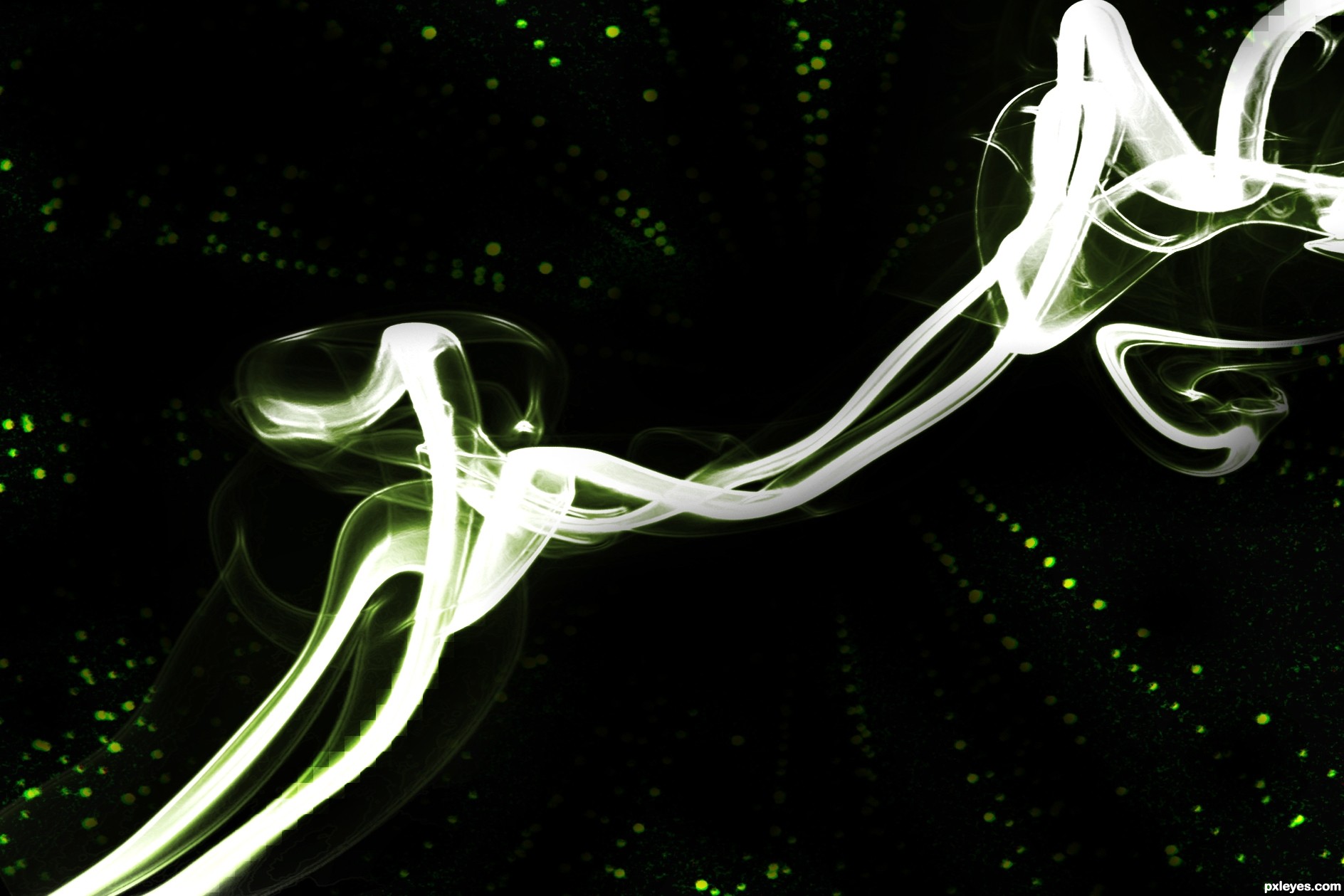
i kept it simple..did everything all in one layer! (does not mean it was easy, getting all the colors and contrast right lol)
i played with the colors, contrasts and brightness, i applied this matrix background and did the same thing, then combined the two and voila! (5 years and 3496 days ago)
I just don;t understand what the hostility is all about..
Author, the image is visually pretty simple. That doesn't mean anything. I've seen very simple art get high marks. As a matter of fact this wouldn't look half bad as a desktop background, but the reason for the comments is because of the similarity to the original source.
You do have to remember that this is a contest website, and even though the image looks good in my eyes, you have to ask yourself how it would fare in a competition.
Again, there is no reason for the hostility. And i like the image you created. Aesthetically it's very vibrant and reminds me of light painting at low shutter speeds in photography. Good luck 
thank you Ponti55, I will take note of your advice! It is fairly simple, but I couldn't think of anything else to do with the smoke, a matrix effect came to my eyes when I seen the original photo, but I did'nt want it to look awkward.
I will definately try something else in the meantime
i like how they deleted their comments after you said something ponti! put them in their rude places!
There was no hostility meant in the comment I deleted. I chose to delete it out of fairness to someone who made a very simple entry which didn't say much to me. It still doesn't, but I don't enjoy being treated like some kind of ogre for making an honest comment, so here I am saying basically the same thing. Like it or don't. That's what the comment section is for. Author, maybe in later entries you will dazzle me with your genius and I will praise you to the heavens.
Expressing your opinion in the form of a sarcastic question is not the way you should do it.. I understand some entries don't appeal to you, and maybe you should show that via the way you vote and not the way you comment.
"Are you kidding me?" Doesn't help anyone solve a problem.
It was "Are you serious"...not everyone submits a serious entry.
I like the colors...
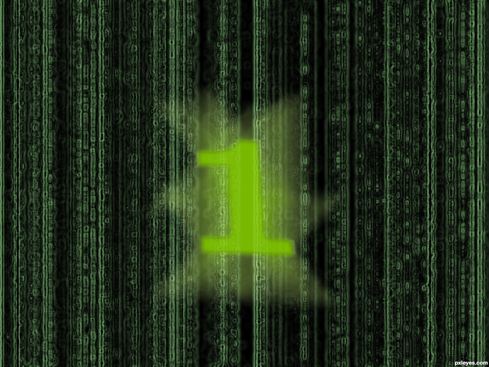
You can find a matrix font on dafont.com, and try to experiment with warping the matrix like the smoke comes out of it, maybe some blend with the codes, if you want to, and for fun 
Font is called: Matrix Code - search it on dafont and not on the big "font.com" ad, they have on front page.
thank you graymval! i will surely get around to it when i officially have the time, probably around tomorrow or wednesday. thanks for the great tips!
It may be simple, but it is likable.
Howdie stranger!
If you want to rate this picture or participate in this contest, just:
LOGIN HERE or REGISTER FOR FREE
(5 years and 3671 days ago)
gl
GL
very cool work...good luck
thanx all

Howdie stranger!
If you want to rate this picture or participate in this contest, just:
LOGIN HERE or REGISTER FOR FREE
Photography and photoshop contests
We are a community of people with
a passion for photography, graphics and art in general.
Every day new photoshop
and photography contests are posted to compete in. We also have one weekly drawing contest
and one weekly 3D contest!
Participation is 100% free!
Just
register and get
started!
Good luck!
© 2015 Pxleyes.com. All rights reserved.


wow thats pretty awesome author..great image
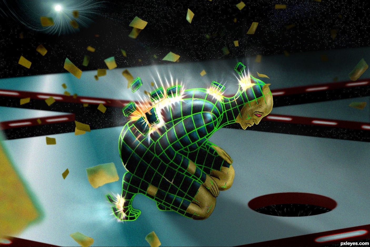
Cool design! You pen tooled the wire-frame, dang that must have took you some time - i guess color range or wand were not too helpful here.
I like the paper flying things around the character and i think it would help if:
1. you color the other hand too or some part of it
2. you make the exploding pieces further away from the body, and at different heights, while also keeping the light rays coming from their breaking holes.
Neat, and indeed looks like that would take a long time to cut out the frame =)
Very nice effective different work...best of luck author
thanks for the suggestions , made some changes

and yes pen tool took me a fair amount of time , just enough to come up with an idea
Very very cool! amazing idea! excellent entry
thats really cool
Fantastic work! Very futuristic and interesting. Love the colors.
Howdie stranger!
If you want to rate this picture or participate in this contest, just:
LOGIN HERE or REGISTER FOR FREE