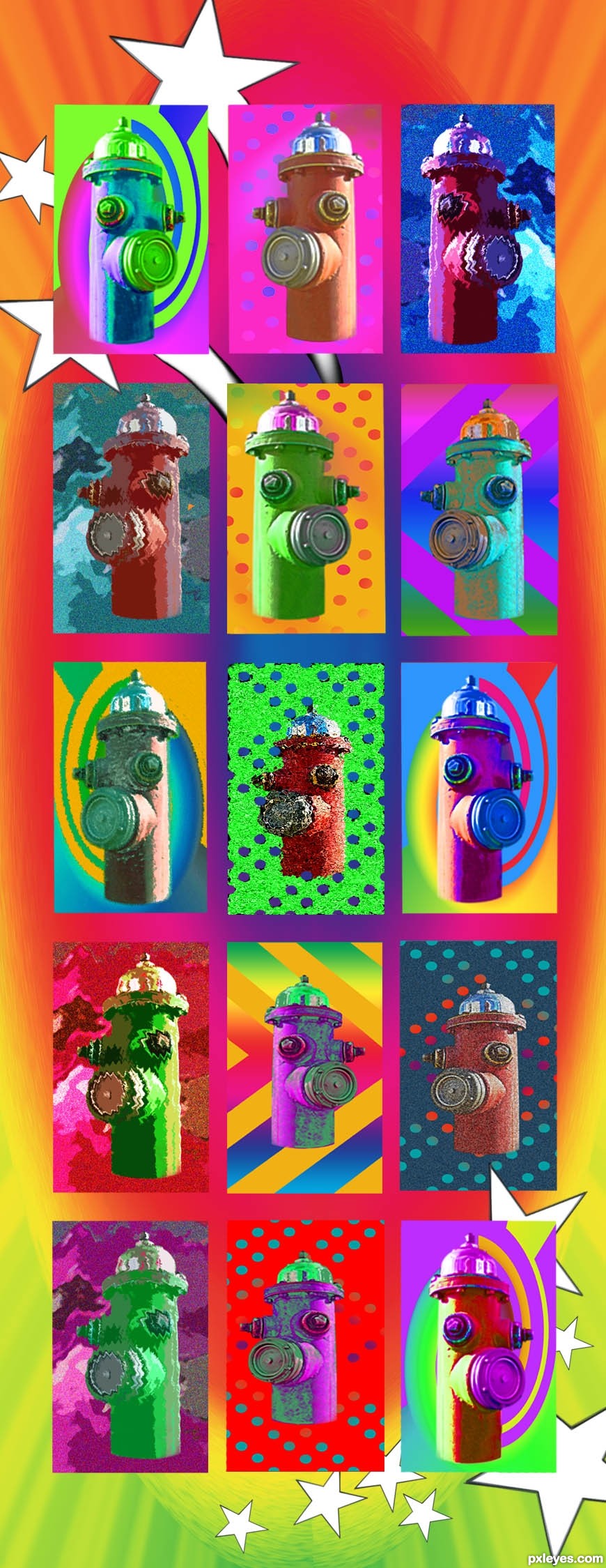
Just the source used on this take-off on Peter Max's colorful art works. To see some of his delightful creations go to: http://www.google.com/images?as_q="Peter%20Max"&safe=active&as_st=yo to: (5 years and 3376 days ago)
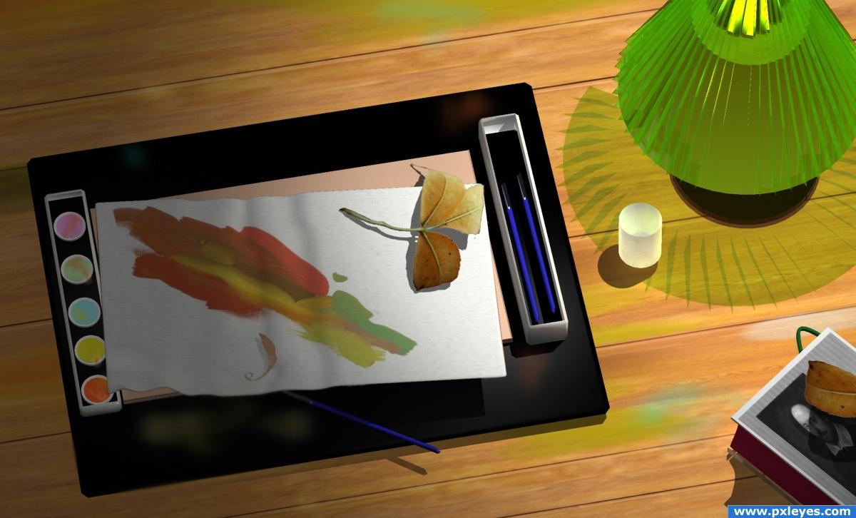
Photoshop, 3 DS Max , ArtRage (5 years and 3912 days ago)
erm.. interesting :P, i don't really understand it, but it looks nice. Good luck!
i like the art look of the image and the leaf thing i dont exactly get but it adds a cool effect to the image
the media mix is quite unique.. you don't see that everyday and that's what I like about it... Like the first time I saw the stop motion animations on seseme street.. good LUCK!!
From the technical point of view this is a very good image. It looks believable. I think it would attract more attention when the elements in the image were more related to each other. e.g. the book title could be 'How to paint leaves'.
Howdie stranger!
If you want to rate this picture or participate in this contest, just:
LOGIN HERE or REGISTER FOR FREE
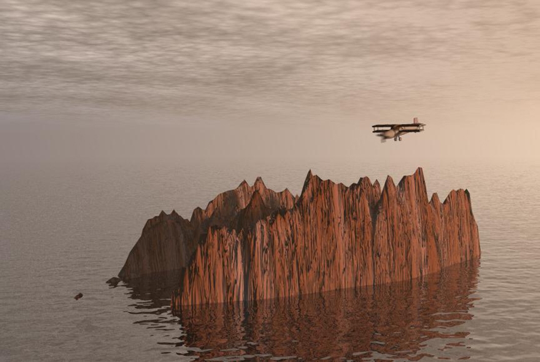
The job of a rocky island aviator is to discover, explore and land on the rocky islands. Usually they are hired for a single mission, no life insurance included..
Bryce 5.5 and 3DS Max.
My first contact with Bryce 5.5 , a free and friendly 3D graphic software .
Also see a very good tutorial for beginners in Bryce made by Robvdn ( ? ) , here
http://www.pxleyes.com/tutorial/Photoshop/1218/Beginnersguide-to-Bryce.html
Edit. Using for the first time Bryce I used on this entrie some preset materials. Only today I discovered the fabulous Mat Laboratories which allow the user to make his own map and materials. Nothing against the rules but I'd like that you know what you vote. (5 years and 3920 days ago)
I don't think that would be the worst job.. it would be scary as all get up.. hehehe.. and you'd have to put a gun to my head to get me to do it LOL.. awesome job of getting the ball rolling author... GOOD LUCK!!!
great image!
Looks good.. not necessarily a bad job.. to make it seem worst you could add more cliffs.. a lot more.. Good luck!!
Good job. I think the propeller should be spinning, though...
terrific entry, CMYK has a point about the propeller, great sbs too 
I'm not sure about the sky and the ocean line, it should be more realistic. Good luck.
Thanks for comments. CMYK, the propeller is spinning now with some motion blur from Photoshop, thanks. But according to the pilot mission this will not be for long time 
japanese suicide airplane flying people would be perfect for this job
Nice work on this....& top job for your first go with bryce! would have been nice to see some more rocky islands in the background just to break it up a bit....
Howdie stranger!
If you want to rate this picture or participate in this contest, just:
LOGIN HERE or REGISTER FOR FREE
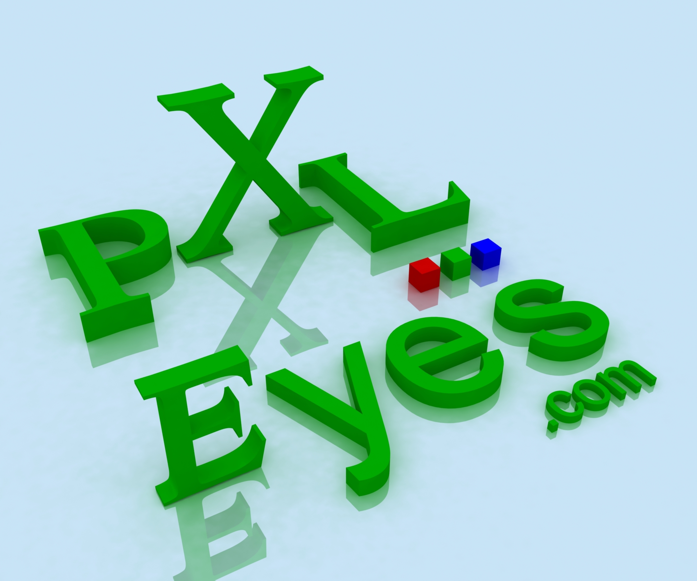
Vray setup with just G.I. Set near white and multiplier of 1.0
Please view SBS for smaller and integrated versions (5 years and 3972 days ago)
WOW.. this is the hardest contest every made.. it's going to be very hard to narrow it down... this one is fantastic..
EDIT.. hehehe. JINX.. great job Author
The more I look at this one the more I feel this one is going to get a high vote.. this is so exciting LOL
cool man
nice design..i love it
Wow! Good effort!
nice design. but it should be little more compact.
good entry....realy!
Niceeeeeeeeeeeeeeeeeeeeeeeeeeeeeeee
nice idea good luck!
wow I like this one! 
woooohooooo i think we have a top contender!!!
Good Luck
as good as it is, it wont have the same effect once shrunk 
I like it
Not bad, but I doubt this will work in the right size. THis is maybe fun as variation, but as frontpage logo it needs to be less complex. Good luck!
Great job!
Nice! Bit complex for a logo tho!
Howdie stranger!
If you want to rate this picture or participate in this contest, just:
LOGIN HERE or REGISTER FOR FREE

A 3d render...(Vray)
Please view SBS for smaller and integrated versions (5 years and 3972 days ago)
yes! good luck!
nice idea good luck!
YES!!!.. cool cool Idea..this contest is going to blow out the part of my brain that does long division
EDIT.. MORE LIKE THIS.. I love the Idea.. (This is very perfect of a website.. so simple but the construction is OUT OF THIS WORLD)
i like the reflection work on this one goodluck.
try on different backgourng color its great this one i like it
good
gl
Good Luck
The font is pretty ok, you may want to exaggerate more the fact that it's in 3D (maybe bit thicker letters). Out of curiosity, why only the e and s are uppercase and the rest normal? But interesting, maybe not with those colors, but I guess that's all optional. Good luck!
EDIT: as part of the site, I'd maybe chose to make the logo from a different (and imo more logical) angle: make PXL more in 3D (P bigger and then going to the back), eyes more straight. Since the logo is on the left side, it might have a nice "introduction" of how you read the logo (really no clue if you get what I mean, but bottomline is that it might look better
Nice!
Too child like. Where's the URL? Not keen on the colours either - too Windows. But like the three dots idea...
Howdie stranger!
If you want to rate this picture or participate in this contest, just:
LOGIN HERE or REGISTER FOR FREE
Photography and photoshop contests
We are a community of people with
a passion for photography, graphics and art in general.
Every day new photoshop
and photography contests are posted to compete in. We also have one weekly drawing contest
and one weekly 3D contest!
Participation is 100% free!
Just
register and get
started!
Good luck!
© 2015 Pxleyes.com. All rights reserved.


Nice! GL!
my fave is the one in third row all the way on the right =)
super cool colorful work...gl author
Amazing!
Howdie stranger!
If you want to rate this picture or participate in this contest, just:
LOGIN HERE or REGISTER FOR FREE