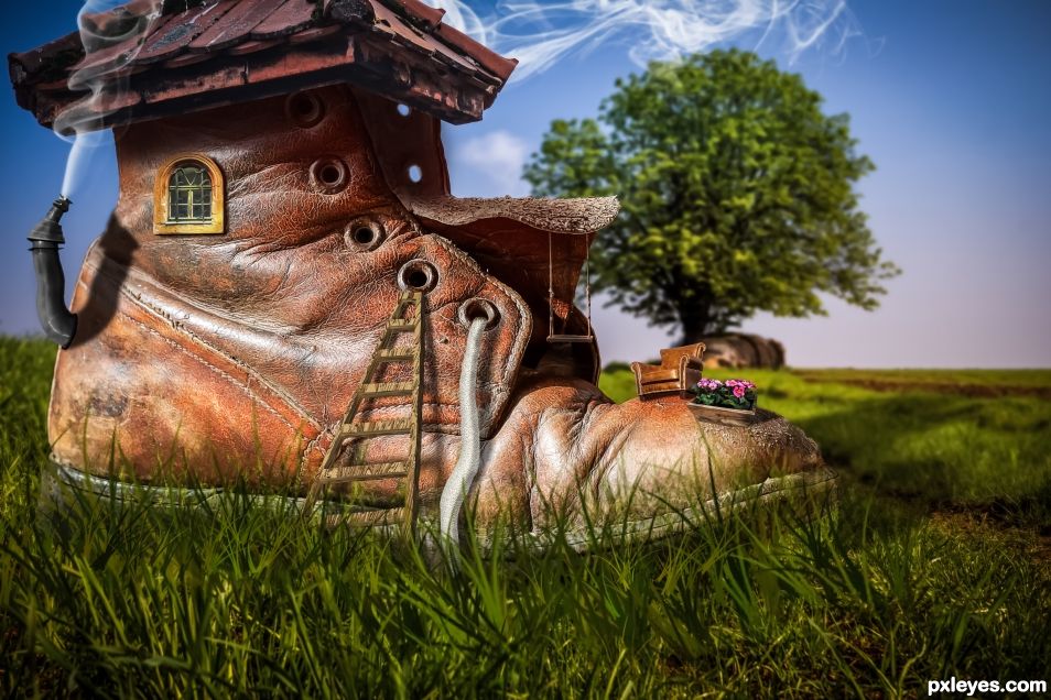
Extra source
Chair by escher https://pixabay.com/en/chair-armchair-hill-outdoor-1049325/ (5 years and 1334 days ago)
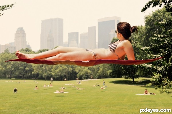
It seems the south end of Central Park was the scene of a gravity defying anomaly. Our photojournalist in NYC was able to capture this shot.
Be sure to view the high resolution image to fully appreciate the detail present. (5 years and 2922 days ago)
This is great! The real talent here is being able to stay perfectly flat on the blanket with zero gravity. 
very Aladdin!
Congrats!
welldone, congrats
Congrats!!
Howdie stranger!
If you want to rate this picture or participate in this contest, just:
LOGIN HERE or REGISTER FOR FREE
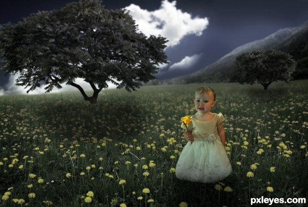
Hey! I hope you like my new entry!
Techniques used were: cutting out with the pen tool, and mostly just lighting shadows and contrasting...
(5 years and 3391 days ago)
Author it's a very sweet image  I noticed in high res the shadows around the cloned flowers on the dress need to be softened and something looks out of proportion to the rest of the image...not sure if it's the child or the trees or the flowers but something isn't quite right....I will hold my vote and check back
Thanks for the advice Christy  I'll see what I can do
Yeah.. I think you were right with something not being right.. I decided to increase the size of the tree on the left and IMO I think it improved a bit. Also decreased the opacity of that shadow of the girl and tweaked the shadows of the trees. Hope it's better now  Please leave feedback so I can improve and learn
  Thanks again Christy !
Light on trees is from 2 different angles. Light on child is opposite that on the foreground tree. Please try to consider light sources when making this type of image.
Conflicting light sources and shadows. Also your tree source links go to the same image.
The lighting ill try to fix and thanks for the feedback. But the source image of the tree consists of two textures meaning it only shows you one in CG tex when you are not logged in. If you log in you will see both trees visible as image 1 and two. Thanks guys...
I've changed the lighting and added some other effects.. Hope this improves 'cause you guys are sure hard to please 
*********NOTE THE IN ORDER TO SEE SOURCE 5 (TREE 2) YOU HAVE TO BE LOGGED INTO CG TEXTURES************* if you are not you will only see one image that is source 4 (tree 1)
Better author!!! Glad I held my vote....Best of Luck
very nice moody work author...best of luck
oh what a princesss!!! Great work on this. 
Thanks people 
I know lights are hard when diff. sources, but you got a nice mood here. Cheers!
Great concept ... love the story you have created here ... just not sure where she got the daffodil in a field of dandelions ... but I am going to assume she brought it with her and is trying to find her way back to the daffodil field! I really want to give her a hug, she looks a little unhappy.
Thanks for all the coments guys I really appreciate the support 
Thanks for voting!! So happy with first!! 
Congrats for your first place, Toothpick!
Congrats on first place!
Howdie stranger!
If you want to rate this picture or participate in this contest, just:
LOGIN HERE or REGISTER FOR FREE

Here I want to frankly say I'm internet learner. And here I took help from the tutorial written by Michael Vincent Manalo here http://photoshoptutorials.ws/photoshop-tutorials/photo-manipulation/make-a-story-book-come-to-life-in-photoshop/Page-1.html. He is a very good artist. I know many of did this before. I just tried.
11.Grass - http://www.sxc.hu/photo/1314009 (5 years and 3393 days ago)
It looks ok, except that :
1. At the beginning of the river, the water should be flat, not following the form of the book.
2. Since you have a path, that croses the river, you could add a bridge over it, too.
3. You could also try to keep edges to the pages so that the grass is not entirely covering them.
4. The original tutorial is this :
http://10steps.sg/tutorials/photoshop/making-a-book-of-magical-playground-scene/
made by Johnson Koh - check it out.
Cheers.
Very nice work author...In high resolution river don't look good at all,it look like some mix of green white mess...so maybe would be better without...also u could use some color adjustment layers to achieve better blending and to pop u entry...if u decide to do that PM me to give u some advices about that...any how image is very nice...gl
Thanks erathion for your kind help. May it looks better now.
Author I agree that is a good tutorial  Very nice work and Best of Luck
Howdie stranger!
If you want to rate this picture or participate in this contest, just:
LOGIN HERE or REGISTER FOR FREE
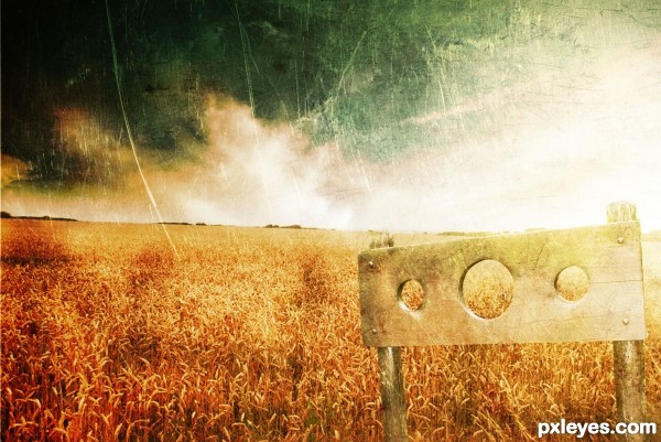
Credits to ~DeadSoldier-stock and =night-fate-stock. (5 years and 3410 days ago)
Really nice old timey feel 
cool work author...gl
Howdie stranger!
If you want to rate this picture or participate in this contest, just:
LOGIN HERE or REGISTER FOR FREE
This looks great! Good luck!
Thank you!
Nice chop!
Appreciated!
One of your best works author... good luck !
Muchas gracias Jorge!
Well done rendition of a classic image!!
Thanks sir!
Super freaky textures ... AWESOME!
Thanks a lot!
Congratulations.... Nice job.
Thanks George!
Congrats.. WOOT!
Appreciated Ernie!
and a first .. congrats. you do great work.
Too kind, thank you
Congrats Randy, well done
Most appreciated!
Congrats Randy, well deserved!!
Thanks Rein!
Congrats!
Thank you!
congrats rturnbow nice job!
Appreciated!
Howdie stranger!
If you want to rate this picture or participate in this contest, just:
LOGIN HERE or REGISTER FOR FREE